Feature Coming Soon!
The newsletter functionality is under development.
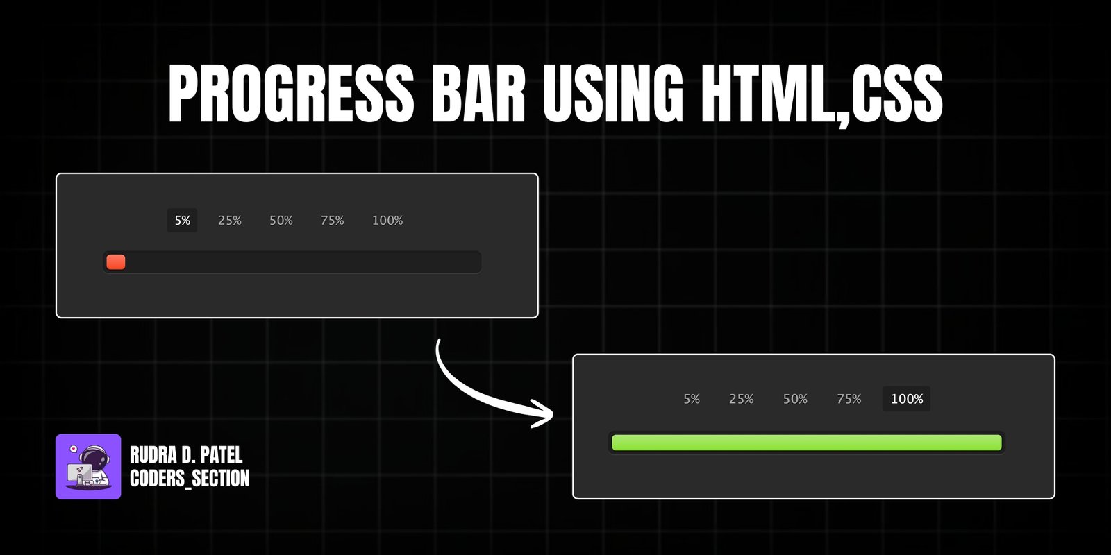
The following represents a simple progress bar that users can click and drag, or via button of 5%, 25%, 50%, 75% and 100%. The bar responds to a user's interaction by filling in its width and changing color — from red, when the bar is empty, to green as it fills up. This is done with hidden radio buttons and styled labels that utilize the :checked pseudo-class and no real form inputs. Fairly smooth CSS transitions, light gradients, and gentle shadows provide for a fairly crisp design, all inside a dark UI theme.
Designed for mobile scalability,the progress bar is made so it’s easy to see and easy to interact. Designed to create easy and intuitive experience for the users, tomake the progress one click action. Through avoidance of strict form structures, modular implementation, and clear css logic, usability is increased without losing visual depth and clarity and the design becomes both functional and userfriendly.
Let's start with the basic HTML for Progress Bar.
<div class="container">
    <input type="radio" class="radio" name="progress" value="five" id="five">
    <label for="five" class="label">5%</label>

    <input type="radio" class="radio" name="progress" value="twentyfive" id="twentyfive" checked>
    <label for="twentyfive" class="label">25%</label>

    <input type="radio" class="radio" name="progress" value="fifty" id="fifty">
    <label for="fifty" class="label">50%</label>

    <input type="radio" class="radio" name="progress" value="seventyfive" id="seventyfive">
    <label for="seventyfive" class="label">75%</label>

    <input type="radio" class="radio" name="progress" value="onehundred" id="onehundred">
    <label for="onehundred" class="label">100%</label>

    <div class="progress">
      <div class="progress-bar"></div>
    </div>
</div>
Here's the CSS that creates the Progress Bar.
.progress {
    padding: 4px;
    background: rgba(0, 0, 0, 0.25);
    border-radius: 6px;
    box-shadow: inset 0 1px 2px rgba(0, 0, 0, 0.25), 0 1px rgba(255, 255, 255, 0.08);
}
.progress-bar {
    height: 16px;
    border-radius: 4px;
    background-image: linear-gradient(to bottom, rgba(255, 255, 255, 0.3), rgba(255, 255, 255, 0.05));
    transition: 0.4s linear;
    transition-property: width, background-color;
    box-shadow: 0 0 1px 1px rgba(0, 0, 0, 0.25), inset 0 1px rgba(255, 255, 255, 0.1);
}
#five:checked ~ .progress > .progress-bar { width: 5%; background-color: #f63a0f; }
#twentyfive:checked ~ .progress > .progress-bar { width: 25%; background-color: #f27011; }
#fifty:checked ~ .progress > .progress-bar { width: 50%; background-color: #f2b01e; }
#seventyfive:checked ~ .progress > .progress-bar { width: 75%; background-color: #f2d31b; }
#onehundred:checked ~ .progress > .progress-bar { width: 100%; background-color: #86e01e; }
.radio { display: none; }
.label {
    display: inline-block;
    margin: 0 5px 20px;
    padding: 3px 8px;
    color: #aaa;
    text-shadow: 0 1px black;
    border-radius: 3px;
    cursor: pointer;
}
.radio:checked + .label {
    color: white;
    background: rgba(0, 0, 0, 0.25);
}
Watch a live demonstration of the Progress Bar below.
This interactive progress bar is an elegant and functional UI component that enhances user experience with smooth animations and intuitive controls. By using pure CSS, it remains lightweight and performant while delivering a visually engaging effect. The dynamic color transitions (from red to green) provide instant visual feedback, making it ideal for dashboards, file upload trackers, or step-based workflows.
You can easily customize this component by:
For smoother animations, use transform: scaleX() instead of modifying width. Add a slight delay on hover effects with transition-delay for a more polished user experience.
Click the button below to download the full source code. Download will be ready in 10 seconds.
Receive coding tips and resources updates. No spam.
We respect your privacy. Unsubscribe at any time.