Feature Coming Soon!
The newsletter functionality is under development.
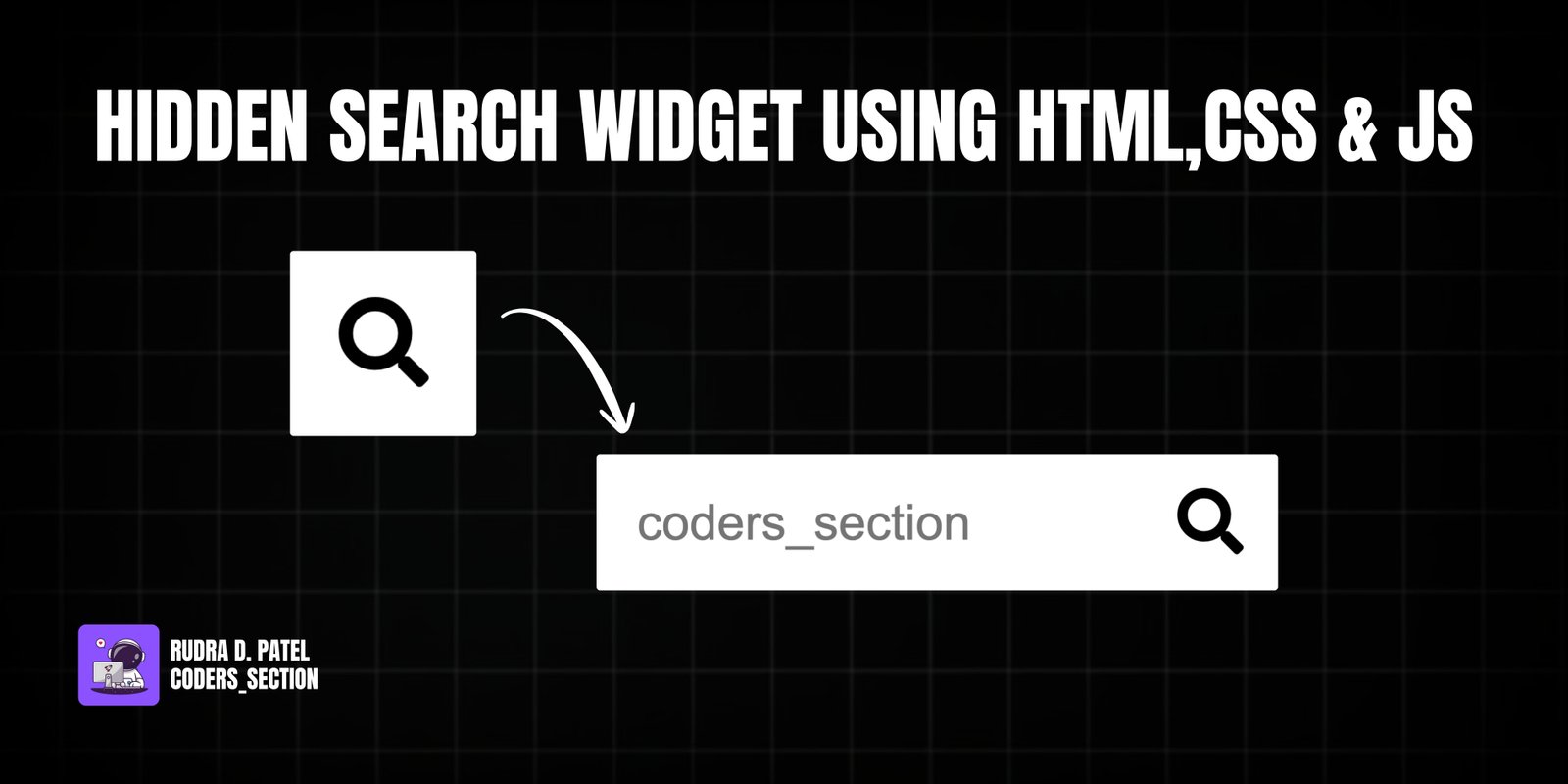
This project showcases a sleek, space-saving hidden search widget. Initially, only a search icon is visible. When the user clicks the icon, the search input field smoothly animates and expands, ready for the user to type their query. This is a common pattern in modern web design, used to keep the interface clean and uncluttered.
The functionality is achieved with a clever combination of CSS transitions and a small amount of JavaScript. The JavaScript simply toggles an 'active' class on the search container, while the CSS handles all the visual changes, such as expanding the width of the input and moving the search button. This approach is efficient and easy to maintain.
The HTML is minimal, consisting of a container div, an input field, and a button with a search icon.
<!DOCTYPE html>
<html lang="en">
  <head>
    <meta charset="UTF-8" />
    <meta name="viewport" content="width=device-width, initial-scale=1.0" />
    <link
      rel="stylesheet"
      href="https://cdnjs.cloudflare.com/ajax/libs/font-awesome/5.15.1/css/all.min.css"
      integrity="sha512-+4zCK9k+qNFUR5X+cKL9EIR+ZOhtIloNl9GIKS57V1MyNsYpYcUrUeQc9vNfzsWfV28IaLL3i96P9sdNyeRssA=="
      crossorigin="anonymous"
    />
    <link rel="stylesheet" href="style.css" />
  </head>
  <body>
    <div class="search">
      <input type="text" class="input" placeholder="coders_section" />
      <button class="btn"><i class="fas fa-search"></i></button>
    </div>
    <script src="script.js"></script>
  </body>
</html>
The CSS uses transitions on the `width` and `transform` properties to create the smooth animation effect when the 'active' class is applied.
@import url("https://fonts.googleapis.com/css2?family=Roboto:wght@400;700&display=swap");

* {
  box-sizing: border-box;
}

body {
  background-image: linear-gradient(90deg, #000000, #000000);
  font-family: "Roboto", sans-serif;
  display: flex;
  align-items: center;
  justify-content: center;
  height: 100vh;
  overflow: hidden;
  margin: 0;
}

.search {
  position: relative;
  height: 50px;
}

.search .input {
  background-color: #fff;
  border: 0;
  font-size: 18px;
  padding: 15px;
  height: 50px;
  width: 50px;
  transition: width 0.3s ease;
}

.btn {
  background-color: #fff;
  border: 0;
  cursor: pointer;
  font-size: 24px;
  position: absolute;
  top: 0;
  left: 0;
  height: 50px;
  width: 50px;
  transition: transform 0.3s ease;
}

.btn:focus,
.input:focus {
  outline: none;
}

.search.active .input {
  width: 200px;
}

.search.active .btn {
  transform: translateX(198px);
}
The JavaScript is straightforward: it adds a click event listener to the button to toggle the 'active' class on the search container.
const search = document.querySelector(".search");
const btn = document.querySelector(".btn");
const input = document.querySelector(".input");

btn.addEventListener("click", () => {
  search.classList.toggle("active");
  input.focus();
});
Watch a live demonstration of the Hidden Search Widget below.
The hidden search widget is a fantastic micro-interaction to add to any website or application. It enhances the user experience by keeping the UI clean while providing functionality in an elegant, animated fashion. It's a great example of how simple HTML, CSS, and JavaScript can be combined to create polished and professional components.
You can easily customize this component by:
To make the widget even more user-friendly, you could add a 'blur' event listener to the input field. This would automatically collapse the search widget when the user clicks away from it, providing a more intuitive closing mechanism.
Click the button below to download the full source code. Download will be ready in 10 seconds.
Receive coding tips and resources updates. No spam.
We respect your privacy. Unsubscribe at any time.