Feature Coming Soon!
The newsletter functionality is under development.
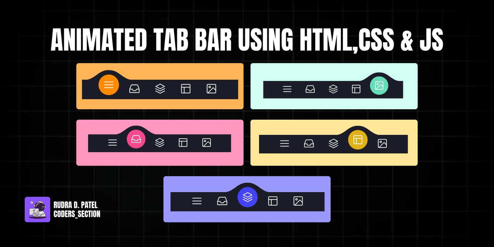
This project features an interactive animated tab bar, built using HTML, CSS, and JavaScript. It provides a sleek and modern navigation experience where selecting a tab triggers a smooth animation, highlighting the active item. This design is perfect for mobile applications or responsive web interfaces where space is at a premium and a dynamic user experience is desired.
The animation is driven by CSS transitions and a clever use of SVG clip-paths to create the unique "wave" effect under the active tab. JavaScript handles the active state toggling and calculates the position for the animated border, ensuring a fluid and visually appealing transition between tabs. This approach demonstrates how to create complex UI animations with a combination of modern web technologies.
The HTML consists of a `menu` container with several `menu__item` buttons, each containing an SVG icon. A `menu__border` div and an `svg-container` with a `clipPath` are used for the animation effect.
<!DOCTYPE html>
<html lang="en">
<head>
    <meta charset="UTF-8">
    <meta name="viewport" content="width=device-width, initial-scale=1.0">
    <title>Animated Tab Bar</title>
    <link rel="stylesheet" href="style.css">
</head>
<body>
    <menu class="menu">

        <button class="menu__item active" style="--bgColorItem: #ff8c00;">
          <svg class="icon" viewBox="0 0 24 24">
            <path d="M3.8,6.6h16.4"/>
            <path d="M20.2,12.1H3.8"/>
            <path d="M3.8,17.5h16.4"/>
          </svg>
        </button>

        <button class="menu__item" style="--bgColorItem: #f54888;">
          <svg class="icon" viewBox="0 0 24 24">
            <path  d="M6.7,4.8h10.7c0.3,0,0.6,0.2,0.7,0.5l2.8,7.3c0,0.1,0,0.2,0,0.3v5.6c0,0.4-0.4,0.8-0.8,0.8H3.8
            C3.4,19.3,3,19,3,18.5v-5.6c0-0.1,0-0.2,0.1-0.3L6,5.3C6.1,5,6.4,4.8,6.7,4.8z"/>
            <path  d="M3.4,12.9H8l1.6,2.8h4.9l1.5-2.8h4.6"/>
          </svg>
        </button>

        <button class="menu__item" style="--bgColorItem: #4343f5;">
          <svg class="icon" viewBox="0 0 24 24">
          <path  d="M3.4,11.9l8.8,4.4l8.4-4.4"/>
          <path  d="M3.4,16.2l8.8,4.5l8.4-4.5"/>
          <path  d="M3.7,7.8l8.6-4.5l8,4.5l-8,4.3L3.7,7.8z"/>
        </button>

        <button class="menu__item" style="--bgColorItem: #e0b115;" >
          <svg class="icon" viewBox="0 0 24 24" >
            <path  d="M5.1,3.9h13.9c0.6,0,1.2,0.5,1.2,1.2v13.9c0,0.6-0.5,1.2-1.2,1.2H5.1c-0.6,0-1.2-0.5-1.2-1.2V5.1
              C3.9,4.4,4.4,3.9,5.1,3.9z"/>
            <path  d="M4.2,9.3h15.6"/>
            <path  d="M9.1,9.5v10.3"/>
        </button>

        <button class="menu__item" style="--bgColorItem:#65ddb7;">
          <svg class="icon" viewBox="0 0 24 24" >
            <path  d="M5.1,3.9h13.9c0.6,0,1.2,0.5,1.2,1.2v13.9c0,0.6-0.5,1.2-1.2,1.2H5.1c-0.6,0-1.2-0.5-1.2-1.2V5.1
              C3.9,4.4,4.4,3.9,5.1,3.9z"/>
            <path  d="M5.5,20l9.9-9.9l4.7,4.7"/>
            <path  d="M10.4,8.8c0,0.9-0.7,1.6-1.6,1.6c-0.9,0-1.6-0.7-1.6-1.6C7.3,8,8,7.3,8.9,7.3C9.7,7.3,10.4,8,10.4,8.8z"/>
          </svg>
        </button>

        <div class="menu__border"></div>

      </menu>

      <div class="svg-container">
        <svg viewBox="0 0 202.9 45.5" >
          <clipPath id="menu" clipPathUnits="objectBoundingBox" transform="scale(0.0049285362247413 0.021978021978022)">
            <path  d="M6.7,45.5c5.7,0.1,14.1-0.4,23.3-4c5.7-2.3,9.9-5,18.1-10.5c10.7-7.1,11.8-9.2,20.6-14.3c5-2.9,9.2-5.2,15.2-7
              c7.1-2.1,13.3-2.3,17.6-2.1c4.2-0.2,10.5,0.1,17.6,2.1c6.1,1.8,10.2,4.1,15.2,7c8.8,5,9.9,7.1,20.6,14.3c8.3,5.5,12.4,8.2,18.1,10.5
              c9.2,3.6,17.6,4.2,23.3,4H6.7z"/>
          </clipPath>
        </svg>
      </div>
    <script src="script.js"></script>    </body>
</html>
The CSS defines the visual appearance of the tab bar, including its background, item styles, and the animation for the border and icons.
html {
    box-sizing: border-box;
    --bgColorMenu : #1d1d27;
    --duration: .7s;
}

html *,
html *::before,
html *::after {
    box-sizing: inherit;
}

body.tab-bar-body {
    margin: 0;
    display: flex;
    height: 100vh;
    overflow: hidden;
    align-items: center;
    justify-content: center;
    background-color: #ffb457;
    -webkit-tap-highlight-color: transparent;
    transition: background-color var(--duration);
}

.menu{
    margin: 0;
    display: flex;
    /* Works well with 100% width  */
    width: 32.05em;
    font-size: 1.5em;
    padding: 0 2.85em;
    position: relative;
    align-items: center;
    justify-content: center;
    background-color: var(--bgColorMenu);
}

.menu__item{
    all: unset;
    flex-grow: 1;
    z-index: 100;
    display: flex;
    cursor: pointer;
    position: relative;
    border-radius: 50%;
    align-items: center;
    will-change: transform;
    justify-content: center;
    padding: 0.55em 0 0.85em;
    transition: transform var(--timeOut , var(--duration));
}

.menu__item::before{
    content: "";
    z-index: -1;
    width: 4.2em;
    height: 4.2em;
    border-radius: 50%;
    position: absolute;
    transform: scale(0);
    transition: background-color var(--duration), transform var(--duration);
}

.menu__item.active {
    transform: translate3d(0, -.8em , 0);
}

.menu__item.active::before{
    transform: scale(1);
    background-color: var(--bgColorItem);
}

.icon{
    width: 2.6em;
    height: 2.6em;
    stroke: white;
    fill: transparent;
    stroke-width: 1pt;
    stroke-miterlimit: 10;
    stroke-linecap: round;
    stroke-linejoin: round;
    stroke-dasharray: 400;
}

.menu__item.active .icon {
    animation: strok 1.5s reverse;
}

@keyframes strok {
    100% {
        stroke-dashoffset: 400;
    }
}

.menu__border{
    left: 0;
    bottom: 99%;
    width: 10.9em;
    height: 2.4em;
    position: absolute;
    clip-path: url(#menu);
    will-change: transform;
    background-color: var(--bgColorMenu);
    transition: transform var(--timeOut , var(--duration));
}

.svg-container {
    width: 0;
    height: 0;
}

@media screen and (max-width: 50em) {
    .menu{
        font-size: .8em;
    }
}
The JavaScript manages the active state of the tab items and controls the position of the animated border based on the selected tab.
// Designed by:  Mauricio Bucardo
// Original image:
// https://dribbble.com/shots/5619509-Animated-Tab-Bar

"use strict";

const body = document.body;
const bgColorsBody = ["#ffb457", "#ff96bd", "#9999fb", "#ffe797", "#cffff1"];
const menu = body.querySelector(".menu");
const menuItems = menu.querySelectorAll(".menu__item");
const menuBorder = menu.querySelector(".menu__border");
let activeItem = menu.querySelector(".active");

function clickItem(item, index) {

    menu.style.removeProperty("--timeOut");

    if (activeItem == item) return;

    if (activeItem) {
        activeItem.classList.remove("active");
    }


    item.classList.add("active");
    body.style.backgroundColor = bgColorsBody[index];
    activeItem = item;
    offsetMenuBorder(activeItem, menuBorder);


}

function offsetMenuBorder(element, menuBorder) {

    const offsetActiveItem = element.getBoundingClientRect();
    const left = Math.floor(offsetActiveItem.left - menu.offsetLeft - (menuBorder.offsetWidth  - offsetActiveItem.width) / 2) +  "px";
    menuBorder.style.transform = `translate3d(${left}, 0 , 0)`;

}

offsetMenuBorder(activeItem, menuBorder);

menuItems.forEach((item, index) => {

    item.addEventListener("click", () => clickItem(item, index));

})

window.addEventListener("resize", () => {
    offsetMenuBorder(activeItem, menuBorder);
    menu.style.setProperty("--timeOut", "none");
});
Watch a live demonstration of the Animated Tab Bar below.
The animated tab bar is a visually engaging and highly functional component that significantly enhances the user experience of any web application. Its smooth transitions and intuitive feedback make navigation a delight. This project demonstrates the power of combining HTML for structure, CSS for styling and animation, and JavaScript for dynamic interactions to create a polished UI element.
You can easily customize this component by:
For more complex animations or interactions, consider using a dedicated animation library like GreenSock (GSAP) to achieve even smoother and more intricate effects with less code.
Click the button below to download the full source code. Download will be ready in 10 seconds.
Receive coding tips and resources updates. No spam.
We respect your privacy. Unsubscribe at any time.