Feature Coming Soon!
The newsletter functionality is under development.
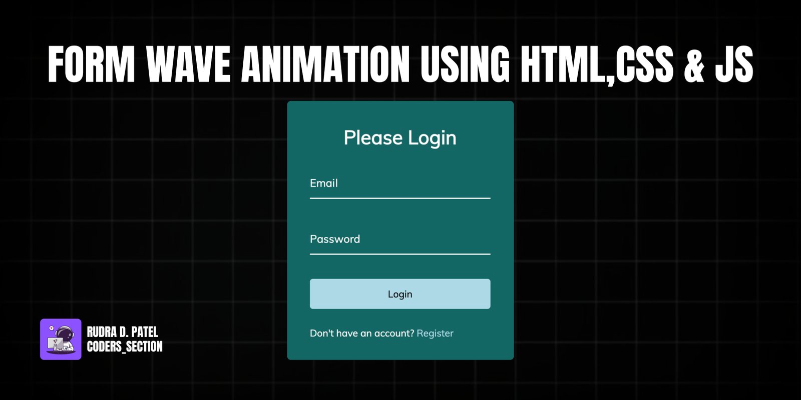
This project brings a simple login form to life with a captivating "wave" animation on the input labels. When a user clicks into an input field, the corresponding label's letters gracefully move upwards in a wave-like sequence, creating a delightful and interactive user experience.
The effect is achieved by using JavaScript to wrap each letter of the label in its own `` tag. A staggered `transition-delay` is then applied to each span via inline styles. When the input field is focused or contains a value, a CSS `transform` is applied to the spans, and the staggered delay creates the elegant wave motion. This technique is a great way to add a touch of personality and polish to any web form.
The HTML consists of a standard form within a container. Each form control includes an `input` and a `label` that will be animated.
<!DOCTYPE html>
<html lang="en">
  <head>
    <meta charset="UTF-8" />
    <meta name="viewport" content="width=device-width, initial-scale=1.0" />
    <link rel="stylesheet" href="style.css" />
    <title>Form Input Wave</title>
  </head>
  <body>
    <div class="container">
      <h1>Please Login</h1>
      <form>
        <div class="form-control">
          <input type="text" required />
          <label>Email</label>
        </div>
        <div class="form-control">
          <input type="password" required />
          <label>Password</label>
        </div>
        <button class="btn">Login</button>
        <p class="text">Don't have an account? <a href="#">Register</a></p>
      </form>
    </div>
    <script src="script.js"></script>
  </body>
</html>
The CSS styles the form and creates the transition effect for the label spans when the input is focused or valid.
@import url("https://fonts.googleapis.com/css2?family=Muli&display=swap");

* {
  box-sizing: border-box;
}

body {
  font-family: "Muli", sans-serif;
  background-color: rgb(0, 0, 0);
  color: #fff;
  display: flex;
  flex-direction: column;
  align-items: center;
  justify-content: center;
  height: 100vh;
  overflow: hidden;
  margin: 0;
}

.container {
  background-color: rgba(0, 255, 247, 0.4);
  padding: 20px 40px;
  border-radius: 5px;
}

.container h1 {
  text-align: center;
  margin-bottom: 30px;
}

.container a {
  text-decoration: none;
  color: lightblue;
}

.btn {
  cursor: pointer;
  display: inline-block;
  width: 100%;
  background: lightblue;
  padding: 15px;
  font-family: inherit;
  font-size: 16px;
  border: 0;
  border-radius: 5px;
}

.btn:focus {
  outline: 0;
}

.btn:active {
  transform: scale(0.98);
}

.text {
  margin-top: 30px;
}

.form-control {
  position: relative;
  margin: 20px 0 40px;
  width: 300px;
}

.form-control input {
  background-color: transparent;
  border: 0;
  border-bottom: 2px #fff solid;
  display: block;
  width: 100%;
  padding: 15px 0;
  font-size: 18px;
  color: #fff;
}

.form-control input:focus,
.form-control input:valid {
  outline: 0;
  border-bottom-color: lightblue;
}

.form-control label {
  position: absolute;
  top: 15px;
  left: 0;
  pointer-events: none;
}

.form-control label span {
  display: inline-block;
  font-size: 18px;
  min-width: 5px;
  transition: 0.3s cubic-bezier(0.68, -0.55, 0.265, 1.55);
}

.form-control input:focus + label span,
.form-control input:valid + label span {
  color: lightblue;
  transform: translateY(-30px);
}
The JavaScript dynamically wraps each letter of the labels in `` tags with a staggered transition delay.
const labels = document.querySelectorAll(".form-control label");

labels.forEach((label) => {
  label.innerHTML = label.innerText
    .split("")
    .map(
      (letter, idx) =>
        `<span style="transition-delay:${idx * 50}ms">${letter}</span>`
    )
    .join("");
});
Watch a live demonstration of the Form Wave Animation below.
The form wave animation is a subtle but powerful way to improve the user experience of your web forms. It adds a layer of polish and interactivity that makes a simple login form feel more modern and responsive. This effect is a great example of progressive enhancement, as the form remains perfectly functional even if the JavaScript or CSS fails to load.
You can easily customize this component by:
For better performance on complex forms, consider applying the JavaScript logic only when an input field comes into the viewport, using the Intersection Observer API. This can help prevent unnecessary DOM manipulation on large pages.
Click the button below to download the full source code. Download will be ready in 10 seconds.
Receive coding tips and resources updates. No spam.
We respect your privacy. Unsubscribe at any time.