Feature Coming Soon!
The newsletter functionality is under development.
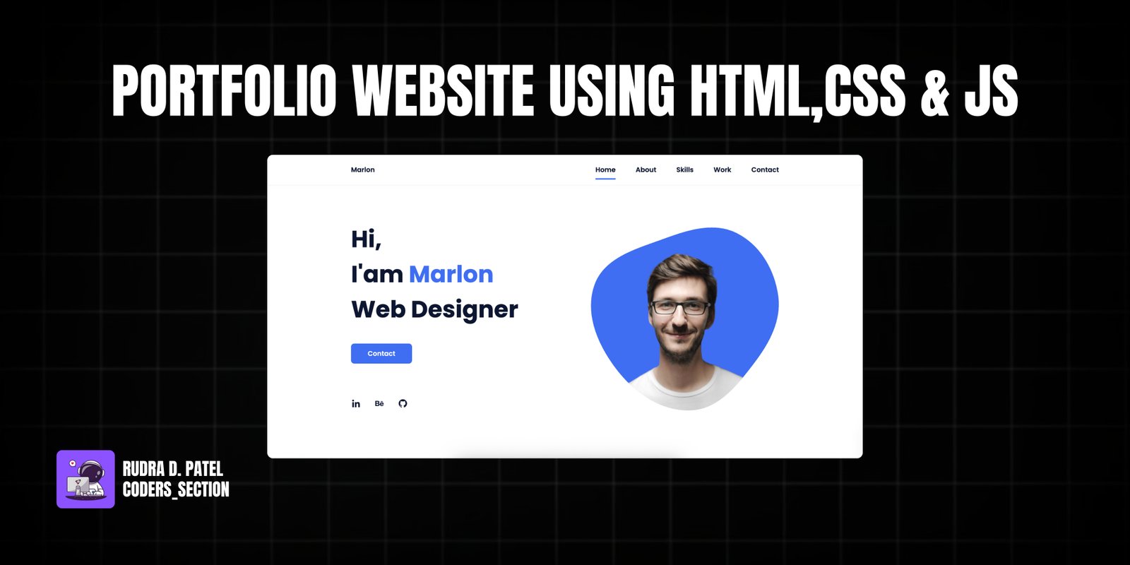
This project showcases a modern and fully responsive personal portfolio website built with HTML, CSS, and JavaScript. It's designed to highlight your skills, projects, and contact information in an elegant and accessible manner across various devices, from desktops to mobile phones.
The portfolio includes a dynamic navigation bar, an engaging home section with a personal introduction, an "About" section to share your story, a "Skills" section featuring visual progress bars, a "Work" section to display your projects, and a "Contact" form for inquiries. The design emphasizes clean aesthetics, smooth animations, and a user-friendly interface.
The HTML structure forms the backbone of the responsive portfolio. It's organized into logical sections: a `
<!DOCTYPE html>
<html lang="en">
<head>
<meta charset="UTF-8" />
<meta name="viewport" content="width=device-width, initial-scale=1.0" />
<link rel="stylesheet" href="assets/css/styles.css" />
<!-- =====BOX ICONS===== -->
<link
href="https://cdn.jsdelivr.net/npm/boxicons@2.0.5/css/boxicons.min.css"
rel="stylesheet"
/>
<title>Portfolio website | Coders_Section</title>
</head>
<body>
<!--===== HEADER =====-->
<header class="l-header">
<nav class="nav bd-grid">
<div>
<a href="#" class="nav__logo">Marlon</a>
</div>
<div class="nav__menu" id="nav-menu">
<ul class="nav__list>
<li class="nav__item">
<a href="#home" class="nav__link active">Home</a>
</li>
<li class="nav__item">
<a href="#about" class="nav__link">About</a>
</li>
<li class="nav__item">
<a href="#skills" class="nav__link">Skills</a>
</li>
<li class="nav__item">
<a href="#work" class="nav__link">Work</a>
</li>
<li class="nav__item">
<a href="#contact" class="nav__link">Contact</a>
</li>
</ul>
</div>
<div class="nav__toggle" id="nav-toggle">
<i class="bx bx-menu"></i>
</div>
</nav>
</header>
<main class="l-main">
<!--===== HOME =====-->
<section class="home bd-grid" id="home">
<div class="home__data">
<h1 class="home__title">
Hi,<br />I'am <span class="home__title-color">Marlon</span><br />
Web Designer
</h1>
<a href="#" class="button">Contact</a>
</div>
<div class="home__social">
<a href="" class="home__social-icon><i class="bx bxl-linkedin"></i></a>
<a href="" class="home__social-icon><i class="bx bxl-behance"></i></a>
<a href="" class="home__social-icon><i class="bx bxl-github"></i></a>
</div>
<div class="home__img">
<svg
class="home__blob"
viewBox="0 0 479 467"
xmlns="http://www.w3.org/2000/svg"
xmlns:xlink="http://www.w3.org/1999/xlink"
>
<mask id="mask0" mask-type="alpha">
<path
d="M9.19024 145.964C34.0253 76.5814 114.865 54.7299 184.111 29.4823C245.804 6.98884 311.86 -14.9503 370.735 14.143C431.207 44.026 467.948 107.508 477.191 174.311C485.897 237.229 454.931 294.377 416.506 344.954C373.74 401.245 326.068 462.801 255.442 466.189C179.416 469.835 111.552 422.137 65.1576 361.805C17.4835 299.81 -17.1617 219.583 9.19024 145.964Z"
/>
</mask>
<g mask="url(#mask0)">
<path
d="M9.19024 145.964C34.0253 76.5814 114.865 54.7299 184.111 29.4823C245.804 6.98884 311.86 -14.9503 370.735 14.143C431.207 44.026 467.948 107.508 477.191 174.311C485.897 237.229 454.931 294.377 416.506 344.954C373.74 401.245 326.068 462.801 255.442 466.189C179.416 469.835 111.552 422.137 65.1576 361.805C17.4835 299.81 -17.1617 219.583 9.19024 145.964Z"
/>
<image
class="home__blob-img"
x="50"
y="60"
href="assets/img/perfil.png"
/>
</g>
</svg>
</div>
</section>
<!--===== ABOUT =====-->
<section class="about section" id="about">
<h2 class="section-title">About</h2>
<div class="about__container bd-grid">
<div class="about__img">
<img src="assets/img/about.jpg" alt="" />
</div>
<div>
<h2 class="about__subtitle">I'am Marlon</h2>
<p class="about__text">
Lorem, ipsum dolor sit amet consectetur adipisicing elit.
Voluptate cum expedita quo culpa tempora, assumenda, quis fugiat
ut voluptates soluta, aut earum nemo recusandae cumque
perferendis! Recusandae alias accusamus atque.
</p>
</div>
</div>
</section>
<!--===== SKILLS =====-->
<section class="skills section" id="skills">
<h2 class="section-title">Skills</h2>
<div class="skills__container bd-grid">
<div>
<h2 class="skills__subtitle">Profesional Skills</h2>
<p class="skills__text">
Lorem ipsum dolor sit, amet consectetur adipisicing elit. Velit
optio id vero amet, alias architecto consectetur error eum eaque
sit.
</p>
<div class="skills__data">
<div class="skills__names">
<i class="bx bxl-html5 skills__icon"></i>
<span class="skills__name">HTML5</span>
</div>
<div class="skills__bar skills__html"></div>
<div>
<span class="skills__percentage">95%</span>
</div>
</div>
<div class="skills__data">
<div class="skills__names">
<i class="bx bxl-css3 skills__icon"></i>
<span class="skills__name">CSS3</span>
</div>
<div class="skills__bar skills__css"></div>
<div>
<span class="skills__percentage">85%</span>
</div>
</div>
<div class="skills__data">
<div class="skills__names">
<i class="bx bxl-javascript skills__icon"></i>
<span class="skills__name">JAVASCRIPT</span>
</div>
<div class="skills__bar skills__js"></div>
<div>
<span class="skills__percentage">65%</span>
</div>
</div>
<div class="skills__data">
<div class="skills__names">
<i class="bx bxs-paint skills__icon"></i>
<span class="skills__name">UX/UI</span>
</div>
<div class="skills__bar skills__ux"></div>
<div>
<span class="skills__percentage">85%</span>
</div>
</div>
</div>
<div>
<img src="assets/img/work3.jpg" alt="" class="skills__img" />
</div>
</div>
</section>
<!--===== WORK =====-->
<section class="work section" id="work">
<h2 class="section-title">Work</h2>
<div class="work__container bd-grid">
<a href="" class="work__img">
<img src="assets/img/work1.jpg" alt="" />
</a>
<a href="" class="work__img">
<img src="assets/img/work2.jpg" alt="" />
</a>
<a href="" class="work__img">
<img src="assets/img/work3.jpg" alt="" />
</a>
<a href="" class="work__img">
<img src="assets/img/work4.jpg" alt="" />
</a>
<a href="" class="work__img">
<img src="assets/img/work5.jpg" alt="" />
</a>
<a href="" class="work__img">
<img src="assets/img/work6.jpg" alt="" />
</a>
</div>
</section>
<!--===== CONTACT =====-->
<section class="contact section" id="contact">
<h2 class="section-title">Contact</h2>
<div class="contact__container bd-grid">
<form action="" class="contact__form">
<input type="text" placeholder="Name" class="contact__input" />
<input type="mail" placeholder="Email" class="contact__input" />
<textarea
name=""
id=""
cols="0"
rows="10"
class="contact__input"
></textarea>
<input type="button" value="Send" class="contact__button button" />
</form>
</div>
</section>
</main>
<!--===== FOOTER =====-->
<footer class="footer">
<p class="footer__title">Marlon</p>
<div class="footer__social">
<a href="#" class="footer__icon"><i class="bx bxl-facebook"></i></a>
<a href="#" class="footer__icon"><i class="bx bxl-instagram"></i></a>
<a href="#" class="footer__icon"><i class="bx bxl-twitter"></i></a>
</div>
<p class="footer__copy">© All rigths reserved</p>
</footer>
<!--===== SCROLL REVEAL =====-->
<script src="https://unpkg.com/scrollreveal"></script>
<!--===== MAIN JS =====-->
<script src="assets/js/main.js"></script>
The CSS provides the aesthetic foundation and responsive behavior for the portfolio. It defines the layout using `display: grid` and `flexbox` for various sections, ensuring elements are well-aligned and adapt to different screen sizes. Key styles include responsive typography, color schemes, and visual effects like gradients and shadows. The CSS also handles the styling of the navigation bar, skill progress bars, and image hover effects in the "Work" section, contributing to a polished and professional appearance.
/*===== GOOGLE FONTS =====*/
@import url("https://fonts.googleapis.com/css2?family=Poppins:wght@400;600;700&display=swap");
/*===== VARIABLES CSS =====*/
:root {
  --header-height: 3rem;
  --font-semi: 600;
  /*===== Colores =====*/
  /*Purple 260 - Red 355 - Blue 224 - Pink 340*/
  /* HSL color mode */
  --hue-color: 224;
  --first-color: hsl(var(--hue-color), 89%, 60%);
  --second-color: hsl(var(--hue-color), 56%, 12%);
  /*===== Fuente y tipografia =====*/
  --body-font: 'Poppins', sans-serif;
  --big-font-size: 2rem;
  --h2-font-size: 1.25rem;
  --normal-font-size: .938rem;
  --smaller-font-size: .75rem;
  /*===== Margenes =====*/
  --mb-2: 1rem;
  --mb-4: 2rem;
  --mb-5: 2.5rem;
  --mb-6: 3rem;
  /*===== z index =====*/
  --z-back: -10;
  --z-fixed: 100;
}

@media screen and (min-width: 968px) {
  :root {
    --big-font-size: 3.5rem;
    --h2-font-size: 2rem;
    --normal-font-size: 1rem;
    --smaller-font-size: .875rem;
  }
}

/*===== BASE =====*/
*, ::before, ::after {
  box-sizing: border-box;
}

html {
  scroll-behavior: smooth;
}

body {
  margin: var(--header-height) 0 0 0;
  font-family: var(--body-font);
  font-size: var(--normal-font-size);
  color: var(--second-color);
}

h1, h2, p {
  margin: 0;
}

ul {
  margin: 0;
  padding: 0;
  list-style: none;
}

a {
  text-decoration: none;
}

img {
  max-width: 100%;
  height: auto;
  display: block;
}

/*===== CLASS CSS ===== */
.section-title {
  position: relative;
  font-size: var(--h2-font-size);
  color: var(--first-color);
  margin-top: var(--mb-2);
  margin-bottom: var(--mb-4);
  text-align: center;
}

.section-title::after {
  position: absolute;
  content: '';
  width: 64px;
  height: 0.18rem;
  left: 0;
  right: 0;
  margin: auto;
  top: 2rem;
  background-color: var(--first-color);
}

.section {
  padding-top: 3rem;
  padding-bottom: 2rem;
}

/*===== LAYOUT =====*/
.bd-grid {
  max-width: 1024px;
  display: grid;
  margin-left: var(--mb-2);
  margin-right: var(--mb-2);
}

.l-header {
  width: 100%;
  position: fixed;
  top: 0;
  left: 0;
  z-index: var(--z-fixed);
  background-color: #fff;
  box-shadow: 0 1px 4px rgba(146, 161, 176, 0.15);
}

/*===== NAV =====*/
.nav {
  height: var(--header-height);
  display: flex;
  justify-content: space-between;
  align-items: center;
  font-weight: var(--font-semi);
}

@media screen and (max-width: 767px) {
  .nav__menu {
    position: fixed;
    top: var(--header-height);
    right: -100%;
    width: 80%;
    height: 100%;
    padding: 2rem;
    background-color: var(--second-color);
    transition: .5s;
  }
}

.nav__item {
  margin-bottom: var(--mb-4);
}

.nav__link {
  position: relative;
  color: #fff;
}

.nav__link:hover {
  position: relative;
}

.nav__link:hover::after {
  position: absolute;
  content: '';
  width: 100%;
  height: 0.18rem;
  left: 0;
  top: 2rem;
  background-color: var(--first-color);
}

.nav__logo {
  color: var(--second-color);
}

.nav__toggle {
  color: var(--second-color);
  font-size: 1.5rem;
  cursor: pointer;
}

/*Active menu*/
.active::after {
  position: absolute;
  content: '';
  width: 100%;
  height: 0.18rem;
  left: 0;
  top: 2rem;
  background-color: var(--first-color);
}

/*=== Show menu ===*/
.show {
  right: 0;
}

/*===== HOME =====*/
.home {
  position: relative;
  row-gap: 5rem;
  padding: 4rem 0 5rem;
}

.home__data {
  align-self: center;
}

.home__title {
  font-size: var(--big-font-size);
  margin-bottom: var(--mb-5);
}

.home__title-color {
  color: var(--first-color);
}

.home__social {
  display: flex;
  flex-direction: column;
}

.home__social-icon {
  width: max-content;
  margin-bottom: var(--mb-2);
  font-size: 1.5rem;
  color: var(--second-color);
}

.home__social-icon:hover {
  color: var(--first-color);
}

.home__img {
  position: absolute;
  right: 0;
  bottom: 0;
  width: 260px;
}

.home__blob {
  fill: var(--first-color);
}

.home__blob-img {
  width: 360px;
}

/*BUTTONS*/
.button {
  display: inline-block;
  background-color: var(--first-color);
  color: #fff;
  padding: .75rem 2.5rem;
  font-weight: var(--font-semi);
  border-radius: .5rem;
  transition: .3s;
}

.button:hover {
  box-shadow: 0px 10px 36px rgba(0, 0, 0, 0.15);
}

/* ===== ABOUT =====*/
.about__container {
  row-gap: 2rem;
  text-align: center;
}

.about__subtitle {
  margin-bottom: var(--mb-2);
}

.about__img {
  justify-self: center;
}

.about__img img {
  width: 200px;
  border-radius: .5rem;
}

/* ===== SKILLS =====*/
.skills__container {
  row-gap: 2rem;
  text-align: center;
}

.skills__subtitle {
  margin-bottom: var(--mb-2);
}

.skills__text {
  margin-bottom: var(--mb-4);
}

.skills__data {
  display: flex;
  justify-content: space-between;
  align-items: center;
  position: relative;
  font-weight: var(--font-semi);
  padding: .5rem 1rem;
  margin-bottom: var(--mb-4);
  border-radius: .5rem;
  box-shadow: 0px 4px 25px rgba(14, 36, 49, 0.15);
}

.skills__icon {
  font-size: 2rem;
  margin-right: var(--mb-2);
  color: var(--first-color);
}

.skills__names {
  display: flex;
  align-items: center;
}

.skills__bar {
  position: absolute;
  left: 0;
  bottom: 0;
  background-color: var(--first-color);
  height: .25rem;
  border-radius: .5rem;
  z-index: var(--z-back);
}

.skills__html {
  width: 95%;
}

.skills__css {
  width: 85%;
}

.skills__js {
  width: 65%;
}

.skills__ux {
  width: 85%;
}

.skills__img {
  border-radius: .5rem;
}

/* ===== WORK =====*/
.work__container {
  row-gap: 2rem;
}

.work__img {
  box-shadow: 0px 4px 25px rgba(14, 36, 49, 0.15);
  border-radius: .5rem;
  overflow: hidden;
}

.work__img img {
  transition: 1s;
}

.work__img img:hover {
  transform: scale(1.1);
}

/* ===== CONTACT =====*/
.contact__input {
  width: 100%;
  font-size: var(--normal-font-size);
  font-weight: var(--font-semi);
  padding: 1rem;
  border-radius: .5rem;
  border: 1.5px solid var(--second-color);
  outline: none;
  margin-bottom: var(--mb-4);
}

.contact__button {
  display: block;
  border: none;
  outline: none;
  font-size: var(--normal-font-size);
  cursor: pointer;
  margin-left: auto;
}

/* ===== FOOTER =====*/
.footer {
  background-color: var(--second-color);
  color: #fff;
  text-align: center;
  font-weight: var(--font-semi);
  padding: 2rem 0;
}

.footer__title {
  font-size: 2rem;
  margin-bottom: var(--mb-4);
}

.footer__social {
  margin-bottom: var(--mb-4);
}

.footer__icon {
  font-size: 1.5rem;
  color: #fff;
  margin: 0 var(--mb-2);
}

.footer__copy {
  font-size: var(--smaller-font-size);
}

/* ===== MEDIA QUERIES=====*/
@media screen and (max-width: 320px) {
  .home {
    row-gap: 2rem;
  }
  .home__img {
    width: 200px;
  }
}

@media screen and (min-width: 576px) {
  .home {
    padding: 4rem 0 2rem;
  }
  .home__social {
    padding-top: 0;
    padding-bottom: 2.5rem;
    flex-direction: row;
    align-self: flex-end;
  }
  .home__social-icon {
    margin-bottom: 0;
    margin-right: var(--mb-4);
  }
  .home__img {
    width: 300px;
    bottom: 25%;
  }
  .about__container {
    grid-template-columns: repeat(2, 1fr);
    align-items: center;
    text-align: initial;
  }
  .skills__container {
    grid-template-columns: .7fr;
    justify-content: center;
    column-gap: 1rem;
  }
  .work__container {
    grid-template-columns: repeat(2, 1fr);
    column-gap: 2rem;
    padding-top: 2rem;
  }
  .contact__form {
    width: 360px;
    padding-top: 2rem;
  }
  .contact__container {
    justify-items: center;
  }
}

@media screen and (min-width: 768px) {
  body {
    margin: 0;
  }
  .section {
    padding-top: 4rem;
    padding-bottom: 3rem;
  }
  .section-title {
    margin-bottom: var(--mb-6);
  }
  .section-title::after {
    width: 80px;
    top: 3rem;
  }
  .nav {
    height: calc(var(--header-height) + 1.5rem);
  }
  .nav__list {
    display: flex;
    padding-top: 0;
  }
  .nav__item {
    margin-left: var(--mb-6);
    margin-bottom: 0;
  }
  .nav__toggle {
    display: none;
  }
  .nav__link {
    color: var(--second-color);
  }
  .home {
    padding: 8rem 0 2rem;
  }
  .home__img {
    width: 400px;
    bottom: 10%;
  }
  .about__container {
    padding-top: 2rem;
  }
  .about__img img {
    width: 300px;
  }
  .skills__container {
    grid-template-columns: repeat(2, 1fr);
    column-gap: 2rem;
    align-items: center;
    text-align: initial;
  }
  .work__container {
    grid-template-columns: repeat(3, 1fr);
    column-gap: 2rem;
  }
}

@media screen and (min-width: 992px) {
  .bd-grid {
    margin-left: auto;
    margin-right: auto;
  }
  .home {
    padding: 10rem 0 2rem;
  }
  .home__img {
    width: 450px;
  }
}
The JavaScript enhances the interactivity and user experience of the portfolio. It manages the mobile navigation menu, allowing it to toggle open and closed. Furthermore, it dynamically highlights the active navigation link as the user scrolls through different sections of the page, providing clear visual feedback. The script also incorporates a "Scroll Reveal" animation library, which introduces elements onto the screen with a smooth animated effect as they come into view, adding a modern and engaging touch to the portfolio's presentation.
/*===== MENU SHOW =====*/
const showMenu = (toggleId, navId) =>{
    const toggle = document.getElementById(toggleId),
    nav = document.getElementById(navId)

    if(toggle && nav){
        toggle.addEventListener('click', ()=>{
            nav.classList.toggle('show')
        })
    }
}
showMenu('nav-toggle','nav-menu')

/*==================== REMOVE MENU MOBILE ====================*/
const navLink = document.querySelectorAll('.nav__link')

function linkAction(){
    const navMenu = document.getElementById('nav-menu')
    // When we click on each nav__link, we remove the show-menu class
    navMenu.classList.remove('show')
}
navLink.forEach(n => n.addEventListener('click', linkAction))

/*==================== SCROLL SECTIONS ACTIVE LINK ====================*/
const sections = document.querySelectorAll('section[id]')

function scrollActive(){
    const scrollY = window.pageYOffset

    sections.forEach(current =>{
        const sectionHeight = current.offsetHeight
        const sectionTop = current.offsetTop - 50;
        sectionId = current.getAttribute('id')

        if(scrollY > sectionTop && scrollY <= sectionTop + sectionHeight){
            document.querySelector('.nav__menu a[href*=' + sectionId + ']').classList.add('active')
        }else{
            document.querySelector('.nav__menu a[href*=' + sectionId + ']').classList.remove('active')
        }
    })
}
window.addEventListener('scroll', scrollActive)

/*===== SCROLL REVEAL ANIMATION =====*/
const sr = ScrollReveal({
    origin: 'top',
    distance: '60px',
    duration: 2000,
    delay: 200,
//     reset: true
});

sr.reveal('.home__data, .about__img, .skills__subtitle, .skills__text',{});
sr.reveal('.home__img, .about__subtitle, .about__text, .skills__img',{delay: 400});
sr.reveal('.home__social-icon',{ interval: 200});
sr.reveal('.skills__data, .work__img, .contact__input',{interval: 200});
Watch a live demonstration of the Responsive Portfolio below.
This responsive portfolio template provides a solid foundation for showcasing your work and skills online. Its clean design, responsive layout, and interactive elements make it an effective tool for personal branding and professional networking. The modular structure allows for easy customization and expansion to fit your unique needs.
You can easily customize this component by:
When building a portfolio, focus on quality over quantity. Showcase your best work and clearly articulate your role and contributions in each project. Ensure your contact information is easily accessible and consider adding a call-to-action to encourage engagement.
Click the button below to download the full source code. Download will be ready in 10 seconds.
Receive coding tips and resources updates. No spam.
We respect your privacy. Unsubscribe at any time.