Feature Coming Soon!
The newsletter functionality is under development.
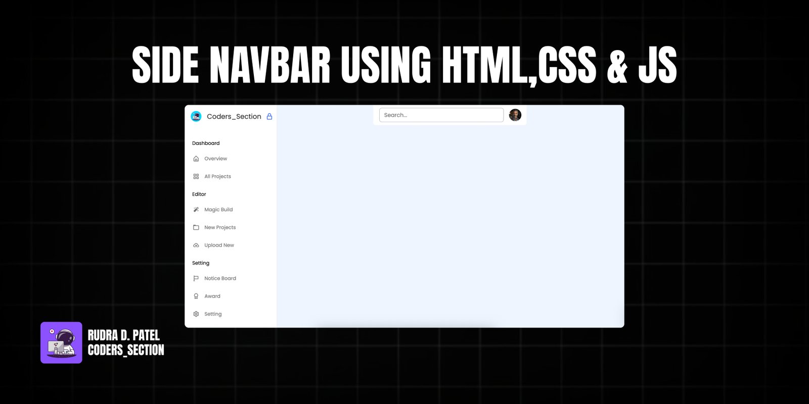
This project demonstrates a responsive and interactive side navigation bar built using HTML, CSS, and JavaScript. It features a sleek design that can be expanded or collapsed, and includes a lock/unlock functionality to keep the sidebar open or allow it to hide on hover. The navigation bar is designed to adapt seamlessly to different screen sizes, providing an optimal user experience on both desktop and mobile devices.
The sidebar includes a logo, a list of menu items categorized under "Dashboard", "Editor", and "Setting", and a user profile section at the bottom. The implementation focuses on smooth transitions and a clean aesthetic, making it suitable for various web applications and dashboards where efficient navigation is key.
The core of the side navigation bar is structured with semantic HTML5 elements. A main `nav` element with the class `sidebar` acts as the container for the entire menu. Inside, you'll find a `div` for the logo and title (`logo_items`), followed by a `menu_container` which holds multiple `ul` elements for different categories of menu items. Each `li` represents a menu item with an icon and text. A `sidebar_profile` `div` is included at the bottom for user information. Additionally, a separate `nav` element with the class `navbar` is used for the top navigation bar, which includes a search box and a user image.
<!DOCTYPE html>
<html lang="en">
  <head>
    <meta charset="UTF-8" />
    <meta http-equiv="X-UA-Compatible" content="IE=edge" />
    <meta name="viewport" content="width=device-width, initial-scale=1.0" />
    <title>Hoverable Sidebar Menu HTML CSS & JavaScript</title>
    <link rel="stylesheet" href="style.css" />
    <!-- Boxicons CSS -->
    <link flex href="https://unpkg.com/boxicons@2.1.4/css/boxicons.min.css" rel="stylesheet" />
    <script src="script.js" defer></script>
  </head>
  <body>
    <nav class="sidebar locked">
      <div class="logo_items flex">
        <span class="nav_image">
          <img src="images/logo.JPG" alt="logo_img" />
        </span>
        <span class="logo_name">Coders_Section</span>
        <i class="bx bx-lock-alt" id="lock-icon" title="Unlock Sidebar"></i>
        <i class="bx bx-x" id="sidebar-close"></i>
      </div>

      <div class="menu_container">
        <div class="menu_items">
          <ul class="menu_item">
            <div class="menu_title flex">
              <span class="title">Dashboard</span>
              <span class="line"></span>
            </div>
            <li class="item">
              <a href="#" class="link flex">
                <i class="bx bx-home-alt"></i>
                <span>Overview</span>
              </a>
            </li>
            <li class="item">
              <a href="#" class="link flex">
                <i class="bx bx-grid-alt"></i>
                <span>All Projects</span>
              </a>
            </li>
          </ul>

          <ul class="menu_item">
            <div class="menu_title flex">
              <span class="title">Editor</span>
              <span class="line"></span>
            </div>
            <li class="item">
              <a href="#" class="link flex">
                <i class="bx bxs-magic-wand"></i>
                <span>Magic Build</span>
              </a>
            </li>
            <li class="item">
              <a href="#" class="link flex">
                <i class="bx bx-folder"></i>
                <span>New Projects</span>
              </a>
            </li>
            <li class="item">
              <a href="#" class="link flex">
                <i class="bx bx-cloud-upload"></i>
                <span>Upload New</span>
              </a>
            </li>
          </ul>

          <ul class="menu_item">
            <div class="menu_title flex">
              <span class="title">Setting</span>
              <span class="line"></span>
            </div>
            <li class="item">
              <a href="#" class="link flex">
                <i class="bx bx-flag"></i>
                <span>Notice Board</span>
              </a>
            </li>
            <li class="item">
              <a href="#" class="link flex">
                <i class="bx bx-award"></i>
                <span>Award</span>
              </a>
            </li>
            <li class="item">
              <a href="#" class="link flex">
                <i class="bx bx-cog"></i>
                <span>Setting</span>
              </a>
            </li>
          </ul>
        </div>

        <div class="sidebar_profile flex">
          <span class="nav_image">
            <img src="images/profile.jpeg" alt="logo_img" />
          </span>
          <div class="data_text">
            <span class="name">Rudra Patel</span>
            <span class="email">ABC@gmail.com</span>
          </div>
        </div>
      </div>
    </nav>

    <!-- Navbar -->
    <nav class="navbar flex">
      <i class="bx bx-menu" id="sidebar-open"></i>
      <input type="text" placeholder="Search..." class="search_box" />
      <span class="nav_image">
        <img src="images/profile.jpeg" alt="logo_img" />
      </span>
    </nav>
The CSS provides the visual design and responsiveness for the side navigation bar. It defines the fixed positioning, width, background, and shadow for the `.sidebar`. Key styles include transitions for smooth opening and closing, and opacity changes for elements like the logo name and lock icon when the sidebar is collapsed. The styling also covers the appearance of menu items on hover, the user profile section, and the top navigation bar, ensuring a consistent and modern look across different screen sizes through media queries.
/* Import Google font - Poppins */
@import url("https://fonts.googleapis.com/css2?family=Poppins:wght@200;300;400;500;600;700&display=swap");
* {
  margin: 0;
  padding: 0;
  box-sizing: border-box;
  font-family: "Poppins", sans-serif;
}
body {
  min-height: 100vh;
  background: #eef5fe;
}
/* Pre css */
.flex {
  display: flex;
  align-items: center;
}
.nav_image {
  display: flex;
  min-width: 55px;
  justify-content: center;
}
.nav_image img {
  height: 35px;
  width: 35px;
  border-radius: 50%;
  object-fit: cover;
}

/* Sidebar */
.sidebar {
  position: fixed;
  top: 0;
  left: 0;
  height: 100%;
  width: 300px;
  background: #fff;
  padding: 15px 10px;
  box-shadow: 0 0 2px rgba(0, 0, 0, 0.1);
  transition: all 0.4s ease;
}
.sidebar.close {
  width: calc(55px + 20px);
}
.logo_items {
  gap: 8px;
}
.logo_name {
  font-size: 22px;
  color: #333;
  font-weight: 500px;
  transition: all 0.3s ease;
}
.sidebar.close .logo_name,
.sidebar.close #lock-icon,
.sidebar.close #sidebar-close {
  opacity: 0;
  pointer-events: none;
}
#lock-icon,
#sidebar-close {
  padding: 10px;
  color: #4070f4;
  font-size: 25px;
  cursor: pointer;
  margin-left: -4px;
  transition: all 0.3s ease;
}
#sidebar-close {
  display: none;
  color: #333;
}
.menu_container {
  display: flex;
  flex-direction: column;
  justify-content: space-between;
  margin-top: 40px;
  overflow-y: auto;
  height: calc(100% - 82px);
}
.menu_container::-webkit-scrollbar {
  display: none;
}
.menu_title {
  position: relative;
  height: 50px;
  width: 55px;
}
.menu_title .title {
  margin-left: 15px;
  transition: all 0.3s ease;
}
.sidebar.close .title {
  opacity: 0;
}
.menu_title .line {
  position: absolute;
  left: 50%;
  transform: translateX(-50%);
  height: 3px;
  width: 20px;
  border-radius: 25px;
  background: #aaa;
  transition: all 0.3s ease;
}
.menu_title .line {
  opacity: 0;
}
.sidebar.close .line {
  opacity: 1;
}
.item {
  list-style: none;
}
.link {
  text-decoration: none;
  border-radius: 8px;
  margin-bottom: 8px;
  color: #707070;
}
.link:hover {
  color: #fff;
  background-color: #4070f4;
}
.link span {
  white-space: nowrap;
}
.link i {
  height: 50px;
  min-width: 55px;
  display: flex;
  font-size: 22px;
  align-items: center;
  justify-content: center;
  border-radius: 4px;
}

.sidebar_profile {
  padding-top: 15px;
  margin-top: 15px;
  gap: 15px;
  border-top: 2px solid rgba(0, 0, 0, 0.1);
}
.sidebar_profile .name {
  font-size: 18px;
  color: #333;
}
.sidebar_profile .email {
  font-size: 15px;
  color: #333;
}

/* Navbar */
.navbar {
  max-width: 500px;
  width: 100%;
  position: fixed;
  top: 0;
  left: 60%;
  transform: translateX(-50%);
  background: #fff;
  padding: 10px 20px;
  border-radius: 0 0 8px 8px;
  justify-content: space-between;
}
#sidebar-open {
  font-size: 30px;
  color: #333;
  cursor: pointer;
  margin-right: 20px;
  display: none;
}
.search_box {
  height: 46px;
  max-width: 500px;
  width: 100%;
  border: 1px solid #aaa;
  outline: none;
  border-radius: 8px;
  padding: 0 15px;
  font-size: 18px;
  color: #333;
}
.navbar img {
  height: 40px;
  width: 40px;
  margin-left: 20px;
}

/* Responsive */
@media screen and (max-width: 1100px) {
  .navbar {
    left: 65%;
  }
}
@media screen and (max-width: 800px) {
  .sidebar {
    left: 0;
    z-index: 1000;
  }
  .sidebar.close {
    left: -100%;
  }
  #sidebar-close {
    display: block;
  }
  #lock-icon {
    display: none;
  }
  .navbar {
    left: 0;
    max-width: 100%;
    transform: translateX(0%);
  }
  #sidebar-open {
    display: block;
  }
}
The JavaScript code brings the side navigation bar to life with interactive features. It handles the toggling of the sidebar's open/close state, as well as its "locked" or "hoverable" behavior. Event listeners are attached to the sidebar itself and to specific buttons (sidebar open, close, and lock icons) to trigger these actions. The script also includes logic to automatically adjust the sidebar's state based on window width, ensuring it remains functional and user-friendly on smaller screens.
// Selecting the sidebar and buttons
const sidebar = document.querySelector(".sidebar");
const sidebarOpenBtn = document.querySelector("#sidebar-open");
const sidebarCloseBtn = document.querySelector("#sidebar-close");
const sidebarLockBtn = document.querySelector("#lock-icon");

// Function to toggle the lock state of the sidebar
const toggleLock = () => {
  sidebar.classList.toggle("locked");
  // If the sidebar is not locked
  if (!sidebar.classList.contains("locked")) {
    sidebar.classList.add("hoverable");
    sidebarLockBtn.classList.replace("bx-lock-alt", "bx-lock-open-alt");
  } else {
    sidebar.classList.remove("hoverable");
    sidebarLockBtn.classList.replace("bx-lock-open-alt", "bx-lock-alt");
  }
};

// Function to hide the sidebar when the mouse leaves
const hideSidebar = () => {
  if (sidebar.classList.contains("hoverable")) {
    sidebar.classList.add("close");
  }
};

// Function to show the sidebar when the mouse enter
const showSidebar = () => {
  if (sidebar.classList.contains("hoverable")) {
    sidebar.classList.remove("close");
  }
};

// Function to show and hide the sidebar
const toggleSidebar = () => {
  sidebar.classList.toggle("close");
};

// If the window width is less than 800px, close the sidebar and remove hoverability and lock
if (window.innerWidth < 800) {
  sidebar.classList.add("close");
  sidebar.classList.remove("locked");
  sidebar.classList.remove("hoverable");
}

// Adding event listeners to buttons and sidebar for the corresponding actions
sidebarLockBtn.addEventListener("click", toggleLock);
sidebar.addEventListener("mouseleave", hideSidebar);
sidebar.addEventListener("mouseenter", showSidebar);
sidebarOpenBtn.addEventListener("click", toggleSidebar);
sidebarCloseBtn.addEventListener("click", toggleSidebar);
Watch a live demonstration of the Side Navigation Bar below.
This side navigation bar is a versatile and elegant UI component that significantly enhances user experience through its intuitive design and smooth animations. Its responsiveness ensures consistent performance across various devices, making it an ideal choice for modern web applications and dashboards. The ability to toggle between expanded, collapsed, and locked states provides flexibility for different user preferences and screen real estate.
You can easily customize this component by:
For optimal performance and smoother animations, utilize CSS `transform` properties for transitions rather than directly manipulating `width` or `left` properties. This leverages GPU acceleration for a more fluid user experience.
Click the button below to download the full source code. Download will be ready in 10 seconds.
Receive coding tips and resources updates. No spam.
We respect your privacy. Unsubscribe at any time.