Feature Coming Soon!
The newsletter functionality is under development.
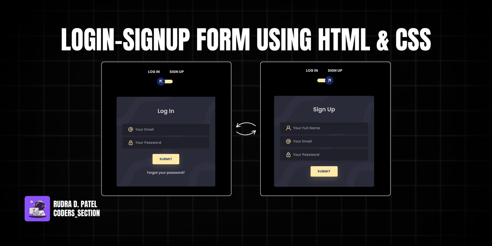
This project features a sleek and interactive Login-Signup Form, crafted purely with HTML and CSS, demonstrating a modern approach to user authentication interfaces. The form utilizes a captivating 3D flip effect, allowing users to seamlessly switch between login and signup panels with a simple toggle.
Designed with a dark theme, the form incorporates minimal gradients and shadows to add depth and character, while maintaining a clean and polished appearance. It is fully responsive, ensuring a consistent and engaging experience across all devices, from desktops to mobile phones. The core functionality relies on CSS pseudo-classes and transformations to create the dynamic flipping motion without the need for complex JavaScript, making it lightweight and performant.
The HTML structure for the Login-Signup Form is designed to create a 3D interactive experience. It includes a main container `div` that wraps the entire form. Inside, a checkbox acts as the toggle mechanism, controlling the visibility of the login and signup panels. These panels are represented by `div` elements with classes like `card-front` and `card-back`, which are then styled to create the flip effect. Each panel contains input fields for email, password, and name (for signup), along with submit buttons and links for forgotten passwords. The use of semantic HTML and appropriate classes lays the groundwork for the intricate CSS styling.
<!DOCTYPE html>
<html lang="en">
  <head>
    <title>Home</title>
    <meta charset="UTF-8" />
    <meta name="viewport" content="width=device-width" />
    <link rel='stylesheet' href='https://cdnjs.cloudflare.com/ajax/libs/twitter-bootstrap/4.5.0/css/bootstrap.min.css'>
    <link rel="stylesheet" href="style.css" />
    <link rel='stylesheet' href='https://unicons.iconscout.com/release/v2.1.9/css/unicons.css'>
  </head>
  <body>
    <div class="section">
        <div class="container">
            <div class="row full-height justify-content-center">
                <div class="col-12 text-center align-self-center py-5">
                    <div class="section pb-5 pt-5 pt-sm-2 text-center">
                        <h6 class="mb-0 pb-3"><span>Log In </span><span>Sign Up</span></h6>
                        <input class="checkbox" type="checkbox" id="reg-log" name="reg-log"/>
                        <label for="reg-log"></label>
                        <div class="card-3d-wrap mx-auto">
                            <div class="card-3d-wrapper">
                                <div class="card-front">
                                    <div class="center-wrap">
                                        <div class="section text-center">
                                            <h4 class="mb-4 pb-3">Log In</h4>
                                            <div class="form-group">
                                                <input type="email" name="logemail" class="form-style" placeholder="Your Email" id="logemail" autocomplete="off">
                                                <i class="input-icon uil uil-at"></i>
                                            </div>
                                            <div class="form-group mt-2">
                                                <input type="password" name="logpass" class="form-style" placeholder="Your Password" id="logpass" autocomplete="off">
                                                <i class="input-icon uil uil-lock-alt"></i>
                                            </div>
                                            <a href="#" class="btn mt-4">submit</a>
                                            <p class="mb-0 mt-4 text-center"><a href="#0" class="link">Forgot your password?</a></p>
                                        </div>
                                    </div>
                                </div>
                                <div class="card-back">
                                    <div class="center-wrap">
                                        <div class="section text-center">
                                            <h4 class="mb-4 pb-3">Sign Up</h4>
                                            <div class="form-group">
                                                <input type="text" name="logname" class="form-style" placeholder="Your Full Name" id="logname" autocomplete="off">
                                                <i class="input-icon uil uil-user"></i>
                                            </div>
                                            <div class="form-group mt-2">
                                                <input type="email" name="logemail" class="form-style" placeholder="Your Email" id="logemail" autocomplete="off">
                                                <i class="input-icon uil uil-at"></i>
                                            </div>
                                            <div class="form-group mt-2">
                                                <input type="password" name="logpass" class="form-style" placeholder="Your Password" id="logpass" autocomplete="off">
                                                <i class="input-icon uil uil-lock-alt"></i>
                                            </div>
                                            <a href="#" class="btn mt-4">submit</a>
                                        </div>
                                    </div>
                                </div>
                            </div>
                        </div>
                    </div>
                </div>
            </div>
        </div>
    </body>
</html>
The CSS is crucial for creating the distinctive 3D flip effect and overall visual appeal of the Login-Signup Form. It defines the `transform-style: preserve-3d` and `perspective` properties for the `card-3d-wrap` and `card-3d-wrapper` elements, enabling the rotation. Styles are applied to position and transform the `card-front` and `card-back` to achieve the flipping animation. Furthermore, the CSS customizes the appearance of input fields, buttons, and text, including a dark background, subtle shadows, and a vibrant accent color for interactive elements, ensuring a modern and consistent look.
@import url('https://fonts.googleapis.com/css?family=Poppins:400,500,600,700,800,900');

body{
	font-family: 'Poppins', sans-serif;
	font-weight: 300;
	font-size: 15px;
	line-height: 1.7;
	color: #c4c3ca;
	background-color: #000000;
	overflow-x: hidden;
}

a {
	cursor: pointer;
  transition: all 200ms linear;
}
a:hover {
	text-decoration: none;
}
.link {
  color: #c4c3ca;
}
.link:hover {
  color: #ffeba7;
}
p {
  font-weight: 500;
  font-size: 14px;
  line-height: 1.7;
}
h4 {
  font-weight: 600;
}
h6 span{
  padding: 0 20px;
  text-transform: uppercase;
  font-weight: 700;
}
.section{
  position: relative;
  width: 100%;
  display: block;
}
.full-height{
  min-height: 100vh;
}
[type="checkbox"]:checked,
[type="checkbox"]:not(:checked){
  position: absolute;
  left: -9999px;
}
.checkbox:checked + label,
.checkbox:not(:checked) + label{
  position: relative;
  display: block;
  text-align: center;
  width: 60px;
  height: 16px;
  border-radius: 8px;
  padding: 0;
  margin: 10px auto;
  cursor: pointer;
  background-color: #ffeba7;
}
.checkbox:checked + label:before,
.checkbox:not(:checked) + label:before{
  position: absolute;
  display: block;
  width: 36px;
  height: 36px;
  border-radius: 50%;
  color: #ffeba7;
  background-color: #102770;
  font-family: 'unicons';
  content: '\eb4f';
  z-index: 20;
  top: -10px;
  left: -10px;
  line-height: 36px;
  text-align: center;
  font-size: 24px;
  transition: all 0.5s ease;
}
.checkbox:checked + label:before {
  transform: translateX(44px) rotate(-270deg);
}


.card-3d-wrap {
  position: relative;
  width: 440px;
  max-width: 100%;
  height: 400px;
  -webkit-transform-style: preserve-3d;
  transform-style: preserve-3d;
  perspective: 800px;
  margin-top: 60px;
}
.card-3d-wrapper {
  width: 100%;
  height: 100%;
  position:absolute;
  top: 0;
  left: 0;
  -webkit-transform-style: preserve-3d;
  transform-style: preserve-3d;
  transition: all 600ms ease-out;
}
.card-front, .card-back {
  width: 100%;
  height: 100%;
  background-color: #2a2b38;
  background-image: url('https://s3-us-west-2.amazonaws.com/s.cdpn.io/1462889/pat.svg');
  background-position: bottom center;
  background-repeat: no-repeat;
  background-size: 300%;
  position: absolute;
  border-radius: 6px;
  left: 0;
  top: 0;
  -webkit-transform-style: preserve-3d;
  transform-style: preserve-3d;
  -webkit-backface-visibility: hidden;
  -moz-backface-visibility: hidden;
  -o-backface-visibility: hidden;
  backface-visibility: hidden;
}
.card-back {
  transform: rotateY(180deg);
}
.checkbox:checked ~ .card-3d-wrap .card-3d-wrapper {
  transform: rotateY(180deg);
}
.center-wrap{
  position: absolute;
  width: 100%;
  padding: 0 35px;
  top: 50%;
  left: 0;
  transform: translate3d(0, -50%, 35px) perspective(100px);
  z-index: 20;
  display: block;
}


.form-group{
  position: relative;
  display: block;
    margin: 0;
    padding: 0;
}
.form-style {
  padding: 13px 20px;
  padding-left: 55px;
  height: 48px;
  width: 100%;
  font-weight: 500;
  border-radius: 4px;
  font-size: 14px;
  line-height: 22px;
  letter-spacing: 0.5px;
  outline: none;
  color: #c4c3ca;
  background-color: #1f2029;
  border: none;
  -webkit-transition: all 200ms linear;
  transition: all 200ms linear;
  box-shadow: 0 4px 8px 0 rgba(21,21,21,.2);
}
.form-style:focus,
.form-style:active {
  border: none;
  outline: none;
  box-shadow: 0 4px 8px 0 rgba(21,21,21,.2);
}
.input-icon {
  position: absolute;
  top: 0;
  left: 18px;
  height: 48px;
  font-size: 24px;
  line-height: 48px;
  text-align: left;
  color: #ffeba7;
  -webkit-transition: all 200ms linear;
    transition: all 200ms linear;
}

.form-group input:-ms-input-placeholder  {
  color: #c4c3ca;
  opacity: 0.7;
  -webkit-transition: all 200ms linear;
    transition: all 200ms linear;
}
.form-group input::-moz-placeholder  {
  color: #c4c3ca;
  opacity: 0.7;
  -webkit-transition: all 200ms linear;
    transition: all 200ms linear;
}
.form-group input:-moz-placeholder  {
  color: #c4c3ca;
  opacity: 0.7;
  -webkit-transition: all 200ms linear;
    transition: all 200ms linear;
}
.form-group input::-webkit-input-placeholder  {
  color: #c4c3ca;
  opacity: 0.7;
  -webkit-transition: all 200ms linear;
    transition: all 200ms linear;
}
.form-group input:focus:-ms-input-placeholder  {
  opacity: 0;
  -webkit-transition: all 200ms linear;
    transition: all 200ms linear;
}
.form-group input:focus::-moz-placeholder  {
  opacity: 0;
  -webkit-transition: all 200ms linear;
    transition: all 200ms linear;
}
.form-group input:focus:-moz-placeholder  {
  opacity: 0;
  -webkit-transition: all 200ms linear;
    transition: all 200ms linear;
}
.form-group input:focus::-webkit-input-placeholder  {
  opacity: 0;
  -webkit-transition: all 200ms linear;
    transition: all 200ms linear;
}

.btn{
  border-radius: 4px;
  height: 44px;
  font-size: 13px;
  font-weight: 600;
  text-transform: uppercase;
  -webkit-transition : all 200ms linear;
  transition: all 200ms linear;
  padding: 0 30px;
  letter-spacing: 1px;
  display: -webkit-inline-flex;
  display: -ms-inline-flexbox;
  display: inline-flex;
  -webkit-align-items: center;
  -moz-align-items: center;
  -ms-align-items: center;
  align-items: center;
  -webkit-justify-content: center;
  -moz-justify-content: center;
  -ms-justify-content: center;
  justify-content: center;
  -ms-flex-pack: center;
  text-align: center;
  border: none;
  background-color: #ffeba7;
  color: #102770;
  box-shadow: 0 8px 24px 0 rgba(255,235,167,.2);
}
.btn:active,
.btn:focus{
  background-color: #102770;
  color: #ffeba7;
  box-shadow: 0 8px 24px 0 rgba(16,39,112,.2);
}
.btn:hover{
  background-color: #102770;
  color: #ffeba7;
  box-shadow: 0 8px 24px 0 rgba(16,39,112,.2);
}
The provided HTML and CSS primarily handle the interactive 3D flip effect of the Login-Signup Form. While this project is largely driven by CSS, JavaScript can be integrated for enhanced functionality such as client-side form validation (e.g., checking email format, password strength) or submitting form data asynchronously to a backend. The existing JavaScript in this template is for general page features like mobile menu toggling and scroll-based animations, which can be adapted or expanded upon for more specific form interactions if needed.
/*===== MENU SHOW =====*/
const showMenu = (toggleId, navId) =>{
    const toggle = document.getElementById(toggleId),
    nav = document.getElementById(navId)

    if(toggle && nav){
        toggle.addEventListener('click', ()=>{
            nav.classList.toggle('show')
        })
    }
}
showMenu('nav-toggle','nav-menu')

/*==================== REMOVE MENU MOBILE ====================*/
const navLink = document.querySelectorAll('.nav__link')

function linkAction(){
    const navMenu = document.getElementById('nav-menu')
    // When we click on each nav__link, we remove the show-menu class
    navMenu.classList.remove('show')
}
navLink.forEach(n => n.addEventListener('click', linkAction))

/*==================== SCROLL SECTIONS ACTIVE LINK ====================*/
const sections = document.querySelectorAll('section[id]')

function scrollActive(){
    const scrollY = window.pageYOffset

    sections.forEach(current =>{
        const sectionHeight = current.offsetHeight
        const sectionTop = current.offsetTop - 50;
        sectionId = current.getAttribute('id')

        if(scrollY > sectionTop && scrollY <= sectionTop + sectionHeight){
            document.querySelector('.nav__menu a[href*=' + sectionId + ']').classList.add('active')
        }else{
            document.querySelector('.nav__menu a[href*=' + sectionId + ']').classList.remove('active')
        }
    })
}
window.addEventListener('scroll', scrollActive)

/*===== SCROLL REVEAL ANIMATION =====*/
const sr = ScrollReveal({
    origin: 'top',
    distance: '60px',
    duration: 2000,
    delay: 200,
//     reset: true
});

sr.reveal('.home__data, .about__img, .skills__subtitle, .skills__text',{});
sr.reveal('.home__img, .about__subtitle, .about__text, .skills__img',{delay: 400});
sr.reveal('.home__social-icon',{ interval: 200});
sr.reveal('.skills__data, .work__img, .contact__input',{interval: 200});
Watch a live demonstration of the Login-Signup Form below.
This Login-Signup Form project provides a visually engaging and interactive solution for user authentication. Its pure HTML and CSS implementation for the 3D flip effect makes it lightweight and efficient, while the modern dark theme ensures a polished user interface. The responsive design guarantees a seamless experience across various devices.
You can easily customize this component by:
For complex form interactions or data handling, consider progressively enhancing this design with JavaScript frameworks. Ensure strong password policies and secure data transmission when implementing real-world authentication systems.
Click the button below to download the full source code. Download will be ready in 10 seconds.
Receive coding tips and resources updates. No spam.
We respect your privacy. Unsubscribe at any time.