Feature Coming Soon!
The newsletter functionality is under development.
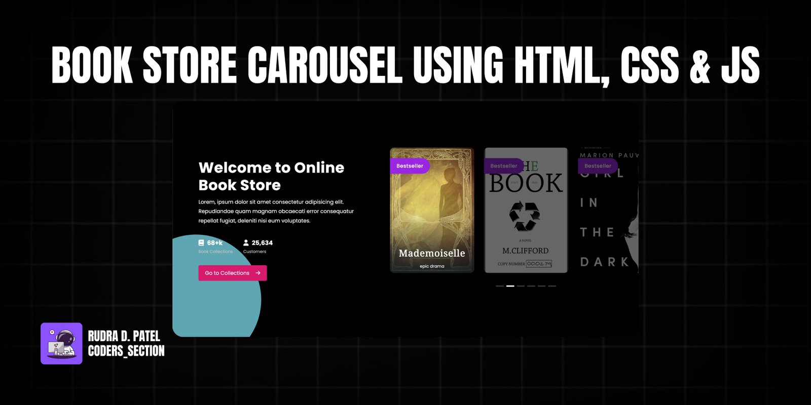
This project features a captivating Book Store Carousel, built with HTML, CSS, and JavaScript, designed to showcase a collection of books in an interactive and visually appealing manner. The carousel utilizes the Swiper.js library to create a smooth 3D coverflow effect, providing an immersive browsing experience for users.
The design incorporates a dark theme with subtle gradients and shadows, enhancing the depth and modern aesthetic of the interface. Key elements include a welcome section with a brief description and statistics, a dynamic carousel displaying book covers, and navigation controls. The carousel is fully responsive, ensuring optimal viewing and interaction across various devices, from desktops to mobile phones.
The HTML structure for the Book Store Carousel is composed of a main container that holds two primary sections: a content area and the Swiper carousel. The content area includes a welcome message, a brief paragraph, and a counter list displaying book collection statistics. The carousel section utilizes `swiper-container`, `swiper`, and `swiper-wrapper` classes, with individual `swiper-slide` elements representing each book. Each slide contains a `span` for a "bestseller" tag and a `div` for `slide-content` with the book's title and description. A `swiper-pagination` `div` is included for navigation dots, and a `circle` `div` adds a decorative background element. This structure facilitates the dynamic rendering and smooth transitions provided by Swiper.js.
<!DOCTYPE html>
<html lang="en" >
<head>
  <meta charset="UTF-8">
  <title>  Just another carousel - Coders_setion</title>
  <link rel='stylesheet' href='https://cdn.jsdelivr.net/npm/swiper@8/swiper-bundle.min.css'>
<link rel='stylesheet' href='https://cdnjs.cloudflare.com/ajax/libs/font-awesome/6.4.2/css/all.min.css'><link rel="stylesheet" href="./style.css">

</head>
<body>
<!-- partial:index.partial.html -->
<main>
  <div class="content">
    <h2>Welcome to Online Book Store</h2>
    <p> Lorem, ipsum dolor sit amet consectetur adipisicing elit. Repudiandae quam magnam obcaecati error consequatur repellat fugiat, deleniti nisi eum voluptates.</p>
    <ul class="counter">
      <li>
        <h3><i class="fa-solid fa-book"></i>68+k</h3>
        <span>book collections</span>
      </li>
      <li>
        <h3><i class="fa-solid fa-user"></i>25,634</h3>
        <span>customers</span>
      </li>
    </ul>
    <button class="btn">Go to Collections <i class="fa-solid fa-arrow-right"></i></button>
  </div>

  <div class="swiper-container">
    <div class="swiper">
      <div class="swiper-wrapper">
        <div class="swiper-slide swiper-slide--one">

          <span>bestseller</span>
          <div class="slide-content">
            <h3>The Raven</h3>

          </div>
        </div>
        <div class="swiper-slide swiper-slide--two">
          <span>bestseller</span>
          <div class="slide-content">
            <h3>Mademoiselle</h3>
            <p>epic drama</p>

          </div>

        </div>
        <div class="swiper-slide swiper-slide--three">
          <span>bestseller</span>

        </div>
        <div class="swiper-slide swiper-slide--four">
          <span>bestseller</span>

        </div>
        <div class="swiper-slide swiper-slide--five">
          <span>bestseller</span>

        </div>
        <div class="swiper-slide swiper-slide--six">
          <span>bestseller</span>
          <div class="slide-content">
            <h3>Woman in the dark</h3>
          </div>

        </div>

      </div>

    </div>

    <div class="swiper-pagination"></div>
  </div>
  <div class="circle"></div>
</main>
<!-- partial -->
  <script src='https://cdnjs.cloudflare.com/ajax/libs/Swiper/8.4.5/swiper-bundle.min.js'></script><script  src="./script.js"></script>

</body>
</html>
The CSS for the Book Store Carousel is meticulously crafted to create its distinctive visual appeal and interactive behavior. It defines the overall layout of the main container, including the content area and the carousel itself, using flexbox for responsive arrangement. Key styles are applied to the Swiper slides to achieve the 3D coverflow effect, including `opacity` and `transform` transitions for a smooth visual experience. The styling also covers the "bestseller" tags, book titles, and pagination bullets, ensuring a consistent and aesthetically pleasing design. Custom fonts and background images are used to enhance the thematic presentation of a book store, while media queries ensure adaptability across various screen sizes.
@import url("https://fonts.googleapis.com/css2?family=Poppins:wght@400;500;700&display=swap");
@import url("https://fonts.googleapis.com/css2?family=Courgette&family=Noto+Serif+Vithkuqi:wght@500&display=swap");
@import url("https://fonts.googleapis.com/css2?family=Chonburi&display=swap");
* {
  margin: 0;
  padding: 0;
  box-sizing: border-box;
  font-family: "Poppins", sans-serif;
}

body {
  overflow-x: hidden;
  position: relative;
}

ul {
  margin: 0;
  padding: 0;
  list-style: none;
}

main {
  position: relative;
  min-height: 100vh;
  column-gap: 3rem;
  padding-block: min(20vh, 3rem);
  padding-inline: 2.3em;
  align-items: center;
  justify-content: center;
  background: #000000;
  overflow: hidden;
}
@media screen and (min-width: 960px) {
  main {
    display: flex;
    padding-inline: 0;
  }
}
main .content {
  width: 100%;
  color: #fff;
  position: relative;
  z-index: 2;
  margin-bottom: 3em;
}
@media screen and (min-width: 960px) {
  main .content {
    width: 40%;
    padding-left: 5em;
    margin-bottom: 0;
  }
}
main h2 {
  letter-spacing: 0.8px;
  font-weight: 700;
  font-size: 2.8rem;
  line-height: 1.2;
}
main p {
  font-size: 1rem;
  line-height: 1.8;
  margin-inline: auto;
  margin-top: 10px;
}
main .counter {
  font-weight: 400;
  display: flex;
  align-items: center;
  margin: 2.5em 0 2em 0;
  gap: 2em;
}
main .counter i {
  margin-right: 10px;
}
main .counter span {
  display: block;
  text-transform: capitalize;
  font-size: 0.8rem;
  color: #c1c1c1;
  margin-top: 3px;
}
main .btn {
  background-color: #d51a6d;
  border: none;
  color: white;
  padding: 12px 20px;
  font-size: 16px;
  cursor: pointer;
  display: inline-block;
  border-radius: 4px;
  transition: 0.3s ease-in;
}
main .btn i {
  margin-left: 15px;
}
main .btn:hover {
  background-color: #ae0a53;
}

.swiper-container {
  position: relative;
  overflow: hidden;
  width: 100%;
  right: 0px;
  margin: 0 auto;
}
@media screen and (min-width: 960px) {
  .swiper-container {
    width: 60%;
    right: -60px;
  }
}

.swiper {
  position: relative;
  width: 100%;
  z-index: 2;
}

.swiper-slide {
  width: 10rem;
  height: 24rem;
  display: flex;
  flex-direction: column;
  align-items: self-start;
  position: relative;
  border-radius: 12px;
  box-shadow: -1px 5px 15px #0000001f;
  text-align: center;
  opacity: 0.4;
  transition: opacity 0.4s ease-in;
}
.swiper-slide span {
  display: inline-block;
  background: #9926e1;
  border-radius: 0 50px 50px 0;
  text-transform: capitalize;
  padding: 12px 20px;
  letter-spacing: 0.5px;
  font-weight: 500;
  position: absolute;
  top: 2em;
  left: 0;
  color: #fff;
}
.swiper-slide h3 {
  color: #fff;
  font-size: 1.3rem;
  line-height: 1.4;
  margin-bottom: 0.625rem;
  letter-spacing: 0.8px;
  position: relative;
  word-wrap: break-word;
}
@media screen and (min-width: 800px) {
  .swiper-slide h3 {
    font-size: 1.8rem;
  }
}
.swiper-slide p {
  color: #fff;
  line-height: 1.6;
  font-size: 0.8rem;
}
.swiper-slide .slide-content {
  position: absolute;
  bottom: 0;
  left: 50%;
  transform: translate(-50%, -10px);
  width: 90%;
}
.swiper-slide--one {
  background: #1a81ae;
  background: linear-gradient(to bottom, #2c536400, #203a4303, #0f2027cc), url("https://cdn.pixabay.com/photo/2023/03/12/20/58/ai-generated-7847847_1280.jpg") no-repeat 50% 50%/cover;
}
.swiper-slide--one h3 {
  font-family: "Courgette", cursive;
  font-weight: 300;
}
.swiper-slide--two {
  background: linear-gradient(to bottom, #2c536400, #203a4303, #0f2027cc), url("https://cdn.pixabay.com/photo/2022/06/26/21/12/cover-7286312_1280.jpg") no-repeat 50% 50%/cover;
}
.swiper-slide--two h3 {
  font-family: "Noto Serif Vithkuqi", serif;
  font-weight: 300;
}
.swiper-slide--three {
  background: url("https://upload.wikimedia.org/wikipedia/commons/9/92/THE_BOOK_cover_image.png") no-repeat 50% 50%/cover;
}
.swiper-slide--four {
  background: url("https://covers.audiobooks.com/images/covers/full/9781511358378.jpg") no-repeat 50% 50%/cover;
}
.swiper-slide--five {
  background: url("https://cdn.pixabay.com/photo/2015/02/20/16/59/deer-643340_1280.jpg") no-repeat 50% 50%/cover;
}
.swiper-slide--six {
  background: linear-gradient(to bottom, #2c536400, #203a4303, #0f2027cc), url("https://cdn.pixabay.com/photo/2022/11/04/23/15/woman-7570834_1280.jpg") no-repeat 50% 50%/cover;
}
.swiper-slide--six h3 {
  font-family: "Chonburi", cursive;
  font-weight: 400;
}

.swiper-slide-active {
  display: grid;
  opacity: 1;
}

.swiper-pagination {
  position: relative;
  bottom: -0.313rem;
  text-align: center;
  margin-top: 35px;
  width: auto;
}
.swiper-pagination-bullet {
  border-radius: 0;
  width: 1.5rem;
  height: 0.25rem;
  background: #fff;
}
.swiper-pagination-bullet-active {
  background: #fff;
}

.circle {
  position: absolute;
  bottom: -5em;
  left: -8em;
  width: clamp(150px, 40vw, 400px);
  height: clamp(150px, 40vw, 400px);
  background: rgb(136, 237, 255);
  border-radius: 50%;
  z-index: 1;
  opacity: 0.7;
}
The JavaScript for the Book Store Carousel primarily utilizes the Swiper.js library to initialize and configure the carousel functionality. The script creates a new Swiper instance, applying various parameters to achieve the desired "coverflow" effect, including `grabCursor`, `spaceBetween`, `centeredSlides`, and `coverflowEffect` properties. It also enables `loop` functionality for continuous scrolling, sets up `pagination` for navigation dots, and integrates `keyboard` and `mousewheel` controls for enhanced user interaction. Breakpoints are defined to ensure the carousel adapts its `slidesPerView` property based on screen width, guaranteeing responsiveness across different devices.
var swiper = new Swiper(".swiper", {
  effect: "coverflow",
  grabCursor: true,
  spaceBetween: 30,
  centeredSlides: false,
  coverflowEffect: {
    rotate: 0,
    stretch: 0,
    depth: 0,
    modifier: 1,
    slideShadows: false
  },
  loop: true,
  pagination: {
    el: ".swiper-pagination",
    clickable: true
  },
  keyboard: {
    enabled: true
  },
  mousewheel: {
    thresholdDelta: 70
  },
  breakpoints: {
    460: {
      slidesPerView: 3
    },
    768: {
      slidesPerView: 3
    },
    1024: {
      slidesPerView: 3
    },
    1600: {
      slidesPerView: 3.6
    }
  }
});
Watch a live demonstration of the Book Store Carousel below.
This Book Store Carousel project offers a visually stunning and highly interactive way to display book collections. Leveraging the power of Swiper.js, it provides a smooth 3D coverflow effect that significantly enhances the user browsing experience. The responsive design ensures that the carousel looks and functions flawlessly across all devices, making it a versatile component for any online book store or digital library.
You can easily customize this component by:
For a richer user experience, consider implementing lazy loading for book cover images within the carousel to optimize performance, especially when dealing with a large collection of books. Also, explore adding accessibility features to ensure the carousel is usable by a wider audience.
Click the button below to download the full source code. Download will be ready in 10 seconds.
Receive coding tips and resources updates. No spam.
We respect your privacy. Unsubscribe at any time.