Feature Coming Soon!
The newsletter functionality is under development.
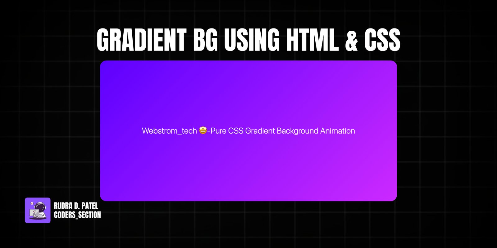
This project demonstrates a captivating animated gradient background created purely with HTML and CSS. It showcases how to use CSS gradients and keyframe animations to create a fluid, mesmerizing background that seamlessly transitions between multiple colors. This effect can significantly enhance the visual appeal of any webpage, providing a modern and dynamic aesthetic without relying on JavaScript.
Key features include a multi-color linear gradient that shifts its position over time, creating a smooth and continuous animation. The animation is set to loop infinitely, providing a constant, engaging visual experience. The HTML structure is minimal, allowing the CSS to do all the heavy lifting in terms of visual effects. This project is ideal for web developers looking to add a touch of modern design and visual dynamism to their websites with efficient, pure CSS techniques.
The HTML structure for the Animated Gradient Background is exceptionally simple, focusing on minimal markup to allow CSS to handle the visual effects. It consists of a `body` element that will receive the animated gradient as its background. Inside the `body`, there's a `div` with a few Bootstrap classes (`d-flex`, `flex-column`, `justify-content-center`, `w-100`, `h-100`) to center content vertically and horizontally, and an `h1` element to display a title. This minimal HTML ensures that the gradient animation is the primary visual focus, demonstrating how powerful CSS can be with very little structural code.
<!DOCTYPE html>
<html lang="en" >
<head>
  <meta charset="UTF-8">
  <title>Webstrom_tech - Pure CSS Gradient Background Animation</title>
  <meta name="viewport" content="width=device-width, initial-scale=1"><link rel='stylesheet' href='https://cdnjs.cloudflare.com/ajax/libs/twitter-bootstrap/5.0.2/css/bootstrap.min.css'>
<link rel='stylesheet' href='https://cdnjs.cloudflare.com/ajax/libs/font-awesome/5.15.4/css/all.min.css'><link rel="stylesheet" href="./style.css">

</head>
<body>
<!-- partial:index.partial.html -->
<div class="d-flex flex-column justify-content-center w-100 h-100">

	<div class="d-flex flex-column justify-content-center align-items-center">
		<h1 class="fw-light text-white m-0">Webstrom_tech 🤩-Pure CSS Gradient Background Animation</h1>
		</a>
	</div>
</div>
</div>
<!-- partial -->
  <script  src="./script.js"></script>

</body>
</html>
The CSS is the core of this animated gradient background project. The `body` element is given a `linear-gradient` background with multiple color stops. The `background-size` is set to `400% 400%` to ensure a larger background than the viewport, which is essential for the animation. The `@keyframes gradient` rule defines the animation sequence. It transitions the `background-position` from `0% 50%` to `100% 50%` and back to `0% 50%`, creating a smooth horizontal movement of the gradient. The animation is applied to the `body` with a duration of `15s`, an `ease` timing function, and set to loop `infinite`ly. This combination of gradient and keyframe animation creates a captivating and continuously flowing background effect.
body {
	background: linear-gradient(-45deg, #fa94ff, #f237ff, #5900ff, #3B275F);
	background-size: 400% 400%;
	-webkit-animation: gradient 15s ease infinite;
	        animation: gradient 15s ease infinite;
	height: 100vh;
}

@-webkit-keyframes gradient {
	0% {
		background-position: 0% 50%;
	}
	50% {
		background-position: 100% 50%;
	}
	100% {
		background-position: 0% 50%;
	}
}

@keyframes gradient {
	0% {
		background-position: 0% 50%;
	}
	50% {
		background-position: 100% 50%;
	}
	100% {
		background-position: 0% 50%;
	}
}
Watch a live demonstration of the Gradient Background Animation below.
This Gradient Background Animation project showcases a powerful and efficient way to add dynamic visual interest to any webpage using only HTML and CSS. The seamless color transitions and continuous movement create an engaging user experience without impacting performance, making it a perfect choice for landing pages, portfolios, or creative websites.
You can easily customize this component by:
For optimal performance, use hardware-accelerated CSS properties like `transform` and `opacity` for animations whenever possible. While `background-position` is used here, for more complex animations, consider animating `transform` properties on pseudo-elements or child elements to offload work to the GPU.
Click the button below to download the full source code. Download will be ready in 10 seconds.
Receive coding tips and resources updates. No spam.
We respect your privacy. Unsubscribe at any time.