Feature Coming Soon!
The newsletter functionality is under development.
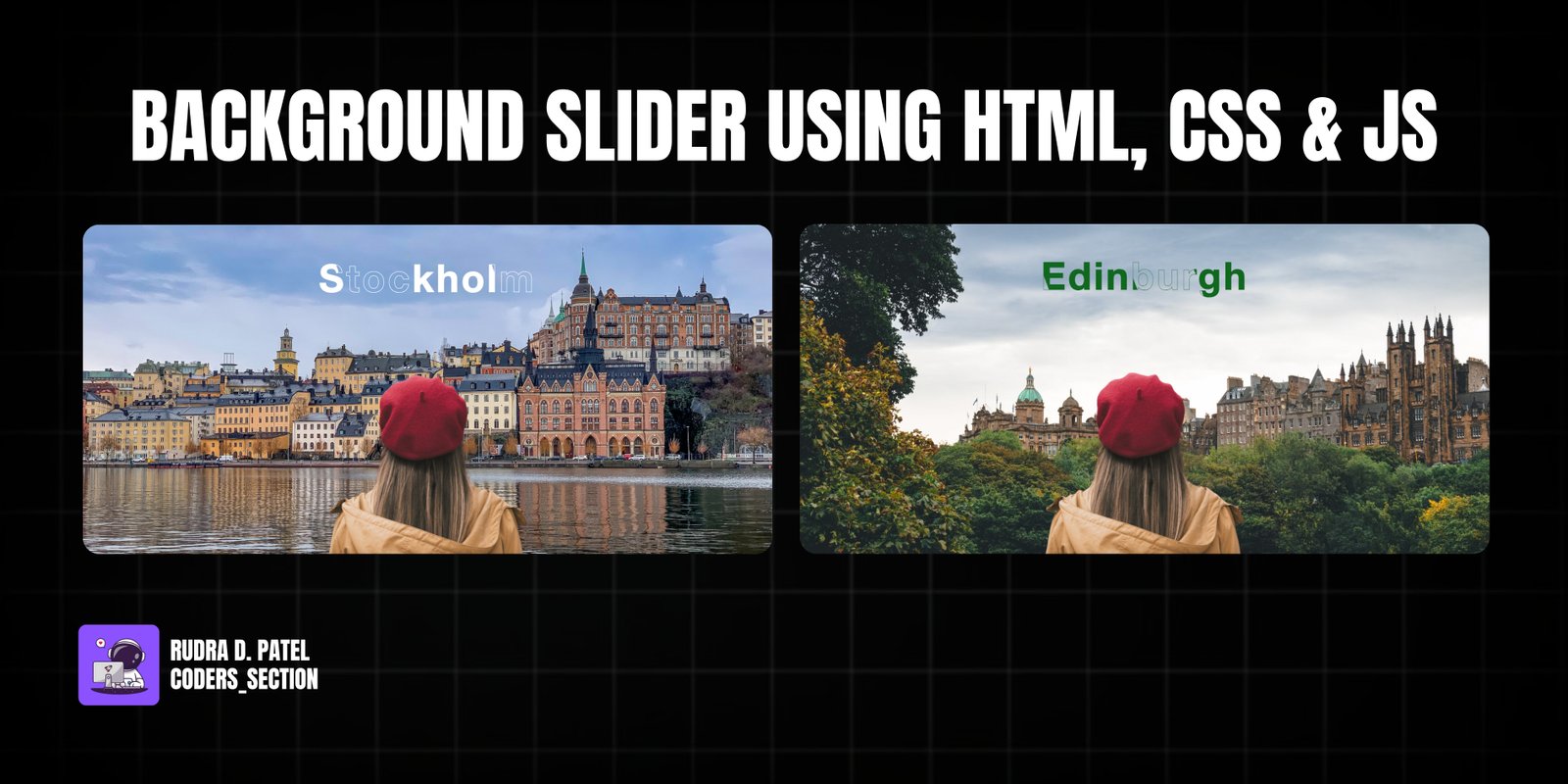
This project showcases a dynamic and responsive Background Slider, implemented using HTML, CSS, and the Swiper.js library. It creates an immersive full-screen image slider with animated text overlays, perfect for hero sections or captivating visual presentations. The slider seamlessly transitions between different background images, each paired with a unique title that features a text-stroke and animated background clip effect.
Key features include smooth slide transitions, a prominent main image element that appears to be part of the scene, and visually striking animated text. The Swiper.js library handles the core slider functionality, including mousewheel navigation and loop effects. The CSS provides the styling for the full-screen layout, image fitting, and the intricate text animations, making the titles appear as if they are revealing themselves with a gradient or texture. This project is an excellent demonstration of combining a powerful JavaScript library with creative CSS for a high-impact visual experience.
The HTML structure for the Background Slider Swiper is built around a main `section` element that contains a `hero` image and the Swiper container. The `swiper` `div` holds the `swiper-wrapper`, which in turn contains multiple `swiper-slide` `div`s. Each `swiper-slide` represents a single slide in the slider and includes an `h1` element for the title and an `img` element for the background image. The `hero` image is positioned separately to create a layered effect. This structure is typical for Swiper.js implementations, allowing for easy management of slides and their content.
<!DOCTYPE html>
<html lang="en" >
<head>
  <meta charset="UTF-8">
  <title> Background Slider | Swiper - Webstrom_Tech </title>
  <link rel='stylesheet' href='https://cdn.jsdelivr.net/npm/swiper@10/swiper-bundle.min.css'><link rel="stylesheet" href="style.css">

</head>
<body>
<!-- partial:index.partial.html -->
<body>
    <section>
      <img class="hero" src="https://github.com/ecemgo/mini-samples-great-tricks/assets/13468728/c62efd51-f844-4335-ba29-70ea35521dd8" alt="" />
      <div class="swiper">
        <div class="swiper-wrapper">
          <div class="swiper-slide">
            <h1 class="title one">Edinburgh</h1>
            <img src="https://github.com/ecemgo/mini-samples-great-tricks/assets/13468728/1bdebd02-d675-4469-be36-dc248448980d" alt="" />
          </div>

          <div class="swiper-slide">
            <h1 class="title two">Stockholm</h1>
            <img src="https://github.com/ecemgo/mini-samples-great-tricks/assets/13468728/62411bbf-dde9-4654-9298-1fe3e7da2d64" alt="" />
          </div>

          <div class="swiper-slide">
            <h1 class="title three">Paris</h1>
            <img src="https://github.com/ecemgo/mini-samples-great-tricks/assets/13468728/b49c729f-65b0-4a2a-baf7-1d9f180df0a6" alt="" />
          </div>

          <div class="swiper-slide">
            <h1 class="title four">Brugge</h1>
            <img src="https://github.com/ecemgo/mini-samples-great-tricks/assets/13468728/c9a61071-c74d-4e8b-966a-6948cdbd9665" alt="" />
          </div>

          <div class="swiper-slide">
            <h1 class="title five">Bavaria</h1>
            <img src="https://github.com/ecemgo/mini-samples-great-tricks/assets/13468728/25ab6cb7-9251-4aa5-9993-32ebd8542616" alt="" />
          </div>

          <div class="swiper-slide">
            <h1 class="title six">Copenhagen</h1>
            <img src="https://github.com/ecemgo/mini-samples-great-tricks/assets/13468728/365656bc-24bc-4d95-92da-7f34faa616cf" alt="" />
          </div>
        </div>
      </div>
    </section>
  </body>
<!-- partial -->
  <script src='https://cdn.jsdelivr.net/npm/swiper@10/swiper-bundle.min.js'></script><script  src="script.js"></script>

</body>
</html>
The CSS for the Background Slider Swiper is crucial for its full-screen presentation and animated text effects. It sets the `html` and `body` to full height and width, and positions the `section` to cover the entire viewport. The `.hero` image is absolutely positioned at the bottom, creating a layered effect with the slider. The `.swiper` and `.swiper-slide` classes ensure the slider takes up 100% of the available space and that images are properly covered. The `.title` class defines the prominent text overlay, including its positioning, font size, and the `animated-text` keyframe animation. This animation moves the `background-position` of the text, creating a dynamic revealing effect. Different titles (`.one`, `.two`, etc.) are styled with distinct `text-stroke` and `background-clip` properties, using image URLs to fill the text, adding to the visual richness of the slider.
* {
  box-sizing: border-box;
  margin: 0;
  padding: 0;
}

html,
body {
  position: relative;
  height: 100%;
  font-family: Helvetica Neue, Helvetica, Arial, sans-serif;
}

section {
  position: relative;
  display: flex;
  justify-content: center;
  width: 100%;
  height: 100vh;
}

.hero {
  position: absolute;
  bottom: 0;
  z-index: 5;
  max-width: 550px;
  filter: contrast(90%);
  pointer-events: none;
}

.swiper {
  width: 100%;
  height: 100%;
}

.swiper-slide {
  position: relative;
  text-align: center;
  font-size: 18px;
  background: #fff;
  display: flex;
  justify-content: center;
  align-items: center;
}

.title {
  position: absolute;
  top: 18%;
  left: 50%;
  -ms-transform: translate(-50%, -50%);
  transform: translate(-50%, -50%);
  font-size: 5rem;
  letter-spacing: 0.3rem;
  z-index: 5;
  color: transparent;
  background-position: 0 0;
  animation: animated-text 20s linear infinite;
}

@keyframes animated-text {
  100% {
    background-position: 200% 0;
  }
}

.one,
.five {
  -webkit-text-stroke: 1px rgba(16, 104, 31, 0.8);
  background: url(https://github.com/ecemgo/mini-samples-great-tricks/assets/13468728/e9d06cb6-2844-49ed-9bde-23d3364b9fa4);
  background-clip: text;
  -webkit-background-clip: text;
}

.two,
.three,
.four,
.six {
  -webkit-text-stroke: 1px #fff;
  background: url(https://github.com/ecemgo/mini-samples-great-tricks/assets/13468728/ba4edde6-822d-437a-88c2-f54392d7a56f);
  background-clip: text;
  -webkit-background-clip: text;
}

.swiper-slide img {
  width: 100%;
  height: 100%;
  object-fit: cover;
  z-index: 1;
}
The JavaScript for the Background Slider is minimal, as the core functionality is provided by the Swiper.js library. The script initializes a new Swiper instance, targeting the `swiper` class. It configures the slider with several options: `grabCursor: true` for a visual indication of draggable slides, `speed: 500` for the transition duration, `effect: "slide"` for the slide transition type, and `loop: true` for continuous looping. Additionally, `mousewheel` settings are included to enable mouse wheel navigation with `invert: false` and `sensitivity: 1`. Finally, `swiper.enable()` ensures the slider is active and responsive. This setup provides a smooth and interactive sliding experience with minimal custom JavaScript.
var swiper = new Swiper(".swiper", {
  grabCursor: true,
  speed: 500,
  effect: "slide",
  loop: true,
  mousewheel: {
    invert: false,
    sensitivity: 1,
  },
});

swiper.enable();
Watch a live demonstration of the Background Slider Swiper below.
This Background Slider Swiper project offers a visually stunning and highly interactive solution for presenting full-screen content. By leveraging the powerful Swiper.js library and creative CSS techniques, it delivers a smooth, engaging user experience with dynamic image transitions and animated text effects. It's an ideal component for hero sections, portfolios, or any application requiring a high-impact visual introduction.
You can easily customize this component by:
For optimal performance with full-screen sliders, ensure your images are optimized for web use to minimize load times. Consider lazy loading images if you have many slides to further improve initial page load performance.
Click the button below to download the full source code. Download will be ready in 10 seconds.
Receive coding tips and resources updates. No spam.
We respect your privacy. Unsubscribe at any time.