Feature Coming Soon!
The newsletter functionality is under development.
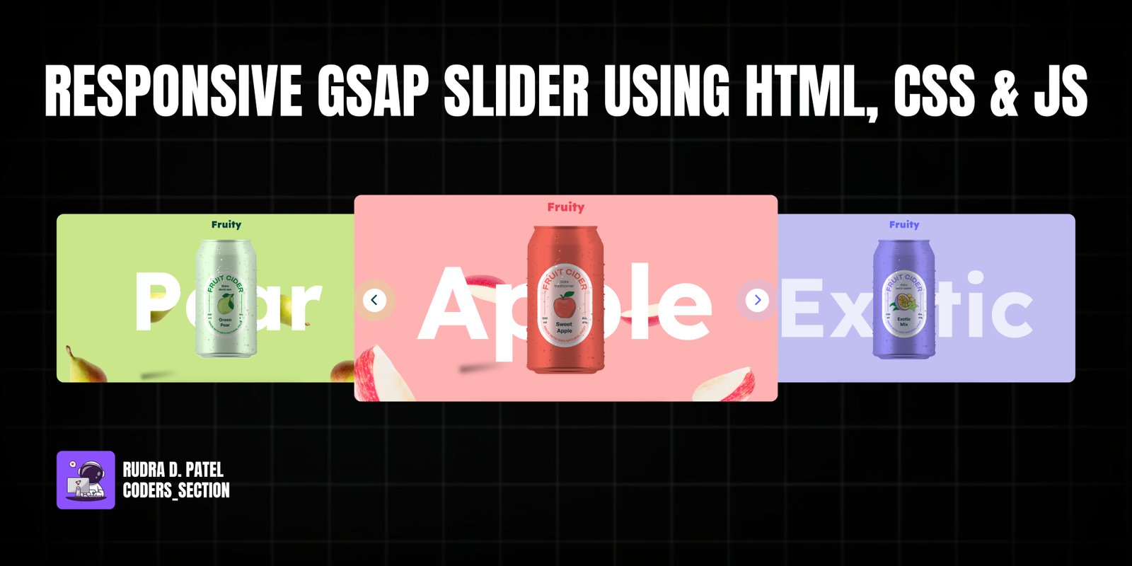
This project features a Responsive GSAP Slider with a captivating button wave effect, built using HTML, CSS, and JavaScript with the GSAP animation library. It showcases a dynamic full-screen slider designed to present different "fruit" sections (Pear, Apple, Exotic), each with its own background color, animated text, and unique fruit imagery. The slider includes navigation buttons that trigger smooth transitions between sections, complete with a visually appealing wave animation on the buttons themselves.
Key functionalities include seamless horizontal sliding between sections, GSAP-powered animations for text and images, and responsive design to ensure optimal viewing across various devices. The "cane image" with "cane labels" provides a fixed, layered element that adds depth to the overall design. The buttons feature a custom CSS `@keyframes` animation that creates a pulsating wave effect, enhancing user interaction. This project is an excellent example of combining modern web technologies for a rich, interactive, and visually engaging user interface.
The HTML structure for the Responsive GSAP Slider is organized to support the full-screen sliding sections and fixed elements. It includes a `header` with a `logo`, and a `main` section containing navigation `button`s (`prevButton`, `nextButton`). Fixed elements like the `h1` text and `cane-image` are placed directly within `main`. The core of the slider is the `section-container-main` which wraps `section-container`, holding multiple `section` elements (`section1`, `section2`, `section3`). Each `section` contains `fruit-images` with individual `img` elements. This modular structure allows for distinct styling and animation of each part of the slider.
<!DOCTYPE html>
<html lang="en" >
<head>
  <meta charset="UTF-8">
  <title> Responsive GSAP Slider with Button Wave Effect - Webstrom_Tech </title>
  <link rel='stylesheet' href='https://cdnjs.cloudflare.com/ajax/libs/font-awesome/6.5.1/css/all.min.css'><link rel="stylesheet" href="./style.css">

</head>
<body>
<!-- partial:index.partial.html -->
<body>
  <!-- header -->
  <header>
    <h2 class="logo">
      Fruity
    </h2>
  </header>
  <!-- main -->
  <main>
    <!-- Buttons -->
    <div>
      <button id="prevButton" class="wave"><i class="fa-solid fa-chevron-left"></i></button>
      <button id="nextButton" class="wave"><i class="fa-solid fa-chevron-right"></i></button>
    </div>
    <!-- Fixed Sections -->
    <div class="text">
      <h1 class="h1">Pear</h1>
      <div class="cane-image ">
        <img src="https://www.yudiz.com/codepen/fruity/cane.svg" alt="">
        <img src="https://www.yudiz.com/codepen/fruity/Labels.jpg" alt="" class="cane-labels">
      </div>
    </div>
    <!-- Fixed Sections Ends-->
    <!-- Fruits Images Section -->
    <div class="section-container-main">
      <div class="section-container">
        <section class="section" id="section1">
          <div class="fruit-images">
            <div class="image-one fruit-image"><img src="https://www.yudiz.com/codepen/fruity/pear-one.png" alt="pear-image"></div>
            <div class="image-two fruit-image"><img src="https://www.yudiz.com/codepen/fruity/pear-two.png" alt="pear-image"></div>
            <div class="image-three fruit-image"><img src="https://www.yudiz.com/codepen/fruity/pear-three.png" alt="pear-image"></div>
            <div class="image-four fruit-image"><img src="https://www.yudiz.com/codepen/fruity/pear-four.png" alt="pear-image"></div>
          </div>
        </section>
        <section class="section" id="section2">
          <div class="fruit-images">
            <div class="image-one fruit-image"><img src="https://www.yudiz.com/codepen/fruity/apple-one.png" alt="apple-image"></div>
            <div class="image-two fruit-image"><img src="https://www.yudiz.com/codepen/fruity/apple-two.png" alt="apple-image"></div>
            <div class="image-three fruit-image"><img src="https://www.yudiz.com/codepen/fruity/apple-three.png" alt="apple-image"></div>
            <div class="image-four fruit-image"><img src="https://www.yudiz.com/codepen/fruity/apple-four.png" alt="apple-image"></div>
          </div>
        </section>
        <section class="section" id="section3">
          <div class="fruit-images">
            <div class="image-one fruit-image"><img src="https://www.yudiz.com/codepen/fruity/exotic-one.png" alt="exotic-image"></div>
            <div class="image-two fruit-image"><img src="https://www.yudiz.com/codepen/fruity/exotic-two.png" alt="exotic-image"></div>
            <div class="image-three fruit-image"><img src="https://www.yudiz.com/codepen/fruity/exotic-three.png" alt="exotic-image"></div>
            <div class="image-four fruit-image"><img src="https://www.yudiz.com/codepen/fruity/exotic-four.png" alt="exotic-image"></div>
          </div>
        </section>
      </div>
    </div>
  </main>
</body>
<!-- partial -->
  <script src='https://cdnjs.cloudflare.com/ajax/libs/gsap/3.9.1/gsap.min.js'></script><script  src="./script.js"></script>

</body>
</html>
The CSS for the Responsive GSAP Slider is extensive, covering global styles, typography, header, fixed elements, fruit images, and the main slider sections. It imports the "Lexend" font for headings and defines CSS variables for various colors, allowing for easy theme switching. The `body` is set to `overflow: hidden` to prevent horizontal scrolling. The `header` is fixed at the top, and the `h1` element is absolutely positioned and centered. The `cane-image` uses `mask-image` for its shape and `mix-blend-mode` for its labels. Each `fruit-image` is absolutely positioned with shadows created by `::after` pseudo-elements. The `.section-container-main` and `.section-container` control the horizontal layout of the slides. Each `.section` has a distinct background color. The navigation `button`s are styled with a circular shape, icons, and a `wave` animation defined by `@keyframes` for each fruit type, creating a pulsating effect. Media queries ensure the layout and font sizes are responsive across different screen widths.
@import url("https://fonts.googleapis.com/css2?family=Lexend:wght@100..900&display=swap");

/* Common Style */
* {
  margin: 0;
  padding: 0;
  box-sizing: border-box;
}
img {
  width: 100%;
  height: auto;
}
body {
  overflow: hidden !important;
}
a:focus {
  outline: none;
  box-shadow: none;
}
input:focus {
  outline: none;
  border: none;
  box-shadow: none;
}
input:focus-visible {
  outline: none;
  border: none;
  box-shadow: none;
}
button:focus,
:focus-visible {
  outline: none;
  border: none;
}
/* Root*/
:root {
  --pear-can: #e6ffde;
  --pear-logo: #03403f;
  --apple-can: #f2675a;
  --apple-logo: #ec4458;
  --exotic-can: #9590f1;
  --black-color: #000000;
  --white-color: #ffffff;
  --exotic-logo: #6464ff;
  --pear-background: #c9e78a;
  --apple-background: #ffb2b2;
  --exotic-background: #c1bff2;
}
/* Typography */
h1 {
  font-family: "Lexend";
  font-size: 449px !important;
  line-height: normal !important;
  color: var(--white-color) !important;
  margin: 0 !important;
}
h2 {
  font-family: "Lexend";
  font-size: 40px;
  line-height: normal;
  margin: 0;
  font-weight: 900;
}
/* Header */
header {
  padding: 22px 28px 0;
  position: fixed;
  top: 0;
  left: 0;
  width: 100vw;
  z-index: 99;
  text-align: center;
}
.logo {
  color: var(--pear-logo);
}
h1 {
  position: absolute;
  top: 50%;
  left: 50%;
  transform: translate(-50%, -50%);
}
/* Cane Image and Wrapper Image */
.cane-image {
  max-width: 265px;
  position: absolute;
  top: 50%;
  left: 50%;
  transform: translate(-50%, -50%);
  mask-image: url(https://www.yudiz.com/codepen/fruity/cane.svg);
  -webkit-mask-repeat: no-repeat;
  mask-repeat: no-repeat;
  -webkit-mask-position: center center;
  mask-position: center center;
  -webkit-mask-size: 100% auto;
  mask-size: 100% auto;
  overflow: hidden;
}
.cane-image img {
  width: 100%;
}
.cane-labels {
  position: absolute;
  top: 0;
  left: 0;
  width: 300% !important;
  mix-blend-mode: multiply;
  transition: all ease-in-out 0.3s;
}
/*Fruits Images */
.fruit-image {
  opacity: 1;
  position: absolute;
}
.image-one {
  max-width: 282px;
  bottom: 100px;
}
.image-two {
  max-width: 247px;
  top: 23%;
  left: 25%;
}
.image-three {
  max-width: 211px;
  top: 23%;
  right: 25%;
}
.image-four {
  max-width: 294px;
  bottom: 100px;
  right: 0;
}
/* After */
.fruit-image::after {
  content: "";
  position: absolute;
  background: linear-gradient(90deg, #000 3.66%, rgba(0, 0, 0, 0) 92.35%);
  opacity: 0.43;
  filter: blur(7.5px);
  transform: rotate(-6.941deg);
  right: 0;
  width: 173px;
  height: 30px;
}
.image-one::after {
  bottom: -50px;
}
.image-two::after {
  bottom: -200px;
  height: 22px;
}
.image-three::after {
  bottom: -280px;
  width: 103px;
}
.image-four::after {
  bottom: -50px;
}
/*Section  */
.section-container-main {
  width: 100vw;
  overflow: hidden;
  position: relative;
  z-index: -1;
}
.section-container {
  width: 300vw;
  display: flex;
  position: relative;
  transition: all ease-in-out 0.5s;
  align-items: center;
}
.section {
  min-width: 100vw;
  height: 100vh;
  position: relative;
  overflow: hidden;
  z-index: -1;
  background: var(--pear-background);
}
.section:nth-child(2) {
  background-color: var(--apple-background);
}
.section:nth-child(3) {
  background-color: var(--exotic-background);
}
/* Add this to your CSS */
/* Buttons */
button {
  position: fixed;
  top: 50%;
  right: 30px;
  z-index: 99;
  transform: translateY(-50%);
  border-radius: 50%;
  height: 80px;
  width: 80px;
  background-color: var(--white-color);
  border: none;
  font-size: 40px;
  color: var(--apple-logo);
  transition: all ease-in-out 0.3s;
  cursor: pointer;
}
#prevButton {
  left: 30px;
  right: unset;
  display: none;
  transition: all ease-in 0.3s;
}
.wave {
  animation: wave-apple-effect 4s linear infinite;
  animation-direction: normal;
}
@keyframes wave-pear-effect {
  0% {
    box-shadow: 0 0 0 0px var(--pear-background),
      0 0 0 0px var(--pear-background);
  }
  40% {
    box-shadow: 0 0 0 50px rgba(60, 41, 188, 0),
      0 0 0 0px var(--pear-background);
  }
  80% {
    box-shadow: 0 0 0 50px rgba(60, 41, 188, 0), 0 0 0 30px rgba(0, 0, 0, 0);
  }
  100% {
    box-shadow: 0 0 0 0px rgba(60, 41, 188, 0), 0 0 0 30px rgba(0, 230, 118, 0);
  }
}
@keyframes wave-apple-effect {
  0% {
    box-shadow: 0 0 0 0px var(--apple-background),
      0 0 0 0px var(--apple-background);
  }
  40% {
    box-shadow: 0 0 0 50px rgba(60, 41, 188, 0),
      0 0 0 0px var(--apple-background);
  }
  80% {
    box-shadow: 0 0 0 50px rgba(60, 41, 188, 0), 0 0 0 30px rgba(0, 0, 0, 0);
  }
  100% {
    box-shadow: 0 0 0 0px rgba(60, 41, 188, 0), 0 0 0 30px rgba(0, 230, 118, 0);
  }
}
@keyframes wave-exotic-effect {
  0% {
    box-shadow: 0 0 0 0px var(--exotic-background),
      0 0 0 0px var(--exotic-background);
  }
  40% {
    box-shadow: 0 0 0 50px rgba(60, 41, 188, 0),
      0 0 0 0px var(--exotic-background);
  }
  80% {
    box-shadow: 0 0 0 50px rgba(60, 41, 188, 0), 0 0 0 30px rgba(0, 0, 0, 0);
  }
  100% {
    box-shadow: 0 0 0 0px rgba(60, 41, 188, 0), 0 0 0 30px rgba(0, 230, 118, 0);
  }
}
/*.......... Responsive.............. */
@media screen and (max-width: 1550px) {
  h1 {
    font-size: 350px !important;
  }
  .cane-image {
    max-width: 280px;
  }
  .image-one {
    max-width: 250px;
  }
  .image-two {
    max-width: 215px;
    left: 22%;
    top: 10%;
  }
  .image-three {
    max-width: 180px;
  }
  .image-four {
    max-width: 260px;
    right: 40px;
  }
}
@media screen and (max-width: 1199px) {
  h1 {
    font-size: 300px !important;
  }
  .cane-image::after {
    width: 150%;
  }
  .image-one {
    max-width: 220px;
  }
  .image-two {
    max-width: 185px;
    left: 18%;
    top: 10%;
  }
  .image-three {
    max-width: 180px;
    right: 18%;
  }
  .image-four {
    max-width: 230px;
  }
}
@media screen and (max-width: 991px) {
  h1 {
    font-size: 240px !important;
  }
  .cane-image {
    max-width: 250px;
  }
  button {
    height: 80px;
    width: 80px;
    top: 90%;
  }
  .image-one {
    max-width: 180px;
  }
  .image-two {
    max-width: 165px;
    left: 12%;
    top: 12%;
  }
  .image-three {
    max-width: 150px;
    right: 12%;
  }
  .image-four {
    max-width: 200px;
  }
}
@media screen and (max-width: 767px) {
  h1 {
    font-size: 180px !important;
  }
  h2 {
    font-size: 30px;
  }
  .cane-image {
    max-width: 180px;
  }
  button {
    height: 60px;
    width: 60px;
    font-size: 20px;
  }
  .image-one {
    max-width: 180px;
    bottom: 150px;
  }
  .image-two {
    max-width: 145px;
    left: 12%;
    top: 15%;
  }
  .image-three {
    max-width: 130px;
    right: 10%;
  }
  .image-four {
    max-width: 180px;
    bottom: 150px;
  }
}
@media screen and (max-width: 575px) {
  h1 {
    font-size: 100px !important;
  }
  .cane-image::after {
    width: 100%;
  }
  .image-one {
    max-width: 150px;
  }
  .image-two {
    max-width: 115px;
    left: 4%;
    top: 18%;
  }
  .image-three {
    max-width: 100px;
    right: 4%;
  }
  .image-four {
    max-width: 150px;
    right: 0;
  }
}
The JavaScript for the Responsive GSAP Slider handles the core animation logic and user interaction. It initializes GSAP animations for the fruit images, making them float subtly. It then retrieves references to the navigation buttons, the main `h1` text, the `cane-labels`, and the `section-container`. Variables `index`, `currentIndex`, and `currentPosition` track the slider's state. Event listeners are attached to the "Next" and "Previous" buttons. When clicked, these listeners update `currentPosition` and `currentIndex`, which in turn translates the `cane-labels` and `section-container` horizontally to show the next/previous slide. GSAP is used to animate the `h1` text and `logo` color, and to re-animate the `fruit-image` elements for a fresh entrance effect. The buttons' `display` property is toggled to hide/show them based on whether it's the first or last slide, and their `color` and `animationName` properties are updated to reflect the current section's theme. This script orchestrates a smooth, interactive, and visually rich slider experience.
//................... Script .....................
// Data for the sections
let h1Texts = ["Pear", "Apple", "Exotic"]; // Add your h1 texts here
let logoColors = [
  "var(--pear-logo)",
  "var(--apple-logo)",
  "var(--exotic-logo)"
]; // Add your logo colors here
let keyframes = ["wave-pear-effect", "wave-apple-effect", "wave-exotic-effect"]; // Add your keyframes here
// Normal GSAP animation.......
gsap.from(".fruit-image ", { y: "-100vh", delay: 0.5 });
gsap.to(".fruit-image img", {
  x: "random(-20, 20)",
  y: "random(-20, 20)",
  zIndex: 22,
  duration: 2,
  ease: "none",
  yoyo: true,
  repeat: -1
});

// get the elements
const waveEffect = document.querySelector(".wave");
const sections = document.querySelectorAll(".section");
const prevButton = document.getElementById("prevButton");
const nextButton = document.getElementById("nextButton");
const caneLabels = document.querySelector(".cane-labels");
const sectionContainer = document.querySelector(".section-container");
// Set index and current position
let index = 0;
let currentIndex = 0;
let currentPosition = 0;

// Add event listeners to the buttons
nextButton.addEventListener("click", () => {
  // Decrease the current position by 100% (to the left)
  if (currentPosition > -200) {
    currentPosition -= 100;
    // Update the left position of the cane-labels
    caneLabels.style.left = `${currentPosition}%`;
    sectionContainer.style.left = `${currentPosition}%`;
  }
  // Increment index and currentIndex
  currentIndex++;
  // Update the h1 text if currentIndex is less than the length of h1Texts
  if (currentIndex < h1Texts.length) {
    document.querySelector(".h1").innerHTML = h1Texts[currentIndex];
  }
  // Gasp animation for next section components
  gsap.to(".logo", {
    opacity: 1,
    duration: 1,
    color: logoColors[currentIndex]
  });
  gsap.from(".h1", { y: "20%", opacity: 0, duration: 0.5 });
  gsap.from(".fruit-image ", { y: "-100vh", delay: 0.4, duration: 0.4 });

  // Disable the nextButton if the last section is active
  if (currentIndex === h1Texts.length - 1) {
    nextButton.style.display = "none";
  }
  // Enable the prevButton if it's not the first section
  if (currentIndex > 0) {
    prevButton.style.display = "block";
  }
  // Button colors and animations
  nextButton.style.color = logoColors[currentIndex + 1];
  prevButton.style.color = logoColors[currentIndex - 1];
  nextButton.style.animationName = keyframes[currentIndex + 1];
  prevButton.style.animationName = keyframes[currentIndex - 1];
});
// Add event listeners to the buttons
prevButton.addEventListener("click", () => {
  if (currentPosition < 0) {
    currentPosition += 100;
    // Update the left position of the cane-labels
    caneLabels.style.left = `${currentPosition}%`;
    sectionContainer.style.left = `${currentPosition}%`;
    sectionContainer.style.transition = `all 0.5s ease-in-out`;
  }
  // Decrement index and currentIndex
  currentIndex--;
  if (currentIndex >= 0) {
    document.querySelector(".h1").innerHTML = h1Texts[currentIndex];
  }
  // Gasp animation for previous section components
  gsap.to(".logo", { color: logoColors[currentIndex], duration: 1 });
  gsap.from(".h1", { y: "20%", opacity: 0, duration: 0.5 });
  gsap.from(".fruit-image ", { y: "100vh", delay: 0.5 });
  // Enable the nextButton if it was disabled
  nextButton.style.display = "block";
  // Disable the prevButton if it's the first section
  if (currentIndex === 0) {
    prevButton.style.display = "none";
  }
  // Button colors and animations
  nextButton.style.color = logoColors[currentIndex + 1];
  prevButton.style.color = logoColors[currentIndex - 1];
  nextButton.style.animationName = keyframes[currentIndex + 1];
  prevButton.style.animationName = keyframes[currentIndex - 1];
});
Watch a live demonstration of the Responsive Gsap Slider below.
This Responsive GSAP Slider project is a powerful example of creating a visually rich and interactive web experience using modern animation libraries. The combination of GSAP for smooth transitions and CSS for detailed styling, along with responsive design, makes this slider highly adaptable and engaging. It's an excellent choice for product showcases, interactive portfolios, or any web application that benefits from dynamic content presentation.
You can easily customize this component by:
When working with complex animations like this, use GSAP's timeline feature (`gsap.timeline()`) to sequence multiple animations and control their timing precisely. This helps in creating more synchronized and professional-looking transitions between slider states.
Click the button below to download the full source code. Download will be ready in 10 seconds.
Receive coding tips and resources updates. No spam.
We respect your privacy. Unsubscribe at any time.