Feature Coming Soon!
The newsletter functionality is under development.
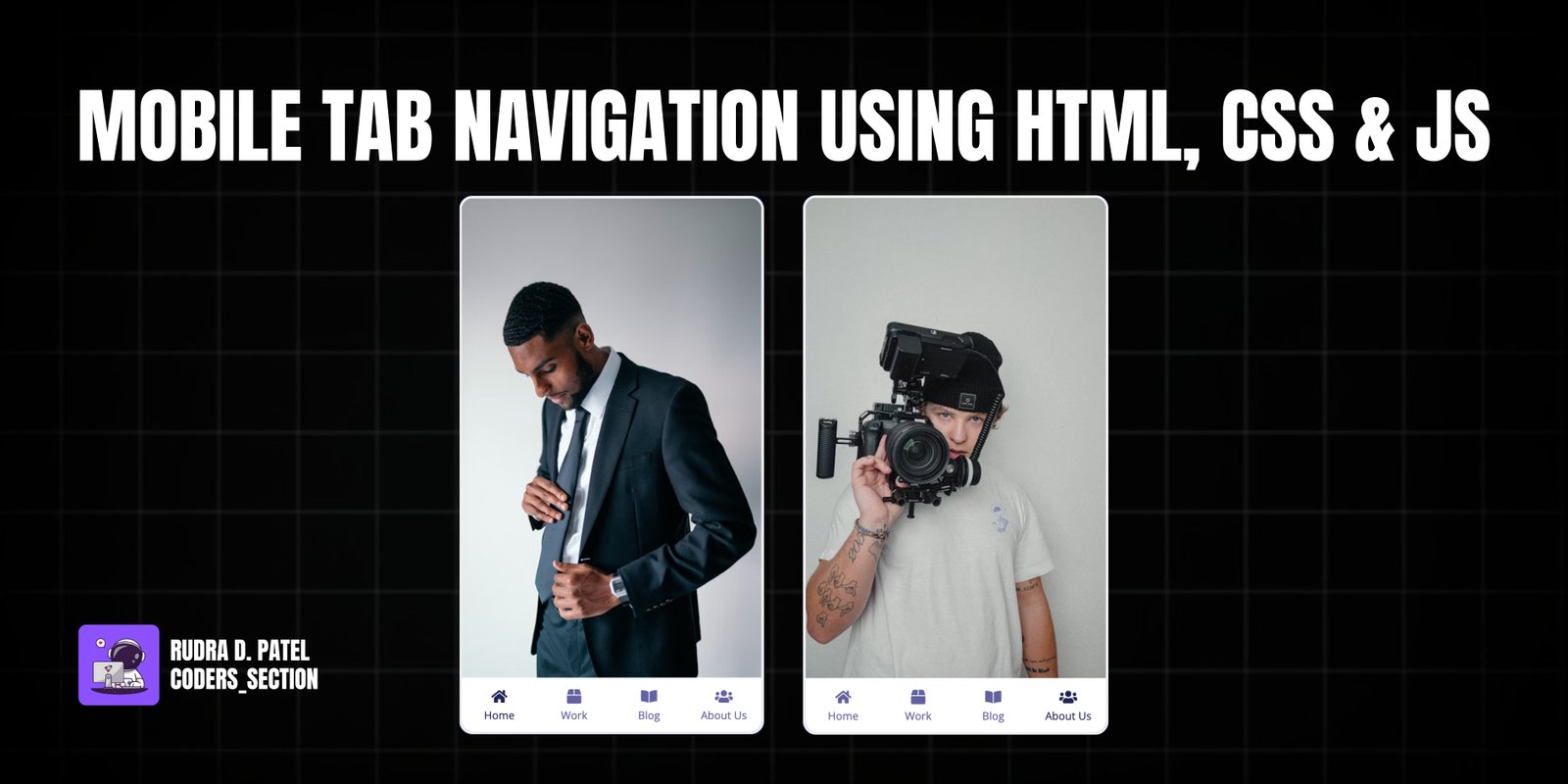
This project demonstrates a responsive mobile tab navigation interface using HTML, CSS, and JavaScript. It simulates a smartphone screen with multiple content tabs (Home, Work, Blog, About Us) at the bottom. Tapping on a tab dynamically changes the displayed content image in the main screen area, providing a smooth and intuitive navigation experience, typical of modern mobile applications.
The design focuses on a clean, minimal aesthetic with clear active states for the selected tab. The content images are full-screen within the simulated phone, and the navigation bar remains fixed at the bottom. This project is an excellent example of how to create a simple yet effective tab-based navigation system suitable for mobile-first web designs or embedded applications.
The HTML structure for the Mobile Tab Navigation is designed to simulate a phone interface. It consists of a main `div` with the class `phone`, which acts as the device frame. Inside this, there are multiple `img` tags, each representing a different content screen (Home, Work, Blog, About Us). The `show` class is used to control which content image is visible. Below the content images, a `nav` element contains an unordered list (`ul`) of navigation items (`li`). Each `li` includes a Font Awesome icon (`i`) and a paragraph (`p`) for the tab label. The `active` class on an `li` indicates the currently selected tab. This setup allows for easy toggling of content and styling of the navigation bar.
<!DOCTYPE html>
<html lang="en">
  <head>
    <meta charset="UTF-8" />
    <meta name="viewport" content="width=device-width, initial-scale=1.0" />
    <link
      rel="stylesheet"
      href="https://cdnjs.cloudflare.com/ajax/libs/font-awesome/5.15.1/css/all.min.css"
      integrity="sha512-+4zCK9k+qNFUR5X+cKL9EIR+ZOhtIloNl9GIKS57V1MyNsYpYcUrUeQc9vNfzsWfV28IaLL3i96P9sdNyeRssA=="
      crossorigin="anonymous"
    />
    <link rel="stylesheet" href="style.css" />
    <title>Mobile Tab Navigation</title>
  </head>
  <body>
    <div class="phone">
      <img
        src="https://images.unsplash.com/photo-1610652492500-ded49ceeb378?ixid=MXwxMjA3fDB8MHxwaG90by1wYWdlfHx8fGVufDB8fHw%3D&ixlib=rb-1.2.1&auto=format&fit=crop&w=634&q=80"
        alt="home"
        class="content show"
      />
      <img
        src="https://images.unsplash.com/photo-1611038917003-9227e16e0d9f?ixid=MXwxMjA3fDB8MHxwaG90by1wYWdlfHx8fGVufDB8fHw%3D&ixlib=rb-1.2.1&auto=format&fit=crop&w=634&q=80"
        alt="work"
        class="content"
      />
      <img
        src="https://images.unsplash.com/photo-1611038916975-f6b3ded00212?ixid=MXwxMjA3fDB8MHxwaG90by1wYWdlfHx8fGVufDB8fHw%3D&ixlib=rb-1.2.1&auto=format&fit=crop&w=554&q=80"
        alt="blog"
        class="content"
      />
      <img
        src="https://images.unsplash.com/photo-1611038917094-02aea0f65649?ixid=MXwxMjA3fDB8MHxwaG90by1wYWdlfHx8fGVufDB8fHw%3D&ixlib=rb-1.2.1&auto=format&fit=crop&w=634&q=80"
        alt="about"
        class="content"
      />
      <nav>
        <ul>
          <li class="active">
            <i class="fas fa-home"></i>
            <p>Home</p>
          </li>
          <li>
            <i class="fas fa-box"></i>
            <p>Work</p>
          </li>
          <li>
            <i class="fas fa-book-open"></i>
            <p>Blog</p>
          </li>
          <li>
            <i class="fas fa-users"></i>
            <p>About Us</p>
          </li>
        </ul>
      </nav>
    </div>
    <script src="script.js"></script>
  </body>
</html>
The CSS for the Mobile Tab Navigation creates the visual appearance of a smartphone and its interactive tabs. The `body` is styled with a dark background and centered content. The `.phone` class defines the simulated phone frame with a border and rounded corners, setting its fixed dimensions. The `.content` images are positioned absolutely to fill the phone screen, with `opacity: 0` by default and a `transition` for smooth fading. The `.show` class makes an image visible. The `nav` element is positioned at the bottom of the phone, containing an unordered list (`ul`) that uses flexbox to distribute the tab items evenly. Each `li` (tab item) has a default color, and on `hover` or when it has the `active` class, its color changes, providing visual feedback. This styling ensures a clean, responsive, and interactive mobile navigation experience.
@import url("https://fonts.googleapis.com/css?family=Open+Sans&display=swap");

* {
  box-sizing: border-box;
}

body {
  background-color: #222457;
  font-family: "Open Sans", sans-serif;
  display: flex;
  align-items: center;
  justify-content: center;
  height: 100vh;
  margin: 0;
}

.phone {
  position: relative;
  overflow: hidden;
  border: 3px solid #eee;
  border-radius: 15px;
  height: 600px;
  width: 340px;
}

.phone .content {
  opacity: 0;
  object-fit: cover;
  position: absolute;
  top: 0;
  left: 0;
  height: calc(100% - 60px);
  width: 100%;
  transition: opacity 0.4s ease;
}

.phone .content.show {
  opacity: 1;
}

nav {
  position: absolute;
  bottom: 0;
  left: 0;
  margin-top: -5px;
  width: 100%;
}

nav ul {
  background-color: #fff;
  display: flex;
  list-style-type: none;
  padding: 0;
  margin: 0;
  height: 60px;
}

nav li {
  color: #6461a2;
  cursor: pointer;
  flex: 1;
  padding: 10px;
  text-align: center;
}

nav ul li p {
  font-size: 12px;
  margin: 2px 0;
}

nav ul li:hover,
nav ul li.active {
  color: #222457;
}
The JavaScript for the Mobile Tab Navigation handles the dynamic switching of content based on tab clicks. It begins by selecting all elements with the class `content` (the images) and all `li` elements within the `nav ul` (the tab items). Two helper functions, `hideAllContents()` and `hideAllItems()`, are defined to remove the `show` class from all content images and the `active` class from all tab items, respectively. The core logic is implemented by iterating through each `listItems` (tab item) and attaching a `click` event listener. When a tab is clicked, it first calls `hideAllContents()` and `hideAllItems()` to reset the display. Then, it adds the `active` class to the clicked tab and the `show` class to the corresponding content image using its index. This ensures that only the selected tab and its content are visible, creating a smooth and interactive tab navigation experience.
const contents = document.querySelectorAll(".content");
const listItems = document.querySelectorAll("nav ul li");

const hideAllContents = () => {
  contents.forEach((content) => content.classList.remove("show"));
};
const hideAllItems = () => {
  listItems.forEach((item) => item.classList.remove("active"));
};

listItems.forEach((item, index) => {
  item.addEventListener("click", () => {
    hideAllContents();
    hideAllItems();
    item.classList.add("active");
    contents[index].classList.add("show");
  });
});
Watch a live demonstration of the Mobile Tab Navigation below.
This Mobile Tab Navigation project provides a clear and effective way to implement a common UI pattern found in many mobile applications. By dynamically switching content based on tab selections, it offers a smooth and intuitive user experience. The combination of HTML for structure, CSS for styling, and JavaScript for interactivity results in a functional and visually appealing navigation system that can be easily adapted for various mobile-first web projects.
You can easily customize this component by:
For more complex mobile applications, consider using a client-side routing library in conjunction with this tab navigation to manage different views and maintain application state more effectively, especially if each tab represents a distinct "page" or section.
Click the button below to download the full source code. Download will be ready in 10 seconds.
Receive coding tips and resources updates. No spam.
We respect your privacy. Unsubscribe at any time.