Feature Coming Soon!
The newsletter functionality is under development.
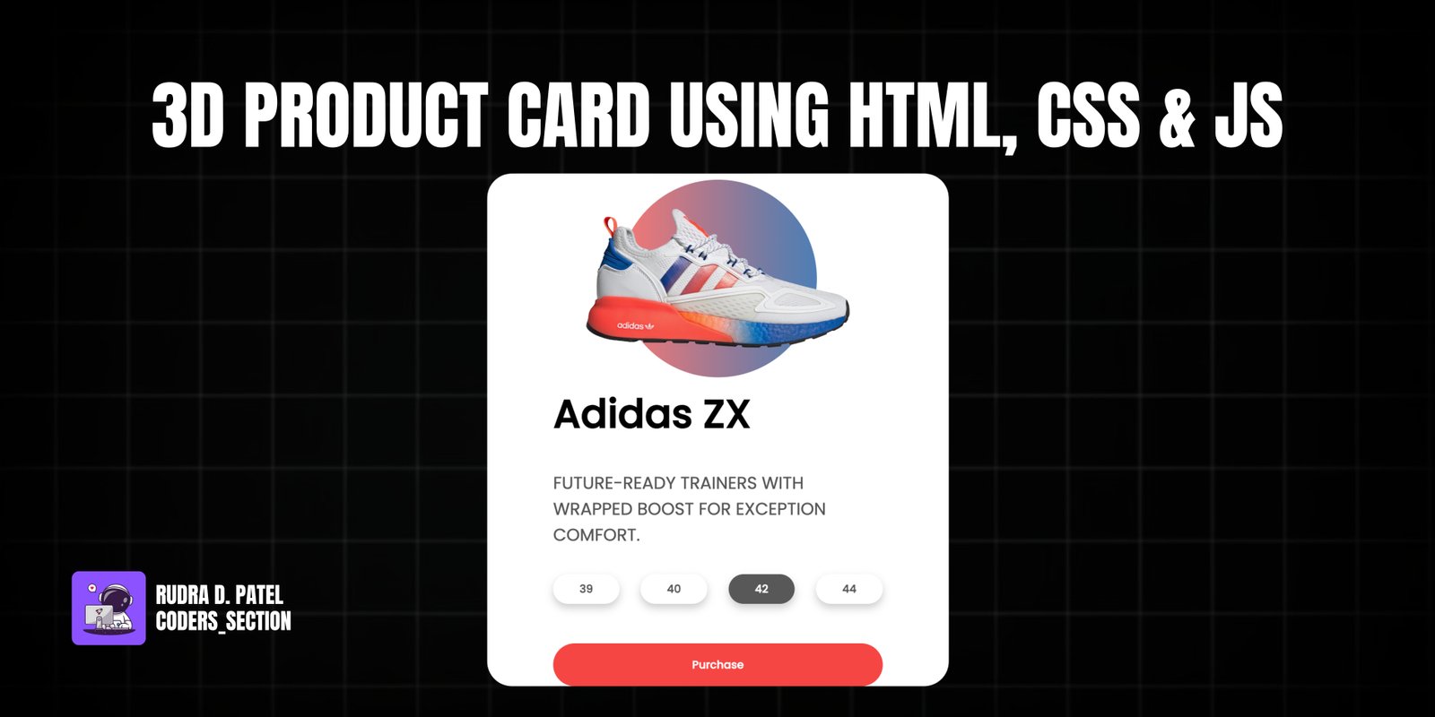
This project creates an interactive 3D product card with a captivating parallax effect and hover animations, built using HTML, CSS, and JavaScript. It showcases a product (e.g., a sneaker) within a card that responds to mouse movements, creating a sense of depth and immersion. When the user hovers over the card, various elements like the title, description, and purchase buttons pop out and rotate slightly, enhancing the visual appeal and user engagement.
Key functionalities include a 3D rotation effect on the card based on mouse position, and individual elements within the card animating with a "pop-out" effect on hover. The design features a minimalist aesthetic with a focus on the product image, complemented by a subtle gradient background for the circular element behind the product. This project is an excellent example of using CSS `transform-style: preserve-3d` and JavaScript event listeners to create dynamic and visually striking web components.
The HTML structure for the 3D Product Card is designed to create a layered effect that enables the 3D transformation. It starts with a `container` div that wraps the entire card. Inside, the `card` div holds all the product information. The product image (a sneaker) is placed within a `sneaker` div, which also contains a `circle` div for the background gradient. Below the `sneaker` section, an `info` div houses the product `title`, `h3` description, `sizes` buttons, and a `purchase` button. The `active` class on a size button indicates selection. This nested structure is crucial for applying the 3D transformations and individual element animations effectively.
<!-- Awesome 3D ANIMATION Javascript Tutorial! by Simo Edwin - Dev Ed (2020)
see: https://www.youtube.com/watch?v=XK7T3mY1V-w -->

<!DOCTYPE html>
<html lang="en">
  <head>
    <meta charset="UTF-8" />
    <meta name="viewport" content="width=device-width, initial-scale=1.0" />
    <link rel="stylesheet" href="style.css" />
    <title>3D Product Card</title>
  </head>
  <body>
    <div class="container">
      <div class="card">
        <div class="sneaker">
          <div class="circle"></div>
          <img src="images/adidas.png" alt="adidas" />
        </div>
        <div class="info">
          <h1 class="title">Adidas ZX</h1>
          <h3>
            FUTURE-READY TRAINERS WITH WRAPPED BOOST FOR EXCEPTION COMFORT.
          </h3>
          <div class="sizes">
            <button>39</button>
            <button>40</button>
            <button class="active">42</button>
            <button>44</button>
          </div>
          <div class="purchase">
            <button>Purchase</button>
          </div>
        </div>
      </div>
    </div>
    <script src="script.js"></script>
  </body>
</html>
The CSS for the 3D Product Card is crucial for creating its interactive and visually appealing effects. It imports the "Poppins" font and sets up the `body` to center content and enable 3D perspective (`perspective: 1000px`). The `.container` uses flexbox to center the `.card`. The `.card` itself is given a `min-height`, `width`, `box-shadow`, `border-radius`, and importantly, `transform-style: preserve-3d` to allow its children to participate in 3D transformations. The `.sneaker` and its `img` are styled for positioning and smooth transitions. The `.circle` behind the sneaker uses a `linear-gradient` for a vibrant background effect. The `.info` section's elements (h1, h3, sizes, purchase) all have `transition` properties to enable smooth "pop-out" animations. The `.sizes` buttons are styled, with an `active` class for selection. Media queries are used to adjust the card and image sizes for larger screens, ensuring responsiveness. Overall, the CSS orchestrates the visual depth, shadows, and transitions that bring the 3D product card to life.
@import url("https://fonts.googleapis.com/css2?family=Poppins:wght@400;500&display=swap");

* {
  box-sizing: border-box;
  margin: 0;
  padding: 0;
}

body {
  font-family: "Poppins", sans-serif;
  display: flex;
  align-items: center;
  justify-content: center;
  min-height: 100vh;
  overflow: hidden;
  perspective: 1000px;
}

.container {
  width: 50%;
  display: flex;
  justify-content: center;
  align-items: center;
}

.card {
  min-height: 80vh;
  width: 25rem;
  box-shadow: 0px 20px 20px rgba(0, 0, 0, 0.2), 0px 0px 50px rgba(0, 0, 0, 0.2);
  border-radius: 30px;
  padding: 0rem 2rem;
  transform-style: preserve-3d;
}

.sneaker {
  min-height: 35vh;
  display: flex;
  justify-content: center;
  align-items: center;
  position: relative;
}

.sneaker img {
  width: 13rem;
  z-index: 2;
  transition: all 0.75s ease-out;
}

.circle {
  width: 7rem;
  height: 7rem;
  background: linear-gradient(
    to right,
    rgba(245, 70, 66, 0.75),
    rgba(8, 83, 156, 0.75)
  );
  position: absolute;
  z-index: -1;
  border-radius: 50%;
}

.info h1 {
  font-size: 1.7rem;
  transition: all 0.75s ease-out;
}

.info h3 {
  font-size: 1rem;
  padding: 2rem 0rem;
  color: #585858;
  font-weight: lighter;
  transition: all 0.75s ease-out;
}

.sizes {
  display: flex;
  justify-content: space-between;
  transition: all 0.75s ease-out;
}

.sizes button {
  padding: 0.5rem 2rem;
  background: none;
  border: none;
  box-shadow: 0px 5px 10px rgba(0, 0, 0, 0.2);
  border-radius: 30px;
  cursor: pointer;
  font-weight: bold;
  font-family: inherit;
  color: #585858;
}

button.active {
  color: white;
  background-color: #585858;
}

.purchase {
  margin-top: 3rem;
  transition: all 0.75s ease-out;
}

.purchase button {
  width: 100%;
  padding: 1rem 0rem;
  background: #f54642;
  border: none;
  color: white;
  cursor: pointer;
  border-radius: 30px;
  font-weight: bolder;
  font-family: inherit;
}

@media screen and (min-width: 740px) {
  .card {
    width: 35rem;
    padding: 0rem 5rem;
  }

  .sneaker img {
    width: 20rem;
  }

  .circle {
    width: 15rem;
    height: 15rem;
  }

  .info h1 {
    font-size: 3rem;
  }

  .info h3 {
    font-size: 1.3rem;
  }
}
The JavaScript for the 3D Product Card handles the interactive 3D rotation and pop-out animations. It selects key DOM elements: the `card` itself, its `container`, and individual elements like the `title`, `sneaker` image, `purchase` button, `description`, and `sizes`. The core functionality is driven by two main event listeners on the `container`:
This script effectively combines mouse events with CSS `transform` properties to create a dynamic and engaging 3D product card experience.
// Movement Animation to happen
const card = document.querySelector(".card");
const container = document.querySelector(".container");

// Items
const title = document.querySelector(".title");
const sneaker = document.querySelector(".sneaker img");
const purchase = document.querySelector(".purchase");
const description = document.querySelector(".info h3");
const sizes = document.querySelector(".sizes");

// Moving animation event
container.addEventListener("mousemove", (e) => {
  let xAxis = (window.innerWidth / 2 - e.pageX) / 25;
  let yAxis = (window.innerHeight / 2 - e.pageY) / 25;
  card.style.transform = `rotateX(${yAxis}deg) rotateY(${xAxis}deg)`;
});

// Animate In
container.addEventListener("mouseenter", (e) => {
  card.style.transition = "none";
  // Popout
  title.style.transform = "translateZ(150px)";
  sneaker.style.transform = "translateZ(200px) rotateZ(-45deg)";
  description.style.transform = "translateZ(125px)";
  sizes.style.transform = "translateZ(100px)";
  purchase.style.transform = "translateZ(75px)";
});

// Animate Out
container.addEventListener("mouseleave", (e) => {
  card.style.transition = "all 0.5s ease";
  card.style.transform = `rotateX(0deg) rotateY(0deg)`;
  //Popback
  title.style.transform = "translateZ(0px)";
  sneaker.style.transform = "translateZ(0) rotateZ(0deg)";
  description.style.transform = "translateZ(0px)";
  sizes.style.transform = "translateZ(0px)";
  purchase.style.transform = "translateZ(0px)";
});
Watch a live demonstration of the 3D Product Card below.
This 3D Product Card project is a fantastic example of how to add depth, interactivity, and visual flair to web components using a combination of HTML, CSS, and JavaScript. The parallax and pop-out effects create a highly engaging user experience, making product showcases or portfolio items stand out. It demonstrates powerful CSS 3D transformations and responsive design techniques.
You can easily customize this component by:
When working with 3D transforms, ensure that your elements have `transform-style: preserve-3d` on their parent container to allow child elements to be positioned in 3D space relative to their parent. This is crucial for creating layered depth effects.
Click the button below to download the full source code. Download will be ready in 10 seconds.
Receive coding tips and resources updates. No spam.
We respect your privacy. Unsubscribe at any time.