Feature Coming Soon!
The newsletter functionality is under development.
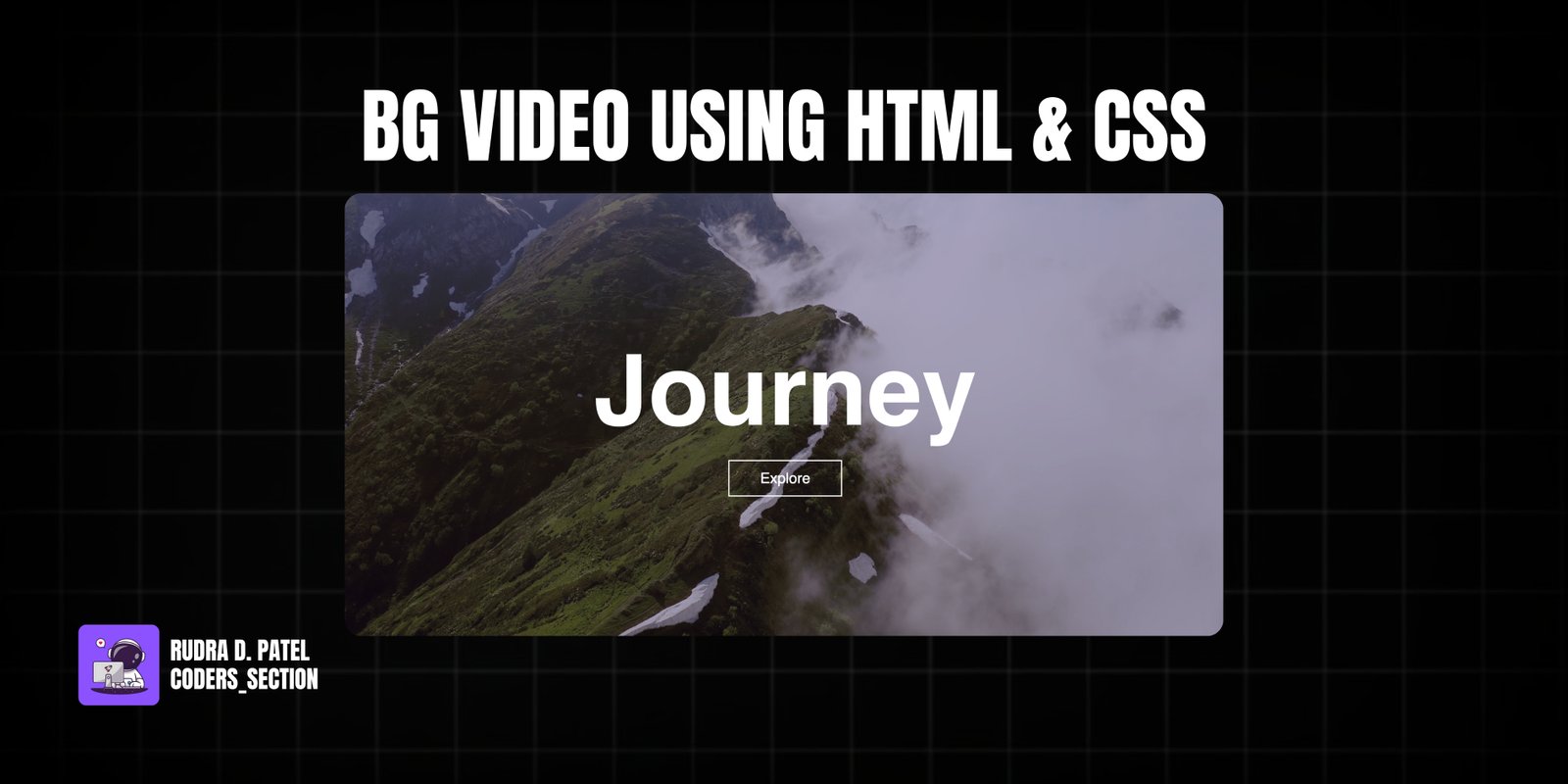
This project creates a stunning full-screen hero section with a looping background video, built entirely with HTML and CSS. It features a responsive video that adapts to different screen sizes and an overlay with a captivating title and an interactive "Explore" button. The title includes a hover effect that changes its appearance, adding a touch of dynamism to the static content.
The design prioritizes visual impact, using a dark gradient overlay on the video to ensure text readability. The "Explore" button is styled with a clear call to action and a smooth hover transition. This project is ideal for creating immersive landing pages, portfolio introductions, or any web section where a strong visual first impression is desired, without relying on complex JavaScript.
The HTML structure for the background video hero section is straightforward, focusing on a clear hierarchy for the video and overlay content. It consists of a main `hero` section that acts as the container for the entire hero area. Inside, a `video` tag with `autoplay`, `loop`, `muted`, and `plays-inline` attributes ensures the video plays automatically and seamlessly. The `source` tag within the video points to the video file. Overlaid on top of the video is a `content` section, which holds an `h1` for the main title and an `a` tag for the "Explore" call-to-action button. This simple and semantic structure makes it easy to apply styling and ensure accessibility.
<html lang="en">
  <head>
    <meta charset="UTF-8" />
    <meta http-equiv="X-UA-Compatible" content="IE=edge" />
    <meta name="viewport" content="width=device-width, initial-scale=1.0" />
    <title>Background Video</title>
    <link rel="stylesheet" href="style.css" />
  </head>
  <body>
    <section class="hero">
      <video autoplay loop muted plays-inline class="back-video">
        <!-- change the video to your own -->
        <source src="assets/video.mp4" />
      </video>

      <section class="content">
        <h1>Journey</h1>
        <a href="">Explore</a>
      </section>
    </section>
  </body>
</html>
The CSS for the background video hero section is designed to create a full-screen, visually immersive experience. It resets default padding and margins and sets a sans-serif font. The `.hero` class defines the full viewport width and height, applies a dark linear gradient overlay to ensure text readability over the video, and uses flexbox to center the content. The `.content` section centers its text. The `h1` (title) is styled with a large white font and a smooth `transition`. On hover, a `-webkit-text-stroke` effect is applied, making the text transparent with a white outline. The `a` tag (button) is styled with a white border, transparent background, and a hover effect that fills the background with white and changes the text to black. The `.back-video` class uses `position: absolute` and `z-index: -1` to place the video behind the content. Crucially, media queries (`@media (min-aspect-ratio: 16/9)` and `(max-aspect-ratio: 16/9)`) ensure the video always covers the entire screen, regardless of aspect ratio, by adjusting its width or height to 100% and letting the other dimension auto-adjust. This robust styling ensures a responsive and visually striking background video hero section.
* {
  padding: 0;
  margin: 0;
  box-sizing: border-box;
  font-family: sans-serif;
}

.hero {
  width: 100%;
  height: 100vh;
  background-image: linear-gradient(rgba(12, 3, 51, 0.3), rgba(12, 3, 51, 0.3));
  position: relative;
  padding: 0 5%;
  display: flex;
  justify-content: center;
  align-items: center;
}

.content {
  text-align: center;
}

.content h1 {
  font-size: 160px;
  color: #fff;
  font-weight: 600;
  transition: 0.5s;
}

.content h1:hover {
  -webkit-text-stroke: 2px white;
  color: transparent;
}

.content a {
  text-decoration: none;
  display: inline-block;
  color: #fff;
  font-size: 24px;
  border: 2px solid white;
  padding: 14px 50px;
  margin-top: 20px;
  transition: 0.5s;
}

.content a:hover {
  background: #fff;
  color: #000;
}

.back-video {
  position: absolute;
  right: 0;
  bottom: 0;
  z-index: -1;
}

@media (min-aspect-ratio: 16/9) {
  .back-video {
    width: 100%;
    height: auto;
  }
}

@media (max-aspect-ratio: 16/9) {
  .back-video {
    width: auto;
    height: 100%;
  }
}
Watch a live demonstration of the Background Video Hero Section below.
This Background Video Hero Section project provides a powerful and visually engaging way to introduce content on a webpage. By leveraging HTML5 video and responsive CSS techniques, it creates an immersive experience that captures user attention immediately. The text overlay with interactive hover effects adds a layer of polish and functionality, making it suitable for a wide range of web design applications.
You can easily customize this component by:
Always provide a fallback image or a solid background color for the hero section in case the video fails to load or for users with slower internet connections. This ensures a consistent user experience even when the video is not available.
Click the button below to download the full source code. Download will be ready in 10 seconds.
Receive coding tips and resources updates. No spam.
We respect your privacy. Unsubscribe at any time.