Feature Coming Soon!
The newsletter functionality is under development.
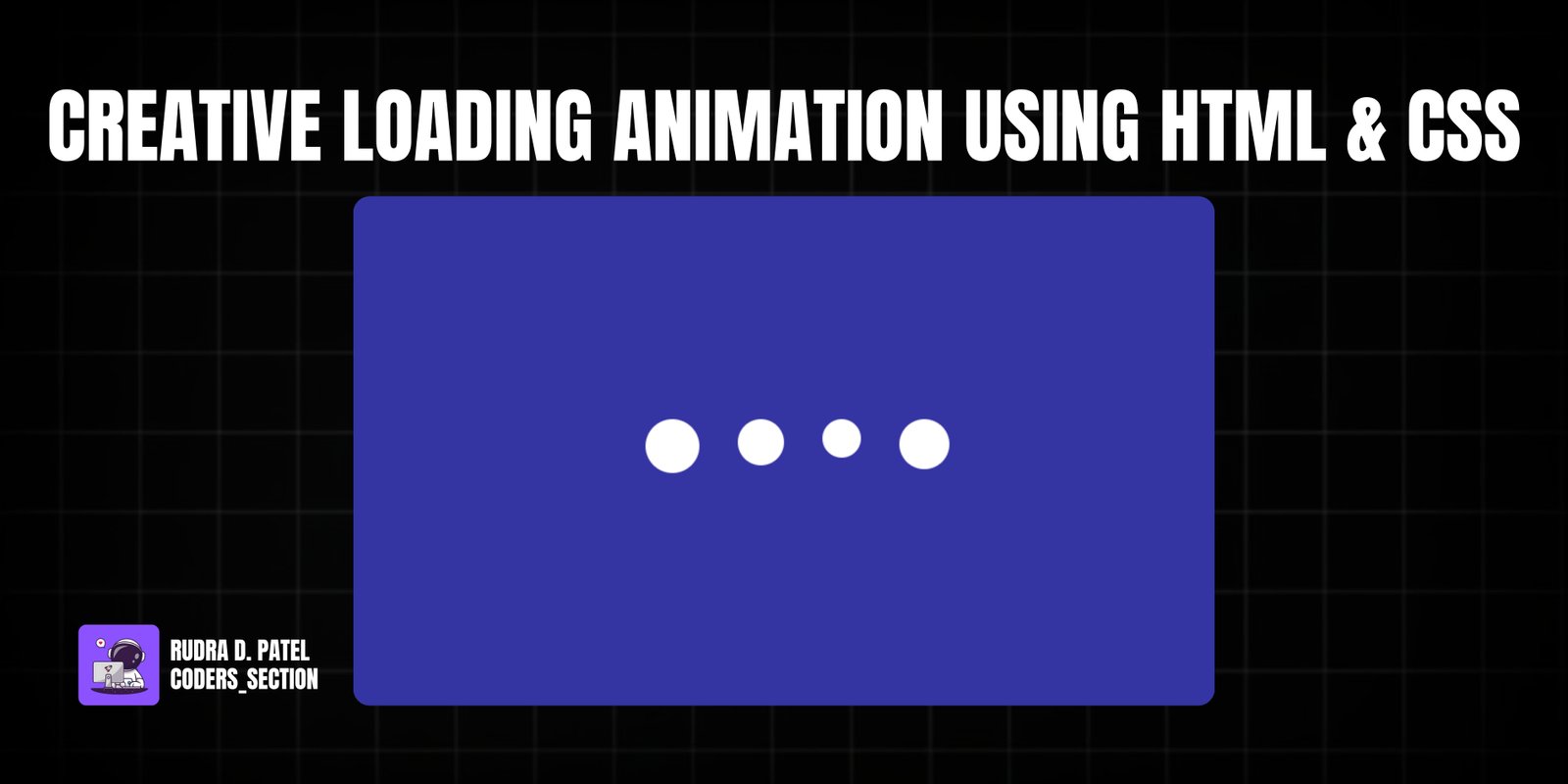
This project demonstrates a simple yet captivating creative loading animation built purely with HTML and CSS. It features four circular elements that animate in a synchronized, wave-like motion, providing visual feedback to the user that content is being loaded. The animation is designed to be smooth and non-distracting, making it suitable for various web applications where a loading indicator is needed.
The design uses a dark background with bright white circles, creating a clean and modern aesthetic. The animation involves changes in both width and height of the circles, creating a subtle "breathing" or "pulsing" effect, with a staggered delay for each circle to produce the wave. This project is an excellent example of using CSS `@keyframes` and `animation-delay` to create engaging and performant loading indicators without the need for JavaScript.
The HTML structure for the creative loading animation is minimal and semantic, focusing on containing the animated elements. It consists of a `section` with the class `wrapper`, which serves as a flex container to center the loading animation on the page. Inside this `wrapper`, a `div` with the class `loader` acts as the main container for the individual animating elements. Within the `loader`, there are four `div` elements, each with the class `loading` and an additional class (`one`, `two`, `three`, `four`) to apply staggered animation delays. This simple and clean structure allows for easy styling and animation control through CSS.
<html lang="en">
  <head>
    <meta charset="UTF-8" />
    <meta http-equiv="X-UA-Compatible" content="IE=edge" />
    <meta name="viewport" content="width=device-width, initial-scale=1.0" />
    <title>Loading Animation</title>
    <link rel="stylesheet" href="style.css" />
  </head>
  <body>
    <section class="wrapper">
      <div class="loader">
        <div class="loading one"></div>
        <div class="loading two"></div>
        <div class="loading three"></div>
        <div class="loading four"></div>
      </div>
    </section>
  </body>
</html>
The CSS for the creative loading animation is responsible for the visual appearance and the smooth, synchronized movement of the loading circles. It starts by resetting default margins and paddings and sets a dark background color for the `body`. The `.wrapper` class uses flexbox to center its content both horizontally and vertically, ensuring the loader is always in the middle of the screen. The `.loader` class also uses flexbox to arrange the individual `loading` circles with even spacing. Each `.loading` circle is styled with a white background, a fixed width and height, and a `border-radius: 50%` to make it perfectly round. The core of the animation is defined by the `@keyframes load` rule, which animates the `width` and `height` of the circles from 30px to 20px and back, creating a pulsing effect. Finally, `animation-delay` properties are applied to `.loading.one`, `.two`, and `.three` to create a staggered, wave-like animation across the circles. This CSS ensures a visually appealing and performant loading indicator.
* {
  margin: 0;
  padding: 0;
  box-sizing: border-box;
}

body {
  background: #00008bcb;
}

.wrapper {
  display: flex;
  justify-content: center;
  align-items: center;
  min-height: 100vh;
}

.wrapper .loader {
  display: flex;
  justify-content: space-evenly;
  padding: 0 20px;
}

.loader .loading {
  background: #fff;
  width: 30px;
  height: 30px;
  border-radius: 50px;
  margin: 0 10px;
  animation: load 0.8s ease infinite;
}

.loader .loading.one {
  animation-delay: 0.3s;
}
.loader .loading.two {
  animation-delay: 0.4s;
}
.loader .loading.three {
  animation-delay: 0.5s;
}

@keyframes load {
  0% {
    width: 30px;
    height: 30px;
  }
  50% {
    width: 20px;
    height: 20px;
  }
}
Watch a live demonstration of the Creative Loading Animation below.
This Creative Loading Animation project provides a simple, elegant, and effective way to indicate loading states in web applications. By utilizing pure HTML and CSS, it delivers a smooth and visually appealing animation without adding JavaScript overhead. The staggered pulsing effect creates a dynamic and engaging user experience, making waiting times feel less tedious.
You can easily customize this component by:
For optimal performance, especially on mobile devices, prefer CSS animations over JavaScript-driven animations for simple loading indicators. CSS animations are often hardware-accelerated, leading to smoother results.
Click the button below to download the full source code. Download will be ready in 10 seconds.
Receive coding tips and resources updates. No spam.
We respect your privacy. Unsubscribe at any time.