Feature Coming Soon!
The newsletter functionality is under development.
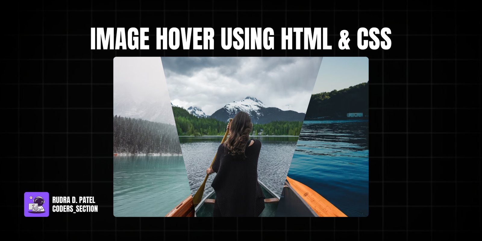
This project showcases a creative image hover effect using pure HTML and CSS. It features a set of images displayed within a container, where each image is initially clipped into a unique polygon shape. On hovering over the entire container, all images expand to their full rectangular form. When hovering over an individual image, it then reveals its full shape while other images revert to their clipped state. This creates an engaging and interactive visual experience.
The design uses `clip-path` property to define the initial polygonal shapes, and CSS `transition` for smooth animations between states. The background images are sourced from Unsplash, providing high-quality visuals. This project is excellent for portfolios, galleries, or any section where you want to add a dynamic and artistic touch to image displays without relying on JavaScript.
The HTML structure for the creative image hover effect is minimal and semantic, designed to house the three distinct image elements. It consists of a `section` with the class `container`, which acts as the main wrapper for the entire interactive area. Inside this `container`, there are three `div` elements, each with the class `clip` and an additional class (`clip1`, `clip2`, `clip3`) to apply unique `clip-path` properties and background images. This clean and hierarchical structure allows for precise styling and animation control through CSS, enabling the complex hover effects.
<!DOCTYPE html>
<html lang="en">
  <head>
    <meta charset="UTF-8" />
    <meta http-equiv="X-UA-Compatible" content="IE=edge" />
    <meta name="viewport" content="width=device-width, initial-scale=1.0" />
    <title>Creative Image Hover Effect</title>
    <link rel="stylesheet" href="style.css" />
  </head>
  <body>
    <section class="container">
      <div class="clip clip1"></div>
      <div class="clip clip2"></div>
      <div class="clip clip3"></div>
    </section>
  </body>
</html>
The CSS for the creative image hover effect is responsible for the unique visual appearance and interactive animations. It starts by resetting default margins and paddings, setting a dark background for the `body`, and centering the content using flexbox. The `.container` class defines a fixed `width` and `height` for the overall image area and sets its `position` to `relative`. Each `.clip` element is absolutely positioned to cover the container, and a `transition` is applied for smooth animations. `clip1`, `clip2`, and `clip3` each have a unique `background` image (from Unsplash) with `cover` and `center` properties, and a distinct `clip-path` polygon to create their initial segmented shapes. The magic happens with the hover effects: when the `.container` is hovered, all `.clip` elements transition to `clip-path: polygon(100% 0, 100% 0, 100% 100%, 100% 100%)`, effectively collapsing them. Then, when an individual `.clip` element within the hovered container is hovered, it expands to `clip-path: polygon(0 0, 100% 0, 100% 100%, 0% 100%)`, revealing its full rectangular form. This intricate use of `clip-path` and transitions creates a captivating visual effect.
body {
  margin: 0;
  padding: 0;
  background: #555;
  height: 100vh;
  display: flex;
  justify-content: center;
  align-items: center;
}

.container {
  position: relative;
  width: 800px;
  height: 500px;
  background: #222;
}

.clip {
  position: absolute;
  top: 0;
  left: 0;
  width: 100%;
  height: 100%;
  transition: all 0.5s;
}

.clip1 {
  background: url(https://images.unsplash.com/photo-1604537466158-719b1972feb8?ixlib=rb-1.2.1&ixid=MnwxMjA3fDF8MHxwaG90by1wYWdlfHx8fGVufDB8fHx8&auto=format&fit=crop&w=1169&q=80);
  background-size: cover;
  background-position: center;
  clip-path: polygon(0 0, 46% 0, 39% 100%, 0 100%);
}

.clip2 {
  background: url(https://images.unsplash.com/photo-1502228213426-d4e9f2add0e5?ixlib=rb-1.2.1&ixid=MnwxMjA3fDB8MHxwaG90by1wYWdlfHx8fGVufDB8fHx8&auto=format&fit=crop&w=1170&q=80);
  background-size: cover;
  background-position: center;
  clip-path: polygon(19% 0, 87% 0, 64% 100%, 33% 100%);
}

.clip3 {
  background: url(https://images.unsplash.com/photo-1519757043093-285fcb07a4e4?ixlib=rb-1.2.1&ixid=MnwxMjA3fDB8MHxwaG90by1wYWdlfHx8fGVufDB8fHx8&auto=format&fit=crop&w=1074&q=80);
  background-size: cover;
  background-position: center;
  clip-path: polygon(82% 0, 100% 0, 100% 100%, 63% 100%);
}

.container:hover .clip {
  clip-path: polygon(100% 0, 100% 0, 100% 100%, 100% 100%);
}

.container .clip:hover {
  clip-path: polygon(0 0, 100% 0, 100% 100%, 0% 100%);
}
Watch a live demonstration of the Image Hover Effect below.
This Creative Image Hover Effect project showcases the power of CSS `clip-path` and `transition` properties to create dynamic and visually appealing interactions without JavaScript. It provides a unique way to display images, making them more engaging and interactive for users. The layered approach with multiple clipped images adds depth and a modern aesthetic to any web design.
You can easily customize this component by:
For cross-browser compatibility with `clip-path`, consider using a tool like Clippy (css-tricks.com/clippy/) to generate the `clip-path` values and ensure consistent rendering across different browsers.
Click the button below to download the full source code. Download will be ready in 10 seconds.
Receive coding tips and resources updates. No spam.
We respect your privacy. Unsubscribe at any time.