Feature Coming Soon!
The newsletter functionality is under development.
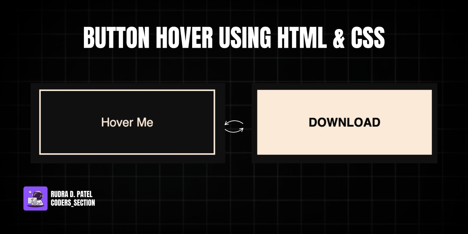
This project demonstrates a sleek and interactive button hover effect using only HTML and CSS. It features a single button with a "Hover Me" text that transforms into a "DOWNLOAD" button with a smooth, animated fill effect on hover. The animation creates a sense of depth and interaction, making the button visually engaging and intuitive.
The design uses a dark background to make the button stand out, with the button itself having a white border and text. The core of the effect lies in the `:before` pseudo-element, which is initially hidden and then slides up from the bottom to reveal the "DOWNLOAD" text and a solid background color. This project is an excellent example of using CSS pseudo-elements and `transform` properties to create sophisticated hover animations without JavaScript.
The HTML structure for the button hover effect is very simple, focusing on a single interactive element. It consists of a `section` with the class `container`, which serves as a flex container to center the button on the page. Inside this `container`, there is an `a` (anchor) tag, styled to look like a button, with the initial text "Hover Me". This minimal structure allows the CSS to apply complex visual and interactive effects directly to the anchor tag and its pseudo-elements.
<!DOCTYPE html>
<html lang="en">
  <head>
    <meta charset="UTF-8" />
    <meta http-equiv="X-UA-Compatible" content="IE=edge" />
    <meta name="viewport" content="width=device-width, initial-scale=1.0" />
    <title>Btn 1</title>
    <link rel="stylesheet" href="style.css" />
  </head>
  <body>
    <section class="container">
      <a href="">Hover Me</a>
    </section>
  </body>
</html>
The CSS for the button hover effect is where the magic happens, creating a sophisticated animation with pure CSS. It starts by resetting default margins and paddings and setting a dark background for the `body`, centering its content using flexbox. The `a` (anchor) tag is styled to resemble a button with `text-decoration: none`, white `color`, a `2px solid` white `border`, and generous `padding`. Key to the animation are `position: relative` and `overflow: hidden`, which prepare the element for the pseudo-element effect. The `transition: all 1s` ensures smooth transitions for all properties. The `a:before` pseudo-element is created with `content: "DOWNLOAD"`, bold black text, and is absolutely positioned to cover the entire button. It's initially hidden by `transform: translateY(-100%)`. On `a:hover:before`, the `transform` changes to `translateY(0)`, making the pseudo-element slide down smoothly, covering the original "Hover Me" text and revealing "DOWNLOAD" with a white background. This combination of properties creates a dynamic and visually appealing button hover effect.
* {
  padding: 0;
  margin: 0;
  box-sizing: border-box;
}

.container {
  display: flex;
  justify-content: center;
  align-items: center;
  height: 100vh;
  background: rgb(16, 16, 16);
  font-family: sans-serif;
}

a {
  text-decoration: none;
  color: antiquewhite;
  border: 2px solid antiquewhite;
  padding: 2rem 5rem;
  position: relative;
  overflow: hidden;
  transition: all 1s;
}

a:before {
  content: "DOWNLOAD";
  font-weight: bold;
  color: #000;
  position: absolute;
  left: 0;
  top: 0;
  width: 100%;
  height: 100%;
  background: antiquewhite;
  transform: translateY(-100%);
  transition: all 1s;
  /* center */
  display: flex;
  justify-content: center;
  align-items: center;
}

a:hover:before {
  transform: translateY(0);
}
Watch a live demonstration of the Button Hover Effect below.
This Button Hover Effect project is a fantastic example of how to create engaging and interactive UI elements using only HTML and CSS. The use of pseudo-elements and `transform` properties allows for complex animations that significantly enhance the user experience without the need for JavaScript. This technique is highly performant and widely supported, making it a great choice for adding subtle yet impactful flair to your web designs.
You can easily customize this component by:
When using pseudo-elements for hover effects, ensure that the `overflow: hidden` property is applied to the parent element to prevent the pseudo-element from extending beyond the button's boundaries during the animation.
Click the button below to download the full source code. Download will be ready in 10 seconds.
Receive coding tips and resources updates. No spam.
We respect your privacy. Unsubscribe at any time.