Feature Coming Soon!
The newsletter functionality is under development.
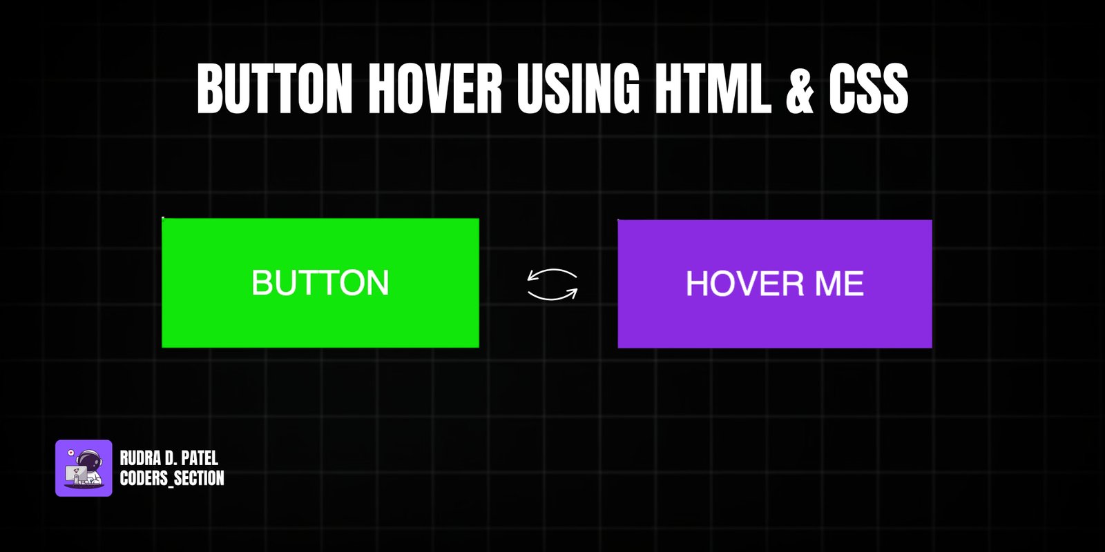
This project demonstrates a dynamic and multi-layered button hover effect using only HTML and CSS. It features a single button with an initial "Hover Me" text that undergoes a series of transformations on hover. First, a crimson-colored layer slides in from the top, followed by a green-colored layer, creating a visually striking and engaging animation.
The design uses a dark background to highlight the button, which is initially styled with a violet background and white text. The core of the effect relies on the `::before` and `::after` pseudo-elements, each styled with different background colors and `transform: rotateX(270deg)` to hide them initially. On hover, these pseudo-elements rotate into view with staggered delays, creating the layered animation. This project is an excellent example of using CSS `transform`, `transition`, and `transition-delay` with pseudo-elements to achieve complex and sophisticated hover effects without JavaScript.
The HTML structure for this multi-layered button hover effect is incredibly simple, centering around a single interactive element. It consists of a `body` tag that directly contains an `a` (anchor) tag. This `a` tag is styled to look and behave like a button, with the initial text "Hover Me". This minimal and clean structure is intentional, as the complex visual effects are entirely generated and controlled through CSS pseudo-elements and their animations, demonstrating the power of CSS alone for rich interactive experiences.
<!DOCTYPE html>
<html lang="en">
  <head>
    <meta charset="UTF-8" />
    <meta http-equiv="X-UA-Compatible" content="IE=edge" />
    <meta name="viewport" content="width=device-width, initial-scale=1.0" />
    <title>Btn 2</title>
    <link rel="stylesheet" href="style.css" />
  </head>
  <body>
    <a href="#">Hover Me</a>
  </body>
</html>
The CSS for this multi-layered button hover effect is where the sophisticated visual transformations are defined. The `body` is styled to take up the full viewport height and uses flexbox to center its content. The `a` (anchor) tag, acting as the button, is given `padding`, `text-transform: uppercase`, a `blueviolet` `background-color`, white `color`, and a `font-size` of `1.5rem`. Crucially, `position: relative` is set to allow for absolute positioning of its pseudo-elements. The `::before` and `::after` pseudo-elements are created, each absolutely positioned to cover the button. They are given different `background` colors (`crimson` and `rgb(14, 231, 14)` respectively) and are initially hidden by `transform: rotateX(270deg)` with their `transform-origin` set to `top`. A `transition` of `all 0.5s` is applied to both, with `::after` having an additional `transition-delay: 0.25s` to create a staggered effect. On `a:hover:before` and `a:hover:after`, the `transform` changes to `rotateX(0)`, smoothly bringing them into view. This combination creates a dynamic, layered reveal animation on button hover.
body {
  height: 100vh;
  display: flex;
  justify-content: center;
  align-items: center;
  font-family: sans-serif;
}

a {
  padding: 2rem 3rem;
  text-transform: uppercase;
  background-color: blueviolet;
  color: #fff;
  font-size: 1.5rem;
  position: relative;
  text-decoration: none;
}

a::before {
  content: "button";
  position: absolute;
  top: 0;
  left: 0;
  width: 100%;
  height: 100%;
  background: crimson;
  /* center our content */
  display: flex;
  justify-content: center;
  align-items: center;
  /* Let's provide our rotation/animation */
  transform: rotateX(270deg);
  transform-origin: top;
  transition: all 0.5s;
}

a::after {
  content: "button";
  position: absolute;
  top: 0;
  left: 0;
  width: 100%;
  height: 100%;
  background: rgb(14, 231, 14);
  display: flex;
  justify-content: center;
  align-items: center;
  transform: rotateX(270deg);
  transform-origin: top;
  transition: all 0.5s;
  transition-delay: 0.25s;
}

a:hover:before,
a:hover:after {
  transform: rotateX(0);
}
Watch a live demonstration of the Button Hover Effect below.
This multi-layered Button Hover Effect project demonstrates a highly creative and visually appealing way to enhance user interaction with buttons using only HTML and CSS. By leveraging pseudo-elements and `3D transforms` with staggered transitions, it creates a unique "flipping" or "unfolding" animation that adds significant polish and engagement to any web interface. This technique is performant and provides a rich user experience without the complexity of JavaScript.
You can easily customize this component by:
When working with `3D transforms` and pseudo-elements, remember to apply `perspective` to a parent element (or the `body`) to ensure the 3D effect is visible. Also, ensure `backface-visibility: hidden` is set on the transforming elements to prevent flickering or unwanted rendering of the back face during rotation.
Click the button below to download the full source code. Download will be ready in 10 seconds.
Receive coding tips and resources updates. No spam.
We respect your privacy. Unsubscribe at any time.