Feature Coming Soon!
The newsletter functionality is under development.
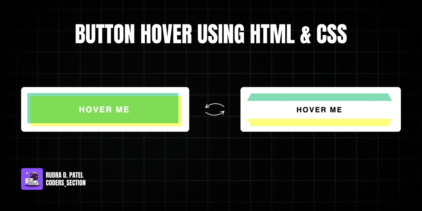
This project showcases a sophisticated 3D button hover effect using only HTML and CSS. It features a single button with an initial "Hover Me" text that, on hover, reveals two distinct colored layers (greenish and yellowish) that rotate into view from different angles, creating a compelling 3D animation. The button's text also changes color on hover for enhanced visual feedback.
The design uses a dark background to make the button stand out. The core of the effect relies on the `::before` and `::after` pseudo-elements, each positioned with slight offsets and initially hidden using `transform: perspective(1000px) rotateX(75deg)` and `rotateX(-75deg)` respectively. On hover, these pseudo-elements rotate back to `rotateX(0)`, revealing their colors and creating the 3D depth. This project is an excellent example of using CSS `3D transforms`, `transform-origin`, `mix-blend-mode`, and `transition` properties to achieve complex and visually rich hover effects without JavaScript.
The HTML structure for this 3D button hover effect is extremely minimal, focusing on a single interactive element. It consists of a `body` tag that directly contains an `a` (anchor) tag with the class `hover-btn` and the initial text "Hover Me". This simple and clean structure is intentional, as the entire complex 3D visual effect and animation are generated and controlled purely through CSS pseudo-elements and their transformations, demonstrating the power of CSS for advanced interactive designs.
<!DOCTYPE html>
<html lang="en">
  <head>
    <meta charset="UTF-8" />
    <meta http-equiv="X-UA-Compatible" content="IE=edge" />
    <meta name="viewport" content="width=device-width, initial-scale=1.0" />
    <title>Btn 3</title>
    <link rel="stylesheet" href="style.css" />
  </head>
  <body>
    <a href="javascript:void(0);" class="hover-btn">Hover Me</a>
  </body>
</html>
The CSS for this 3D button hover effect is intricate and responsible for the entire visual and interactive experience. The `body` is styled to take up the full viewport height and uses flexbox to center its content. The `a` (anchor) tag, acting as the button, is given a fixed `width` and `height`, `text-decoration: none`, `text-transform: uppercase`, `background: transparent`, `text-align: center`, `line-height` for vertical centering, `font-weight: bold`, `letter-spacing`, `position: relative`, and a `transition` for smooth effects. Crucially, `color: #fff` is set for the initial text. The `::before` and `::after` pseudo-elements are created, each absolutely positioned with slight `top` and `left` offsets. They are given distinct `background` colors (`#06c988a4` and `#ffff00a6` respectively), `z-index: -1` to place them behind the text, and `mix-blend-mode: multiply` for a color-mixing effect. Both are initially hidden and rotated using `transform: perspective(1000px) rotateX(75deg)` and `rotateX(-75deg)` with `transform-origin` set to `top` and `bottom` respectively. On `a:hover:before` and `a:hover:after`, their `transform` changes to `rotateX(0)`, bringing them into view and creating the 3D rotation. Finally, `a:hover` changes the text `color` to `#000`. This combination of properties creates a dynamic and visually stunning 3D hover effect.
body {
  height: 100vh;
  display: flex;
  justify-content: center;
  align-items: center;
  font-family: sans-serif;
}

a {
  width: 300px;
  height: 60px;
  text-decoration: none;
  text-transform: uppercase;
  background: transparent;
  text-align: center;
  line-height: 60px;
  font-weight: bold;
  letter-spacing: 2px;
  position: relative;
  transition: all 0.2s;
  color: #fff;
}

a:before {
  content: "";
  position: absolute;
  top: -3px;
  left: -3px;
  width: 100%;
  height: 100%;
  background: #06c988a4;
  z-index: -1;
  mix-blend-mode: multiply;
  transition: all 0.2s;
  transform-origin: top;
}

a:after {
  content: "";
  position: absolute;
  top: 3px;
  left: 3px;
  width: 100%;
  height: 100%;
  background: #ffff00a6;
  z-index: -1;
  mix-blend-mode: multiply;
  transition: all 0.2s;
  transform-origin: bottom;
}

a:hover:before {
  top: -6px;
  left: 0;
  transform: perspective(1000px) rotateX(75deg);
}

a:hover:after {
  top: 6px;
  left: 0;
  transform: perspective(1000px) rotateX(-75deg);
}

a:hover {
  color: #000;
}
Watch a live demonstration of the Button Hover Effect below.
This 3D Button Hover Effect project is a compelling demonstration of how advanced CSS properties can create immersive and interactive UI elements without relying on JavaScript. By skillfully combining `3D transforms`, `transform-origin`, `mix-blend-mode`, and `transition` properties, it achieves a dynamic visual effect that adds significant depth and engagement to any button. This technique is performant and provides a rich user experience, making it ideal for calls to action or navigation elements that require a strong visual impact.
You can easily customize this component by:
When implementing 3D transforms, ensure that the parent container has a `perspective` property set. This property creates the 3D space in which the transformed elements are rendered, making the 3D effects visible and more realistic. Also, consider using `backface-visibility: hidden` on the rotating elements to prevent unexpected rendering issues during the animation.
Click the button below to download the full source code. Download will be ready in 10 seconds.
Receive coding tips and resources updates. No spam.
We respect your privacy. Unsubscribe at any time.