Feature Coming Soon!
The newsletter functionality is under development.
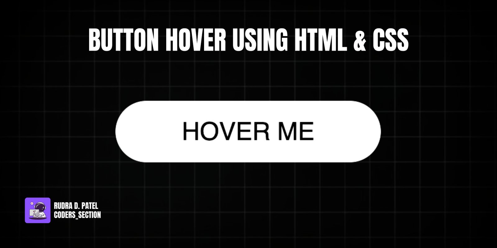
This project demonstrates a sleek and interactive button hover effect using only HTML and CSS. It features a single button with a "Hover Me" text that, on hover, triggers a subtle yet engaging animation. The button, initially white with black text, expands slightly and gains a shadow, while a white background layer scales out from its center, creating a smooth "ripple" or "burst" effect.
The design uses a dark background to make the button stand out. The core of the effect relies on the `::before` pseudo-element, which is initially scaled down and hidden, then scales up and fades out on hover. This project is an excellent example of using CSS `transform`, `transition`, and `opacity` properties with pseudo-elements to create sophisticated and visually appealing hover animations without JavaScript.
The HTML structure for this button hover effect is very simple, focusing on a single interactive element. It consists of a `section` with the class `container`, which acts as a flex container to center the button on the page. Inside this `container`, there is an `a` (anchor) tag with the class `btn-hover-effect` and the initial text "Hover Me". This minimal structure allows the CSS to apply complex visual and interactive effects directly to the anchor tag and its pseudo-elements.
<!DOCTYPE html>
<html lang="en">
  <head>
    <meta charset="UTF-8" />
    <meta http-equiv="X-UA-Compatible" content="IE=edge" />
    <meta name="viewport" content="width=device-width, initial-scale=1.0" />
    <title>Btn 5</title>
    <link rel="stylesheet" href="style.css" />
  </head>
  <body>
    <section class="container">
      <a href="#" class="btn-hover-effect" role="button">Hover Me</a>
    </section>
  </body>
</html>
The CSS for this button hover effect is responsible for the sleek visual animation. It starts by resetting default margins and paddings, setting a black background for the `body`, and using flexbox to center the content. The `a` (anchor) tag, acting as the button, is absolutely positioned, given `text-decoration: none`, `text-transform: uppercase`, a white `background`, black `color`, `border-radius: 100px` for a pill shape, and a `font-size` of `1.5rem`. A `transition: all 0.2s` is applied for subtle scaling and shadow effects. The `a:before` pseudo-element is created, absolutely positioned to cover the button, with a white `background`, `border-radius: 100px`, and `z-index: -1` to place it behind the text. It's initially scaled down (`transform: scaleX(1) scaleY(1)`) and then on `a:hover:before`, it scales out (`transform: scaleX(1.4) scaleY(1.6)`) and fades out (`opacity: 0`) with a `transition: all 1s`. On `a:hover`, the button itself translates slightly up (`transform: translateY(-3px)`) and gains a `box-shadow`. On `a:active`, it translates further up and the shadow changes. This combination creates a dynamic and visually appealing hover effect.
* {
  padding: 0;
  margin: 0;
  box-sizing: border-box;
}

.container {
  height: 100vh;
  display: flex;
  justify-content: center;
  align-items: center;
  font-family: sans-serif;
  background: #000;
}

a {
  position: absolute;
  text-decoration: none;
  text-transform: uppercase;
  padding: 1rem 4rem;
  background: #fff;
  color: #000;
  border-radius: 100px;
  font-size: 1.5rem;
  transition: all 0.2s;
}

a:before {
  content: "";
  position: absolute;
  top: 0;
  left: 0;
  width: 100%;
  height: 100%;
  background: #fff;
  border-radius: 100px;
  transition: all 1s;
  z-index: -1;
}

a:hover:before {
  transform: scaleX(1.4) scaleY(1.6);
  opacity: 0;
}

a:hover {
  transform: translateY(-3px);
  box-shadow: 0 10px 20px rgba(0, 0, 0, 0.2);
}

a:active {
  transform: translateY(-1px);
  box-shadow: 0 5px 10px rgba(0, 0, 0, 0.2);
}
Watch a live demonstration of the Button Hover Effect below.
This Button Hover Effect project is a great example of creating a polished and interactive UI element using only HTML and CSS. The combination of scaling, opacity changes, and subtle translations on hover provides a dynamic visual feedback that enhances the user experience. This technique is lightweight, performant, and widely compatible, making it suitable for various web design applications where a clean yet engaging button interaction is desired.
You can easily customize this component by:
When creating scaling animations, ensure that the `transform-origin` property is set correctly (e.g., `center center` for a symmetrical expansion) to achieve the desired visual effect. Also, consider using `will-change: transform, opacity` on the animated elements to hint to the browser about upcoming animations, potentially improving performance.
Click the button below to download the full source code. Download will be ready in 10 seconds.
Receive coding tips and resources updates. No spam.
We respect your privacy. Unsubscribe at any time.