Feature Coming Soon!
The newsletter functionality is under development.
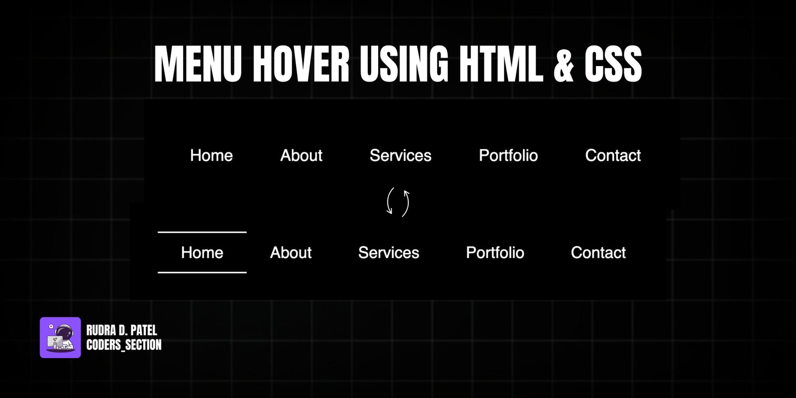
This project demonstrates an elegant and interactive menu hover effect using only HTML and CSS. It features a horizontal navigation menu where each link, on hover, triggers a subtle animation: two thin lines (one at the top and one at the bottom) appear and expand from opposite directions, creating a clean and modern visual feedback.
The design uses a dark background to make the white menu links stand out. The core of the effect relies on the `::before` and `::after` pseudo-elements, each positioned at the top and bottom of the link respectively. They are initially scaled down (`transform: scaleX(0)`) and then scale up (`transform: scaleX(1)`) on hover, creating the line animation. This project is an excellent example of using CSS pseudo-elements, `transform`, `transition`, and `transform-origin` properties to create sophisticated and visually appealing hover animations for navigation menus without JavaScript.
The HTML structure for this menu hover effect is clean and semantic, designed for a standard navigation list. It consists of a `section` with the class `container`, which serves as a flex container to center the menu on the page. Inside this `container`, there is an unordered list (`ul`) with the class `nav-menu`. This list contains five list items (`li`), each with the class `nav-item`, and inside each `li` is an `a` (anchor) tag with the class `nav-link` for the menu items ("Home", "About", "Services", "Portfolio", "Contact"). This structure provides a clear and accessible foundation for applying the CSS hover animations.
<!DOCTYPE html>
<html lang="en">
  <head>
    <meta charset="UTF-8" />
    <meta http-equiv="X-UA-Compatible" content="IE=edge" />
    <meta name="viewport" content="width=device-width, initial-scale=1.0" />
    <title>Creative Menu Effect</title>
    <link rel="stylesheet" href="style.css" />
  </head>
  <body>
    <section class="container">
      <ul class="nav-menu">
        <li class="nav-item"><a href="#" class="nav-link">Home</a></li>
        <li class="nav-item"><a href="#" class="nav-link">About</a></li>
        <li class="nav-item"><a href="#" class="nav-link">Services</a></li>
        <li class="nav-item"><a href="#" class="nav-link">Portfolio</a></li>
        <li class="nav-item"><a href="#" class="nav-link">Contact</a></li>
      </ul>
    </section>
  </body>
</html>
The CSS for this menu hover effect is responsible for the visual styling and the interactive line animation. It starts by resetting default margins and paddings, setting a black background for the `body`, and using flexbox to center the content. The `ul` (unordered list) is styled as a flex container to arrange menu items horizontally, removing default `padding` and `margin`. Each `li` (list item) removes its default `list-style`. The `a` (anchor) tags, representing the menu links, are styled with `text-decoration: none`, white `color`, `font-size: 22px`, and `padding`. Crucially, `position: relative` is set on the `a` tags to allow for absolute positioning of their pseudo-elements. The `::before` pseudo-element creates a 2px white line at the `top` of the link, initially scaled down (`transform: scaleX(0)`) from the `left` origin. The `::after` pseudo-element creates another 2px white line at the `bottom` of the link, also initially scaled down (`transform: scaleX(0)`) but from the `right` origin. Both pseudo-elements have a `transition: all 1s` for smooth animation. On `ul li a:hover:before` and `ul li a:hover:after`, their `transform` changes to `scaleX(1)`, making the lines appear and expand. This combination creates a clean and elegant hover effect for the navigation menu.
* {
  padding: 0;
  margin: 0;
  box-sizing: border-box;
}

.container {
  height: 100vh;
  display: flex;
  justify-content: center;
  align-items: center;
  font-family: sans-serif;
  background: #000;
}

ul {
  padding: 0;
  margin: 0;
  display: flex;
  flex-wrap: wrap;
  text-align: center;
}

ul li {
  list-style: none;
}

ul li a {
  text-decoration: none;
  color: #fff;
  font-size: 22px;
  padding: 1rem 2rem;
  position: relative;
}

a:before {
  content: "";
  position: absolute;
  top: 0;
  left: 0;
  width: 100%;
  height: 2px;
  background: #fff;
  transform: scaleX(0);
  transition: all 1s;
  transform-origin: left;
}

ul li a:hover:before,
ul li a:hover:after {
  transform: scaleX(1);
}

a:after {
  content: "";
  position: absolute;
  bottom: 0;
  left: 0;
  width: 100%;
  height: 2px;
  background: #fff;
  transform: scaleX(0);
  transition: all 1s;
  transform-origin: right;
}
Watch a live demonstration of the Menu Hover Effect below.
This Menu Hover Effect project provides a sleek and modern way to enhance navigation menus using only HTML and CSS. The subtle yet effective animation of lines appearing from opposite sides adds a touch of sophistication and visual interest without overwhelming the user. This technique is lightweight, performant, and widely compatible, making it an excellent choice for any website looking to improve its navigation's aesthetic and user experience.
You can easily customize this component by:
For more complex line animations, consider using `clip-path` or SVG line animations. However, for simple and elegant effects like this, CSS pseudo-elements and `transform: scaleX()` offer a highly efficient and performant solution.
Click the button below to download the full source code. Download will be ready in 10 seconds.
Receive coding tips and resources updates. No spam.
We respect your privacy. Unsubscribe at any time.