Feature Coming Soon!
The newsletter functionality is under development.
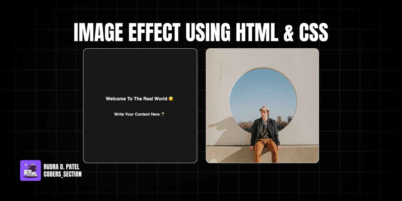
This project demonstrates a dynamic image hover effect using only HTML and CSS. It features an image container that, on hover, smoothly slides the image to the right while simultaneously sliding an overlay with text content from the left. This creates an engaging visual transition, revealing additional information or a call to action when the user interacts with the image.
The design uses a simple dark background to highlight the image container. The core of the effect relies on the `transform: translateX()` property applied to both the image and the content overlay. Initially, the content overlay is hidden off-screen to the left. On hover, the image translates to the right, and the content overlay translates into view from the left, both with a smooth `transition`. This project is an excellent example of using CSS `transform` and `transition` properties to create sophisticated and visually appealing hover animations for images without JavaScript.
The HTML structure for this image hover effect is straightforward, designed to encapsulate an image and its associated content. It consists of a `section` with the class `container`, which acts as a flex container to center the image effect on the page. Inside this `container`, there is a `div` with the class `container` (reused for styling, but functionally the main image wrapper) that holds both the `img` tag for the visual content and an `article` tag with the class `content` for the overlay text. The `article` contains an `h1` and `h4` for the title and subtitle. This structure allows for precise positioning and animation of both the image and its overlay using CSS.
<!DOCTYPE html>
<html lang="en">
  <head>
    <meta charset="UTF-8" />
    <meta http-equiv="X-UA-Compatible" content="IE=edge" />
    <meta name="viewport" content="width=device-width, initial-scale=1.0" />
    <title>Effect 1</title>
    <link rel="stylesheet" href="style.css" />
  </head>
  <body>
    <section class="container">
      <img src="rayul-_M6gy9oHgII-unsplash.jpg" />
      <article class="content">
        <h1>Welcome To The Real World 😉</h1>
        <h4>Write Your Content Here 🥂</h4>
      </article>
    </section>
  </body>
</html>
The CSS for this image hover effect is responsible for both the layout and the dynamic sliding animation. The `body` is styled to take up the full viewport height and uses flexbox to center its content. The outer `.container` (the `section` element) is set to a fixed `width` and `height`, with `position: relative` and `overflow: hidden` to contain the sliding elements. The `img` element inside this container is set to `width: 100%` and has a `transition: all 1s` for smooth animation. The `.content` element, which acts as the overlay, is absolutely positioned to cover the entire container, uses flexbox to center its text content, and has white `color` and a dark `background`. Crucially, it's initially hidden off-screen to the left using `transform: translateX(-100%)` and also has a `transition: all 1s`. On `.container:hover .content`, the `.content` element slides into view with `transform: translateX(0)`. Simultaneously, on `.container:hover img`, the `img` element slides out of view to the right with `transform: translateX(100%)`. This synchronized movement creates the engaging image-to-content transition effect.
body {
  height: 100vh;
  display: flex;
  justify-content: center;
  align-items: center;
  font-family: sans-serif;
}

.container {
  width: 30rem;
  height: 30rem;
  position: relative;
  overflow: hidden;
}

.container img {
  width: 100%;
  transition: all 1s;
}

.content {
  position: absolute;
  top: 0;
  left: 0;
  width: 100%;
  height: 100%;
  /* center the text */
  display: flex;
  flex-direction: column;
  justify-content: center;
  align-items: center;
  color: #fff;
  transition: all 1s;
  background: rgb(23, 23, 23);
  transform: translateX(-100%);
}

.container:hover .content {
  transform: translateX(0);
}

.container:hover img {
  transform: translateX(100%);
}
Watch a live demonstration of the Image Effect below.
This Image Effect project provides a visually engaging and interactive way to display content on hover using only HTML and CSS. The synchronized sliding animation of the image and its overlay creates a dynamic user experience, making it ideal for portfolio items, product showcases, or news cards where you want to reveal additional information on interaction. This technique is lightweight, performant, and widely compatible, offering a clean and modern approach to image effects.
You can easily customize this component by:
When creating sliding effects with `transform`, ensure that the parent container has `overflow: hidden` to prevent the elements from being visible outside their intended boundaries during the transition. This keeps the animation clean and contained within the design.
Click the button below to download the full source code. Download will be ready in 10 seconds.
Receive coding tips and resources updates. No spam.
We respect your privacy. Unsubscribe at any time.