Feature Coming Soon!
The newsletter functionality is under development.
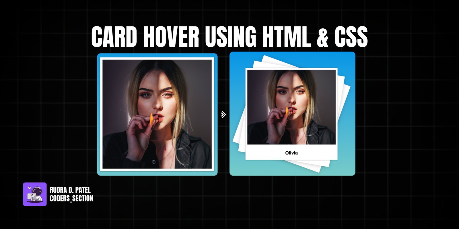
This project demonstrates a captivating card hover effect using only HTML and CSS. It features a single card with an image that, on hover, triggers a dynamic 3D rotation and reveals a title at the bottom. The effect creates a sense of depth and interaction, making the card visually appealing and engaging for users.
The design uses a vibrant linear gradient background to make the card stand out. The core of the effect relies on the `transform: rotateY()` property applied to the card on hover, creating the 3D flip. Additionally, pseudo-elements are used to create subtle background layers that also rotate, enhancing the 3D illusion. This project is an excellent example of using CSS `3D transforms`, `transition`, and pseudo-elements to create sophisticated and visually appealing hover animations for cards without JavaScript.
The HTML structure for this card hover effect is simple and semantic, designed to hold an image and a title. It consists of a `body` tag that directly contains a `section` with the class `card`. Inside this `card` section, there is another `section` with the class `imgBox` which holds the `img` tag for the image content. Following the `imgBox`, there's an `article` tag with the class `details`, which contains an `h2` for the card's title. This structure provides a clear hierarchy for applying the CSS styles and animations to create the hover effect.
<!DOCTYPE html>
<html lang="en">
  <head>
    <meta charset="UTF-8" />
    <meta http-equiv="X-UA-Compatible" content="IE=edge" />
    <meta name="viewport" content="width=device-width, initial-scale=1.0" />
    <title>Creative Card 2</title>
    <link rel="stylesheet" href="style.css" />
  </head>
  <body>
    <section class="card">
      <section class="imgBox">
        <img
          src="marian-oleksyn-Edv_EEWiB3E-unsplash.jpg"
          alt="Olivia portrait"
          class="card-image"
        />
      </section>
      <article class="details">
        <h2 class="card-title">Olivia</h2>
      </article>
    </section>
  </body>
</html>
The CSS for this card hover effect is responsible for the layout, 3D transformations, and animations. The `body` is styled to take up the full viewport height and uses a linear gradient background with flexbox to center its content. The `.card` element is given a fixed `width` and `height`, a white `background`, and a `box-shadow`. Crucially, `position: relative` is set to allow for absolute positioning of its inner elements and pseudo-elements. The `::before` and `::after` pseudo-elements are created, positioned to cover the card, given a white `background`, and `z-index: -1`. They have a `transition: 1s` and are transformed on `.card:hover:before` and `.card:hover:after` with `transform: rotate(20deg)` and `rotate(10deg)` respectively, along with a `box-shadow`, creating a layered 3D effect. The `.imgBox` is absolutely positioned inside the card with offsets, has a dark `background`, and a `transition: 1s`. On `.card:hover .imgBox`, its `bottom` property changes, causing the image to slide up. The `img` inside `imgBox` is set to cover its container. The `.details` section is absolutely positioned at the bottom of the card and has `text-align: center`. This combination of properties creates a dynamic and visually appealing 3D card hover effect.
body {
  margin: 0;
  height: 100vh;
  background: linear-gradient(#0093e9, #80d0c7);
  display: flex;
  justify-content: center;
  align-items: center;
  font-family: sans-serif;
}

.card {
  position: relative;
  width: 30rem;
  height: 30rem;
  background: white;
  box-shadow: 0 1px 5px rgba(0, 0, 0, 0.5);
}

.card:before,
.card:after {
  content: "";
  position: absolute;
  top: 0;
  left: 0;
  width: 100%;
  height: 100%;
  background: white;
  transition: 1s;
  z-index: -1;
}

.card:hover:before {
  transform: rotate(20deg);
  box-shadow: 0 2px 20px rgba(0, 0, 0, 0.2);
}

.card:hover:after {
  transform: rotate(10deg);
  box-shadow: 0 2px 20px rgba(0, 0, 0, 0.2);
}

.imgBox {
  position: absolute;
  top: 10px;
  left: 10px;
  bottom: 10px;
  right: 10px;
  background: #222;
  transition: 1s;
  z-index: 2;
}

img {
  position: absolute;
  top: 0;
  left: 0;
  width: 100%;
  height: 100%;
  object-fit: cover;
}

.card:hover .imgBox {
  bottom: 80px;
}

.details {
  position: absolute;
  left: 10px;
  right: 10px;
  bottom: 10px;
  height: 60px;
  text-align: center;
}
Watch a live demonstration of the Card Hover Effect below.
This Card Hover Effect project provides a visually striking and interactive way to display content, leveraging the power of HTML and CSS for dynamic 3D animations. The combination of rotated pseudo-elements and image translation creates a captivating effect that enhances user engagement. This technique is lightweight, performant, and widely compatible, making it an excellent choice for portfolios, product galleries, or any content requiring an eye-catching interactive element.
You can easily customize this component by:
When creating complex 3D hover effects with multiple rotating layers, pay close attention to the `z-index` property to ensure elements stack correctly. Also, consider using `perspective` on a parent element of the `.card` to enhance the 3D perception and make the rotations appear more realistic.
Click the button below to download the full source code. Download will be ready in 10 seconds.
Receive coding tips and resources updates. No spam.
We respect your privacy. Unsubscribe at any time.