Feature Coming Soon!
The newsletter functionality is under development.
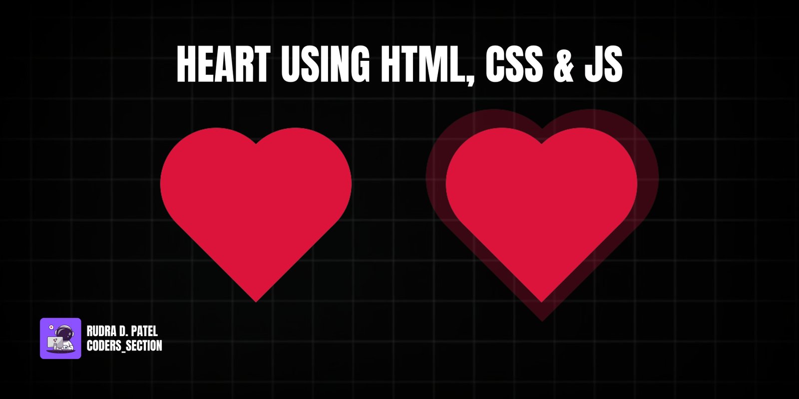
This project demonstrates a captivating interactive heart animation using HTML, CSS, and JavaScript. It features a gray heart icon that, when clicked, transforms into a red heart and triggers a "pop" animation, simulating a "like" or "favorite" action. Clicking the red heart again reverts it to the gray state, removing the animation. This effect is commonly seen in social media applications and provides satisfying visual feedback to user interactions.
The design uses a dark background to make the heart icon stand out. The core of the effect relies on two heart shapes (one gray, one red) positioned on top of each other. CSS is used to define the heart shapes using pseudo-elements and rotations. JavaScript handles the click events, toggling CSS classes that control the visibility of the red heart and trigger the `pop` animation. This project is an excellent example of combining HTML structure, CSS styling with animations, and simple JavaScript for interactive UI elements.
The HTML structure for this heart animation is minimal, consisting of a container for the two heart elements. It contains a `div` with the class `heart-container` which serves as the main wrapper. Inside this container, there are two `div` elements: one with the class `gray-heart` (representing the unliked state) and another with the class `red-heart` (representing the liked state). Both have `aria-label` attributes for accessibility. A `script` tag links to an external JavaScript file (`app.js`) to handle the interactivity. This simple structure allows for the CSS to define the visual appearance of the hearts and for JavaScript to manage their states.
<!DOCTYPE html>
<html lang="en">
  <head>
    <meta charset="UTF-8" />
    <meta http-equiv="X-UA-Compatible" content="IE=edge" />
    <meta name="viewport" content="width=device-width, initial-scale=1.0" />
    <title>Heart</title>
    <link rel="stylesheet" href="style.css" />
  </head>
  <body>
    <div class="heart-container">
      <div class="gray-heart" aria-label="Gray heart icon"></div>
      <div class="red-heart" aria-label="Red heart icon"></div>
    </div>

    <script src="app.js"></script>
  </body>
</html>
The CSS for this heart animation defines the heart shapes, their colors, and the "pop" animation. The `body` is styled to take up the full viewport height with a dark background and uses flexbox to center the heart container. Both `.gray-heart` and `.red-heart` are created using a square `div` rotated by -45 degrees, combined with `::before` and `::after` pseudo-elements that are circular and positioned to form the top lobes of the heart. The `.gray-heart` is styled with a `#ccc` background, while the `.red-heart` uses a `var(--main-color)` (crimson) background. The `.red-heart` is initially `visibility: hidden`. The `red-heart.animation` class triggers a CSS `@keyframes pop` animation, which scales the red heart to `1.7` times its size and fades it out (`opacity: 0`) over `0.9s`. The `red-heart.fill-color` class ensures the red heart remains visible when active. This combination of shape creation and animation provides a visually appealing and responsive heart icon.
* {
  box-sizing: border-box;
  margin: 0;
  padding: 0;
}

:root {
  --main-color: #dc143c;
}

body {
  display: flex;
  justify-content: center;
  align-items: center;
  height: 100vh;
  background: rgb(7, 7, 20);
}

/* gray-heart */
.gray-heart {
  background: #ccc;
  display: flex;
  justify-content: center;
  align-items: center;
  width: 100px;
  height: 100px;
  position: relative;
  top: 0;
  transform: rotate(-45deg);
}

.gray-heart:before,
.gray-heart:after {
  content: "";
  background: #ccc;
  border-radius: 50%;
  height: 100px;
  width: 100px;
  position: absolute;
}

.gray-heart:before {
  top: -50px;
  left: 0;
}

.gray-heart:after {
  left: 50px;
  top: 0;
}

/* red-heart */
.red-heart {
  background: var(--main-color);
  display: flex;
  justify-content: center;
  align-items: center;
  height: 100px;
  width: 100px;
  transform: rotate(-45deg);
  position: absolute;
  visibility: hidden;
}

.red-heart:before,
.red-heart:after {
  content: "";
  background: var(--main-color);
  border-radius: 50%;
  width: 100px;
  height: 100px;
  position: absolute;
}

.red-heart:before {
  top: -50px;
  left: 0;
}

.red-heart:after {
  left: 50px;
  top: 0;
}

.red-heart.animation {
  animation: pop 0.9s linear;
  visibility: visible;
}

.red-heart.fill-color {
  background: var(--main-color);
}

@keyframes pop {
  100% {
    transform: scale(1.7) rotate(-45deg);
    opacity: 0;
  }
}
The JavaScript for this project handles the interactive toggling of the heart's state. It selects the `.gray-heart` and `.red-heart` elements from the DOM. An event listener is added to the `grayHeart` element: when clicked, it adds the `animation` class to the `redHeart` (triggering the pop animation) and the `fill-color` class to the `grayHeart` (which, based on the CSS, should make it appear red, though in this specific CSS, `fill-color` is applied to `red-heart` and `gray-heart` only has a static background, suggesting a slight discrepancy or an intended visual effect where the gray heart itself doesn't change color, but the red one appears). Another event listener is added to the `redHeart`: when clicked, it removes both the `animation` and `fill-color` classes, reverting the heart to its initial gray state. This script provides the core interactivity for the heart icon.
const grayHeart = document.querySelector(".gray-heart");
const redHeart = document.querySelector(".red-heart");

grayHeart.addEventListener("click", () => {
  redHeart.classList.add("animation");
  grayHeart.classList.add("fill-color");
});

redHeart.addEventListener("click", () => {
  redHeart.classList.remove("animation");
  grayHeart.classList.remove("fill-color");
});
Watch a live demonstration of the Heart Animation below.
This Heart Animation project provides a delightful and interactive UI element that enhances user experience, especially for "like" or "favorite" functionalities. By combining HTML for structure, CSS for shape and animation, and JavaScript for interactivity, it creates a responsive and visually appealing effect. The "pop" animation adds a satisfying touch, making the interaction more engaging. This technique is lightweight and performant, suitable for various web applications.
You can easily customize this component by:
For more complex animations or synchronized effects, consider using the Web Animations API (WAAPI) in JavaScript, which offers more control over CSS animations and transitions. For simple toggling effects like this, direct class manipulation remains highly effective and performant.
Click the button below to download the full source code. Download will be ready in 10 seconds.
Receive coding tips and resources updates. No spam.
We respect your privacy. Unsubscribe at any time.