Feature Coming Soon!
The newsletter functionality is under development.
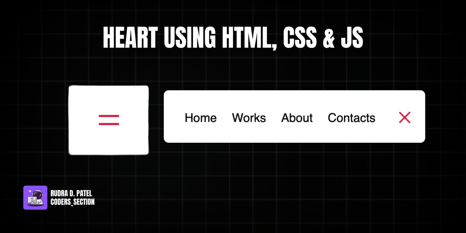
This project demonstrates a sleek and interactive animated navigation menu using HTML, CSS, and a touch of JavaScript. It features a compact navigation bar with a hamburger icon that, when clicked, expands to reveal a list of navigation links. The links themselves animate into view with a subtle rotation, and the hamburger icon transforms into a close icon. This creates a modern and user-friendly navigation experience, especially suitable for responsive designs.
The design uses a clean white background for the navigation bar, contrasting with a dark body background. The core of the effect relies on CSS `transition` and `transform` properties to smoothly animate the width of the navigation bar, the rotation of the menu links, and the transformation of the hamburger icon. JavaScript is used to toggle a single `active` class on the `nav` element, which then triggers all the CSS animations. This project is an excellent example of combining HTML structure, advanced CSS animations, and minimal JavaScript for a highly interactive and visually appealing navigation component.
The HTML structure for this animated navigation is straightforward, designed to be accessible and easily expandable. It consists of a `nav` element with the ID `nav` and an `aria-label` for accessibility. Inside the `nav`, there's an unordered list (`ul`) with the class `nav-list`, containing four list items (`li`), each with a `nav-item` class and an anchor tag (`a`) with `nav-link` class for the menu items ("Home", "Works", "About", "Contact"). Following the navigation list, there's a `button` with the class `icon` and ID `toggle`, which acts as the hamburger/close icon. This button contains two `div` elements with classes `line line1` and `line line2` that form the lines of the hamburger icon. A `script` tag links to an external JavaScript file (`app.js`) to handle the toggling functionality. This structure provides a clear and semantic foundation for applying the CSS animations and JavaScript interactivity.
<!DOCTYPE html>
<html lang="en">
  <head>
    <meta charset="UTF-8" />
    <meta http-equiv="X-UA-Compatible" content="IE=edge" />
    <meta name="viewport" content="width=device-width, initial-scale=1.0" />
    <title>Animated Navigation</title>
    <link rel="stylesheet" href="style.css" />
  </head>
  <body>
    <nav id="nav" aria-label="Main navigation">
      <ul class="nav-list">
        <li class="nav-item"><a href="#home" class="nav-link">Home</a></li>
        <li class="nav-item"><a href="#works" class="nav-link">Works</a></li>
        <li class="nav-item"><a href="#about" class="nav-link">About</a></li>
        <li class="nav-item"><a href="#contact" class="nav-link">Contact</a></li>
      </ul>

      <button class="icon" id="toggle" aria-label="Toggle navigation" aria-expanded="false">
        <div class="line line1"></div>
        <div class="line line2"></div>
      </button>
    </nav>

    <script src="app.js"></script>
  </body>
</html>
The CSS for this animated navigation controls its appearance, expansion, and the animation of its elements. The `body` is styled to center the navigation. The `nav` element is initially compact with a fixed `width`, `padding`, white `background`, `border-radius`, and `box-shadow`. It uses `display: flex` to arrange its content and has a `transition` for its `width`. When the `nav` has the `active` class, its `width` expands to `350px`. The `ul` (navigation list) initially has `width: 0` and `opacity: 0`, and its `transition` ensures smooth expansion. When `nav.active`, the `ul` expands to `width: 100%` and its `li` elements become `opacity: 1` and rotate `360deg` (`transform: rotateY(360deg)`), creating the animated appearance of links. The `.icon` button contains two `.line` elements that form the hamburger icon. These lines are absolutely positioned and have a `transition` for their `transform`. When `nav.active`, `.line1` and `.line2` rotate and translate to form an "X" shape, effectively transforming the hamburger into a close icon. This comprehensive CSS setup delivers a fluid and responsive animated navigation experience.
* {
  box-sizing: border-box;
  margin: 0;
  padding: 0;
}

body {
  font-family: sans-serif;
  display: flex;
  justify-content: center;
  align-items: center;
  height: 100vh;
  margin: 0;
}

nav {
  background: #fff;
  padding: 20px;
  width: 80px;
  display: flex;
  justify-content: center;
  align-items: center;
  border-radius: 3px;
  box-shadow: 0 2px 5px rgba(0, 0, 0, 0.3);
  transition: width 0.6s linear;
}

nav.active {
  width: 350px;
}

ul {
  display: flex;
  list-style: none;
  padding: 0;
  margin: 0;
  width: 0;
  transition: width 0.6s linear;
}

nav.active ul {
  width: 100%;
}

nav ul li {
  transform: rotate(0deg);
  opacity: 0;
  transition: transfrom 0.6s linear, opacity 0.6s linear;
}

nav.active ul li {
  opacity: 1;
  transform: rotateY(360deg);
}

nav ul a {
  position: relative;
  color: #000;
  text-decoration: none;
  margin: 0 10px;
}

.icon {
  background: #fff;
  border: 0;
  padding: 0;
  position: relative;
  height: 30px;
  width: 30px;
  outline: none;
  cursor: pointer;
}

.icon .line {
  background: crimson;
  height: 2px;
  width: 20px;
  position: absolute;
  top: 10px;
  left: 5px;
  transition: transfrom 0.6s linear;
}

.icon .line2 {
  top: auto;
  bottom: 10px;
}

nav.active .icon .line1 {
  transform: rotate(-765deg) translateY(5.5px);
}

nav.active .icon .line2 {
  transform: rotate(765deg) translateY(-5.5px);
}
The JavaScript for this project is minimal and solely responsible for toggling the navigation menu's active state. It selects the `toggle` button and the `nav` element from the DOM. An event listener is added to the `toggle` button: when clicked, it simply toggles the `active` class on the `nav` element. This single line of JavaScript is powerful, as all the complex animation logic is handled by the CSS transitions and transformations based on the presence or absence of this `active` class. This approach keeps the JavaScript lightweight and focused on interaction, while CSS manages the visual effects, promoting a clear separation of concerns.
const toggle = document.getElementById("toggle");
const nav = document.getElementById("nav");

toggle.addEventListener("click", () => nav.classList.toggle("active"));
Watch a live demonstration of the Animated Navigation below.
This Animated Navigation project provides a modern, responsive, and visually appealing menu solution for web applications. By utilizing CSS transitions and transformations, combined with minimal JavaScript for state toggling, it delivers a smooth and engaging user experience. The transformation of the hamburger icon into a close icon adds a professional touch, making it an ideal choice for mobile-first designs or any website seeking a dynamic navigation component. This approach emphasizes performance and maintainability by offloading complex animations to CSS.
You can easily customize this component by:
For more complex navigation patterns or when dealing with a large number of menu items, consider implementing a "skip to content" link for accessibility. This allows users navigating with keyboards or screen readers to bypass the navigation and jump directly to the main content, improving usability.
Click the button below to download the full source code. Download will be ready in 10 seconds.
Receive coding tips and resources updates. No spam.
We respect your privacy. Unsubscribe at any time.