Feature Coming Soon!
The newsletter functionality is under development.
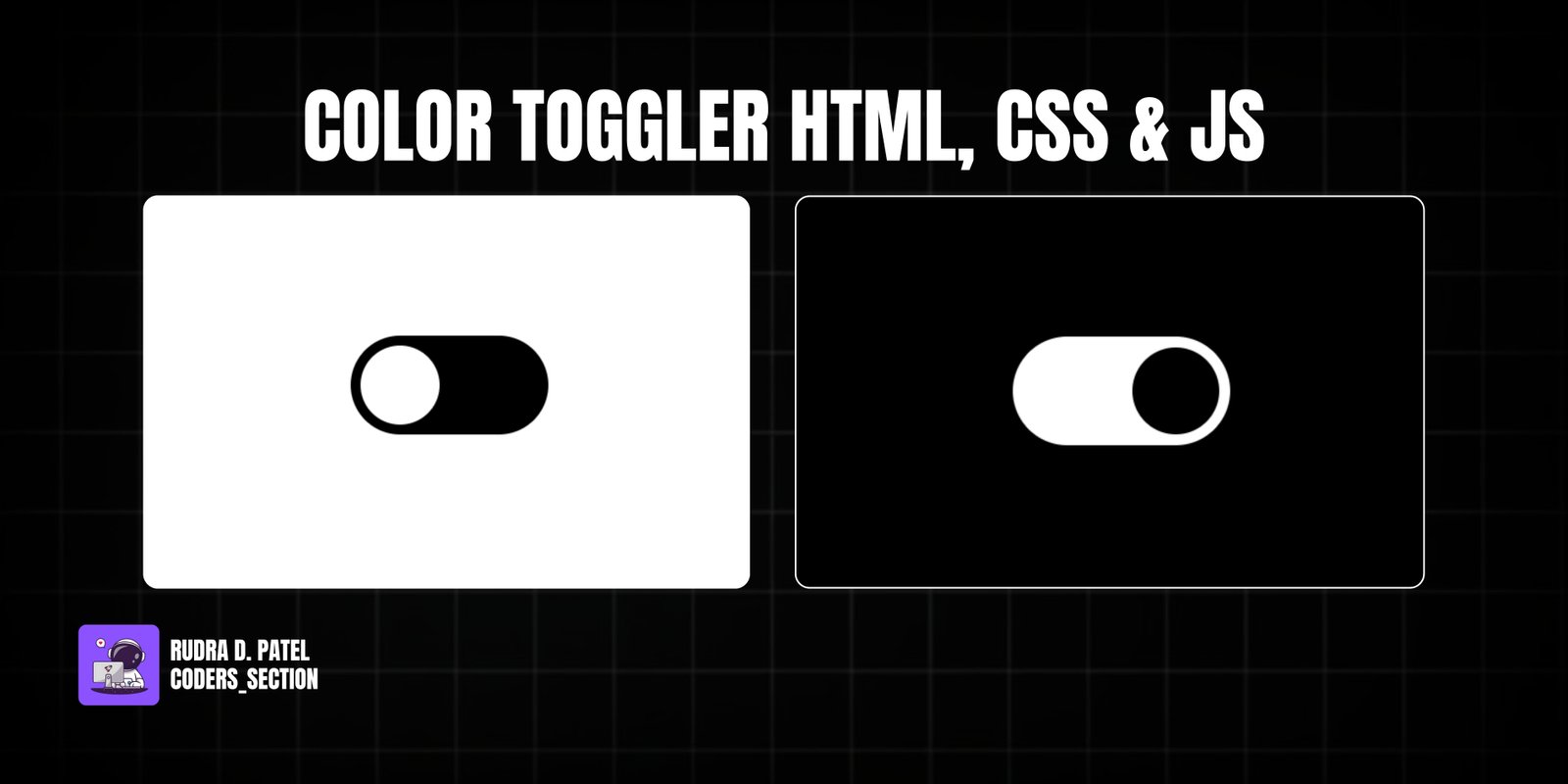
This project demonstrates a simple yet effective color toggler using HTML, CSS, and JavaScript. It features a custom-styled toggle switch that, when activated, changes the background color of the entire page between two distinct themes (e.g., light and dark). This functionality is crucial for providing users with a personalized browsing experience and is a common feature in modern web applications.
The design uses a clean and minimalist approach for the toggle switch itself, ensuring it is intuitive to use. The core of the effect relies on CSS variables to define the primary and secondary colors for both the background and the toggle switch elements. JavaScript handles the click event on the toggle switch, dynamically changing the `backgroundColor` of the `body` element based on the switch's checked state. This project is an excellent example of combining HTML structure, CSS variables for theming, and simple JavaScript for interactive UI elements.
The HTML structure for this color toggler is concise and semantic, focusing on the toggle switch itself. It consists of a `div` with the class `theme-switcher` as the main container. Inside this `div`, there's an `input` element of `type="checkbox"` with the ID `color-switch` and class `theme-toggle`. This checkbox is visually hidden (`visibility: hidden`) but serves as the functional control. A `label` element, associated with the checkbox using `for="color-switch"`, is styled to create the visual toggle switch. This label also has `aria-hidden="true"` as its visual representation is for the hidden checkbox. A `script` tag links to an external JavaScript file (`app.js`) to handle the color-changing logic. This structure provides a clear and accessible foundation for the interactive color toggler.
<!DOCTYPE html>
<html lang="en">
  <head>
    <meta charset="UTF-8" />
    <meta http-equiv="X-UA-Compatible" content="IE=edge" />
    <meta name="viewport" content="width=device-width, initial-scale=1.0" />
    <title>Color Toggler</title>
    <link rel="stylesheet" href="style.css" />
  </head>
  <body>
    <div class="theme-switcher">
      <input
        type="checkbox"
        id="color-switch"
        class="theme-toggle"
        aria-label="Toggle color theme"
      />
      <label
        for="color-switch"
        class="toggle-btn"
        aria-hidden="true"
      ></label>
    </div>

    <script src="app.js"></script>
  </body>
</html>
The CSS for this color toggler defines the visual appearance of the toggle switch and the dynamic theme changes. Root variables (`--primary-color`, `--primary-label`, etc.) are used to manage colors, making it easy to switch themes. The `body` is positioned absolutely to center the toggle switch and its background color is controlled by the `--primary-color` variable. The `input[type="checkbox"]` is hidden. The `label` element is styled as the visible toggle switch: it has a `width`, `height`, `background` color (`--primary-label`), `border-radius`, and `position: relative`. The `::after` pseudo-element creates the movable "ball" within the toggle, with its own `width`, `height`, `border-radius`, `background-color` (`--white-ball`), and `position: absolute`. Both the `label` and `label::after` have `transition: 0.5s` for smooth animations. When the checkbox is `:checked`, the `label::after`'s `background-color` changes to `--black-ball`, and its `left` and `transform` properties move it to the right side of the toggle. Simultaneously, the `label`'s `background-color` changes to `--secondary-label`. An `active:after` state provides a subtle "squish" effect on click. This combination of CSS features creates a responsive and visually appealing color toggler.
:root {
  --primary-color: white;
  --primary-label: black;
  --secndary-label: white;
  --white-ball: white;
  --black-ball: black;
}

body {
  background: var(--primary-color);
  position: absolute;
  top: 50%;
  left: 50%;
  transform: translate(-50%, -50%);
}

#switch {
  width: 0;
  height: 0;
  visibility: hidden;
}

label {
  display: block;
  width: 100px;
  height: 50px;
  background: var(--primary-label);
  border-radius: 100px;
  position: relative;
  cursor: pointer;
  transition: 0.5s;
}

label::after {
  content: "";
  width: 40px;
  height: 40px;
  border-radius: 70px;
  background-color: var(--white-ball);
  position: absolute;
  top: 5px;
  left: 5px;
  transition: 0.5s;
}

#switch:checked + label:after {
  background-color: var(--black-ball);
  left: calc(100% - 5px);
  transform: translateX(-100%);
}

#switch:checked + label {
  background-color: var(--secndary-label);
}

label:active:after {
  width: 60px;
}
The JavaScript for this project handles the core functionality of changing the page's background color based on the toggle switch's state. It selects the `toggler` element (the hidden checkbox) by its ID. An event listener is added to this `toggler`: when clicked, it checks the `checked` property of the checkbox. If `toggler.checked` is `true`, the `document.body.style.backgroundColor` is set to "black" (for dark mode); otherwise, it's set to "white" (for light mode). This uses a ternary operator for a concise conditional assignment. This script effectively synchronizes the visual state of the toggle switch with the overall page theme, providing a dynamic and interactive user experience.
let toggler = document.getElementById("switch");

toggler.addEventListener("click", () => {
  //   if (toggler.checked === true) {
  //     document.body.style.backgroundColor = "black";
  //   } else {
  //     document.body.style.backgroundColor = "white";
  //   }

  toggler.checked === true
    ? (document.body.style.backgroundColor = "black")
    : (document.body.style.backgroundColor = "white");
});
Watch a live demonstration of the Color Toggler below.
This Color Toggler project provides a practical and visually appealing way to implement theme switching on a webpage. By combining HTML for the toggle structure, CSS for its styling and animations, and simple JavaScript for the dynamic background change, it creates a responsive and user-friendly feature. This component is highly versatile and can be easily integrated into various web projects to offer users a personalized viewing experience.
You can easily customize this component by:
For more robust theme switching, instead of directly changing `document.body.style.backgroundColor`, consider adding and removing a class (e.g., `dark-mode`) to the `body` element. Then, define all your light and dark mode styles within these classes in your CSS. This approach makes your CSS more organized and easier to manage for complex themes, and allows for more than just background color changes.
Click the button below to download the full source code. Download will be ready in 10 seconds.
Receive coding tips and resources updates. No spam.
We respect your privacy. Unsubscribe at any time.