Feature Coming Soon!
The newsletter functionality is under development.
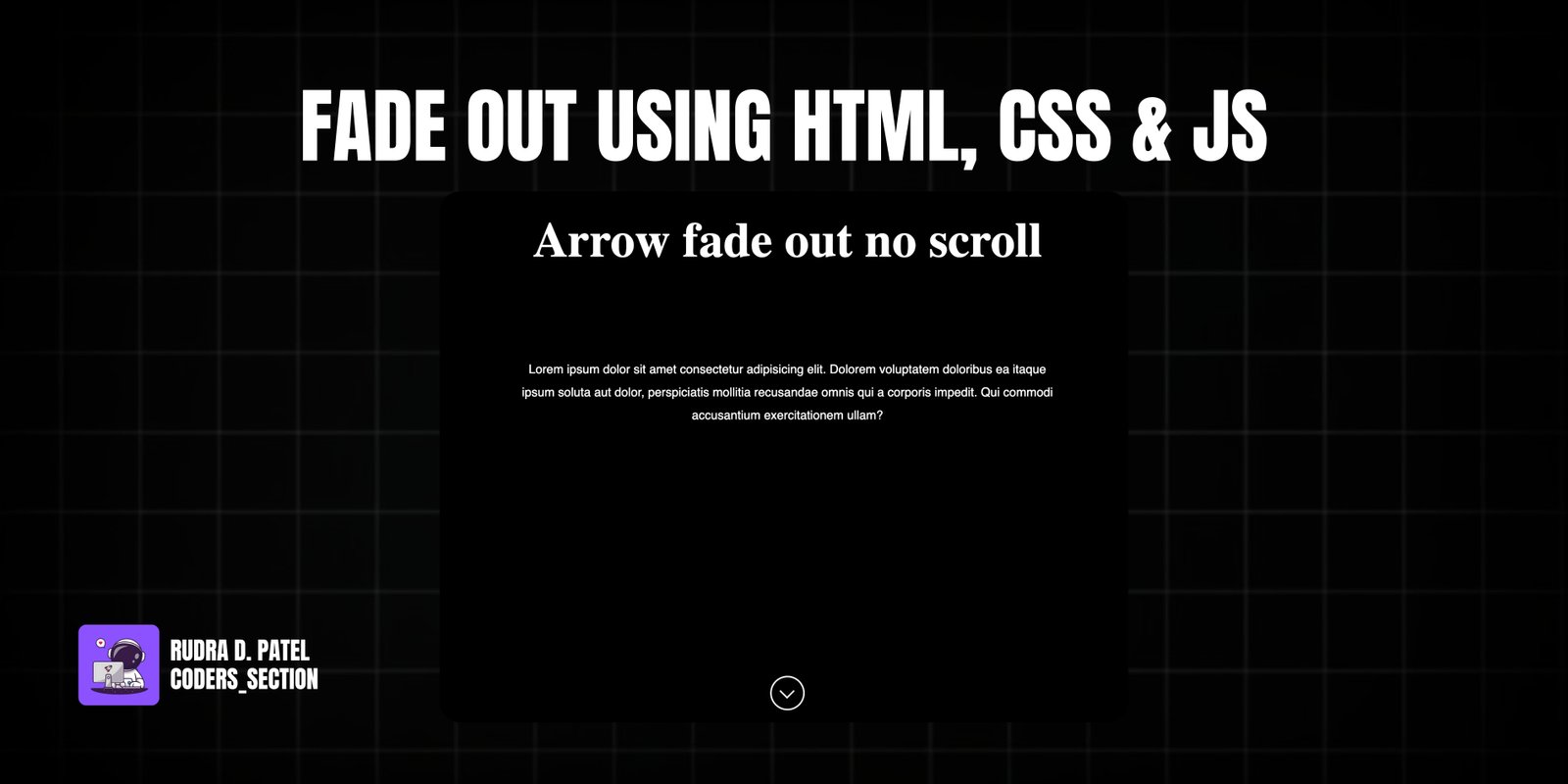
This project demonstrates a subtle yet effective "Arrow Fade Out" animation using HTML, CSS, and JavaScript. It features a main content area with a heading and description, and a visually animated arrow at the bottom of the screen. The arrow is designed to fade out as the user scrolls down the page, providing a visual cue that more content is available without being obtrusive.
The design uses a dark background to make the white text and arrow stand out, creating a sleek and modern aesthetic. The core of the functionality lies in JavaScript, which listens for scroll events and dynamically applies CSS classes (`fade-in` and `fade-out`) to the arrow based on the scroll position. CSS is used to define the appearance of the arrow (a circular element with a triangular pseudo-element to form the arrow shape) and to implement the bouncing animation and fade transitions. This project is an excellent example of combining HTML structure, CSS animations, and JavaScript event listeners for interactive UI elements that enhance user navigation.
The HTML structure for this fading arrow animation is straightforward. It is contained within a `main` element with the class `fade-container`. Inside, there are two `section` elements: `content-section` and `arrow-section`. The `content-section` contains a `div` with a `mainHeading` and a `subHeading` (a `p` element with `id="subHeading"`) for the main text content. The `arrow-section` contains a `div` with `id="arrow"` and the class `arrow`, which will be styled as the fading arrow. Both the `subHeading` and `arrow` elements have `aria-label` for accessibility. A `script` tag links to an external JavaScript file (`app.js`) to handle the fade-out logic. This structure provides a clear separation of content and the animated arrow element.
<!DOCTYPE html>
<html lang="en">
  <head>
    <meta charset="UTF-8" />
    <meta http-equiv="X-UA-Compatible" content="IE=edge" />
    <meta name="viewport" content="width=device-width, initial-scale=1.0" />
    <title>Fade Out</title>
    <link rel="stylesheet" href="style.css" />
  </head>
  <body>
    <main class="fade-container">
      <section class="content-section">
        <div class="text-group">
          <h1 id="mainHeading" class="main-heading">Arrow fade out no scroll</h1>
          <p
            id="subHeading"
            class="sub-heading"
            aria-label="Description text"
          >
            Lorem ipsum dolor sit amet consectetur adipisicing elit. Dolorem
            voluptatem doloribus ea itaque ipsum soluta aut dolor, perspiciatis
            mollitia recusandae omnis qui a corporis impedit. Qui commodi
            accusantium exercitationem ullam?
          </p>
        </div>
      </section>

      <section class="arrow-section">
        <div
          id="arrow"
          class="arrow"
          aria-label="Fading arrow indicator"
        ></div>
      </section>
    </main>

    <script src="app.js"></script>
  </body>
</html>
The CSS for this project styles the main content and the animated fading arrow. The `body` is set to a `height` of `200vh` to enable scrolling, with a black background. The `.container` (likely a typo for a wrapper around the text content) centers its content and sets text color to white. The `h1` and `.sub-headings` (likely a typo for the `p` element) are styled for prominence and readability. The `.arrow` element is crucial: it's positioned absolutely at the bottom, styled as a white circular border, and includes a pseudo-element (`:before`) to create the arrow shape. The arrow has a `transition` for smooth fading and an `animation` named `bounce` that makes it move up and down. The `@keyframes bounce` defines this animation. Finally, `.fade-in` and `.fade-out` classes are defined with `opacity` and `transition` properties to control the arrow's visibility based on scroll position.
* {
  box-sizing: border-box;
  margin: 0;
  padding: 0;
}

html,
body {
  width: 100%;
  height: 200vh;
  background: #000;
}

.container {
  display: flex;
  flex-direction: column;
  justify-content: center;
  align-items: center;
  color: #fff;
}

.sub-headings {
  max-width: 700px;
  text-align: center;
  margin: 20px;
  font-family: sans-serif;
  line-height: 30px;
}

h1 {
  margin-top: 50px;
  color: #fff;
  text-align: center;
  font-size: 4rem;
  margin-bottom: 6rem;
}

.arrow {
  width: 45px;
  height: 45px;
  border: 2px solid white;
  border-radius: 50%;
  position: absolute;
  bottom: 30px;
  margin: auto;
  transition: ease-in;
  animation: bounce 1.5s infinite;
}

.arrow:before {
  content: "";
  position: absolute;
  top: 11px;
  left: 13px;
  width: 12px;
  height: 12px;
  border-left: 2px solid #fafafa;
  border-bottom: 2px solid #fafafa;
  transform: rotate(-45deg);
}

@keyframes bounce {
  0% {
    transform: translate(0);
  }
  20% {
    transform: translateY(15px);
  }
  40% {
    transform: translate(0);
  }
}

@-webkit-keyframes bounce {
  0% {
    transform: translate(0);
  }
  20% {
    transform: translateY(15px);
  }
  40% {
    transform: translate(0);
  }
}

.fade-in {
  opacity: 1;
  transition: 1s all ease-in;
}

.fade-out {
  opacity: 0;
  transition: 1s all ease-out;
}
The JavaScript for this project controls the fading behavior of the arrow based on scroll position. It first selects the arrow element by its `id="arrow"`. An event listener is attached to the `window` for the `scroll` event. This listener continuously checks the `window.scrollY` position. If the scroll position is less than or equal to `5` (meaning the user is near the top of the page), it toggles the `fade-in` and `fade-out` classes on the arrow. This effectively makes the arrow visible when at the top and hides it as the user scrolls down, providing a subtle visual cue for scrolling.
let arrow = document.getElementById("arrow");

window.addEventListener("scroll", () => {
  let position = window.scrollY;
  // console.log(position);
  if (position <= 5) {
    arrow.classList.toggle("fade-in");
    arrow.classList.toggle("fade-out");
  }
});
Watch a live demonstration of the Arrow Fade Out animation below.
This "Arrow Fade Out" project demonstrates a simple yet effective way to guide user interaction on a web page using subtle animations. By combining HTML for structure, CSS for styling and animation, and JavaScript for scroll-based interactivity, it creates a polished user experience. This technique is particularly useful for single-page websites or long-scrolling content where you want to encourage users to explore more without distracting them.
You can easily customize this component by:
For better performance on scroll events, especially for complex animations, consider debouncing or throttling the `scroll` event listener. This limits how often the function executes, preventing potential jank and ensuring a smoother user experience, particularly on less powerful devices.
Click the button below to download the full source code. Download will be ready in 10 seconds.
Receive coding tips and resources updates. No spam.
We respect your privacy. Unsubscribe at any time.