Feature Coming Soon!
The newsletter functionality is under development.
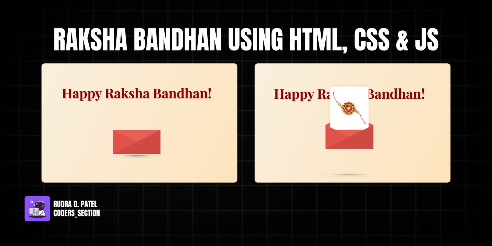
This project is a heartwarming, digital greeting card created especially for Raksha Bandhan. It features a beautifully animated envelope that opens on hover to reveal a special message and a Rakhi. To make the experience more magical, the background has a dynamic, iridescent trail that follows the user's mouse movements.
It's a perfect example of how to combine elegant design with interactive animations to create a memorable and personal web experience. The project uses pure CSS for the envelope animation and JavaScript with HTML Canvas for the background effect, making it lightweight and performant.
The HTML is structured with a canvas for the background effect and a main container for the animated letter, which includes nested divs for each part of the envelope.
<!DOCTYPE html>
<html lang="en">
<head>
    <meta charset="UTF-8">
    <title>Happy Raksha Bandhan</title>
    <link rel="stylesheet" href="style.css">
</head>
<body>
    <canvas id="mouseTrackCanvas"></canvas>

    <div class="main-message">Happy Raksha Bandhan!</div>

    <div class="letter-image">
        <div class="animated-mail">
            <div class="back-fold"></div>
            <div class="letter">
                <img src="..." alt="Rakhi" class="rakhi-img">
            </div>
            <div class="top-fold"></div>
            <div class="body"></div>
            <div class="left-fold"></div>
        </div>
        <div class="shadow"></div>
    </div>

    <script src="script.js"></script>
</body>
</html>
CSS handles the entire envelope animation. We use transitions and transforms on hover to lift the envelope, rotate the flap, and reveal the letter. The shadow also expands and fades to create a realistic lifting effect.
body {
    height: 100vh;
    display: flex;
    flex-direction: column; /* Changed to column to stack title and mail */
    align-items: center;
    justify-content: center;
    position: relative; /* For absolute positioning of canvas */
    background-color: #f7f3e9; /* Fallback background color for body */
    font-family: 'Lora', serif;
    overflow: hidden;
    color: #4a2c2a; /* Default text color */
}

/* Canvas for the mouse tracking animation */
#mouseTrackCanvas {
    position: absolute;
    top: 0;
    left: 0;
    width: 100%;
    height: 100%;
    z-index: 0; /* Ensures it's behind the content */
    pointer-events: none; /* Allows mouse events to pass through to elements beneath */
}

/* Styling for the "Happy Raksha Bandhan" title */
.main-message {
    font-family: 'Playfair Display', serif;
    font-size: clamp(2rem, 5vw, 3.5rem); /* Responsive font size */
    color: #8b0000; /* Rich red */
    margin-bottom: 40px; /* Space between message and mail */
    text-shadow: 2px 2px 4px rgba(0,0,0,0.1);
    opacity: 0;
    animation: fadeInText 1s ease-out forwards; /* Fade in animation */
    animation-delay: 0.2s; /* Appear shortly after page load */
    text-align: center;
    padding: 0 20px; /* Padding for small screens */
    position: relative; /* Ensure it's above the canvas */
    z-index: 2;
}

@keyframes fadeInText {
    from { opacity: 0; transform: translateY(-20px); }
    to { opacity: 1; transform: translateY(0); }
}

/* Styles for the main mail container */
.letter-image {
    position: relative;
    width: 200px;
    height: 200px;
    cursor: pointer;
    perspective: 1000px; /* For 3D transformations */
    z-index: 2; /* Ensure it's above the canvas */
}

/* Styles for the animated mail envelope */
.animated-mail {
    position: absolute;
    height: 150px;
    width: 200px;
    top: 50%;
    left: 50%;
    transform: translate(-50%, -50%);
    transition: transform .4s ease-out; /* Smooth transition for mail lift */
}

.animated-mail .body {
    position: absolute;
    bottom: 0;
    width: 0;
    height: 0;
    border-style: solid;
    border-width: 0 0 100px 200px;
    border-color: transparent transparent #cf4a43 transparent; /* Base envelope color */
    z-index: 2;
}

.animated-mail .top-fold {
    position: absolute;
    top: 50px;
    width: 0;
    height: 0;
    border-style: solid;
    border-width: 50px 100px 0 100px;
    transform-origin: 50% 0%;
    transition: transform .4s .4s ease-out, z-index .2s .4s;
    border-color: #e95f55 transparent transparent transparent; /* Flap color */
    z-index: 2;
}

.animated-mail .back-fold {
    position: absolute;
    bottom: 0;
    width: 200px;
    height: 100px;
    background: #e95f55; /* Back of envelope */
    z-index: 0;
}

.animated-mail .left-fold {
    position: absolute;
    bottom: 0;
    width: 0;
    height: 0;
    border-style: solid;
    border-width: 50px 0 50px 100px;
    border-color: transparent transparent transparent #e15349; /* Side flap color */
    z-index: 2;
}

/* The letter/content that appears inside */
.animated-mail .letter {
    left: 20px; /* Offset to center within envelope */
    bottom: 0px;
    position: absolute;
    width: 160px; /* Width of the letter */
    height: 60px; /* Initial hidden height */
    background: white;
    z-index: 1;
    overflow: hidden; /* Hide content when letter is small */
    transition: height .6s .2s ease-out, transform .6s .2s ease-out; /* Slower, smoother reveal */
    display: flex; /* Use flexbox for centering content */
    align-items: center;
    justify-content: center;
    flex-direction: column; /* Stack contents vertically */
    box-shadow: 0 0 10px rgba(0,0,0,0.1); /* Subtle shadow for the letter */
    border-radius: 8px; /* Rounded corners for the letter */
}

/* Rakhi image styling within the letter */
.rakhi-img {
    width: 90%; /* Responsive width */
    height: auto; /* Maintain aspect ratio */
    max-height: 90%; /* Ensure it doesn't overflow */
    object-fit: contain; /* Contain the image within its bounds */
    opacity: 0; /* Start hidden */
    transition: opacity 0.5s ease-in 0.8s, transform 0.5s ease-in 0.8s; /* Fade in and scale */
    transform: scale(0.7); /* Start smaller */
    transform-origin: center center;
    animation: rakhiPulse 2s ease-in-out infinite alternate; /* Gentle pulse */
}

/* Keyframe for Rakhi gentle pulse */
@keyframes rakhiPulse {
    from { transform: scale(0.95); }
    to { transform: scale(1.05); }
}

/* Shadow under the mail */
.shadow {
    position: absolute;
    top: calc(50% + 75px); /* Position below the mail, relative to letter-image center */
    left: 50%;
    width: 200px; /* Initial width */
    height: 15px; /* Thinner shadow */
    transition: width .4s ease-out, opacity .4s ease-out, top .4s ease-out;
    transform: translateX(-50%);
    border-radius: 100%;
    background: radial-gradient(rgba(0,0,0,0.4), rgba(0,0,0,0.0), rgba(0,0,0,0.0));
    opacity: 1;
    z-index: 2; /* Ensure it's above the canvas */
}

/* Hover effects */
.letter-image:hover {
    .animated-mail {
        transform: translate(-50%, -100px); /* Lift the mail higher */
    }

    .animated-mail .top-fold {
        transition: transform .4s ease-out, z-index .2s;
        transform: rotateX(180deg);
        z-index: 0; /* Send behind the letter */
    }

    .animated-mail .letter {
        height: 180px; /* Full height of the letter */
        transform: translateY(-80px); /* Move letter up as it 'comes out' */
    }

    .rakhi-img {
        opacity: 1; /* Fade in Rakhi */
        transform: scale(1); /* Return to original size */
    }

    .shadow {
        width: 250px; /* Shadow spreads out */
        opacity: 0.6; /* Shadow lightens */
        top: calc(50% + 150px); /* Shadow moves down with lifted mail */
    }
}

/* Responsive adjustments */
@media (max-width: 480px) {
    .main-message {
        font-size: clamp(1.5rem, 7vw, 2.5rem);
        margin-bottom: 20px;
    }
    .letter-image {
        width: 160px;
        height: 160px;
    }
    .animated-mail {
        height: 120px;
        width: 160px;
    }
    .animated-mail .body {
        border-width: 0 0 80px 160px;
    }
    .animated-mail .top-fold {
        top: 40px;
        border-width: 40px 80px 0 80px;
    }
    .animated-mail .back-fold {
        width: 160px;
        height: 80px;
    }
    .animated-mail .left-fold {
        border-width: 40px 0 40px 80px;
    }
    .animated-mail .letter {
        left: 15px;
        width: 130px;
        height: 50px;
    }
    .letter-image:hover .animated-mail {
        transform: translate(-50%, -80px);
    }
    .letter-image:hover .animated-mail .letter {
        height: 140px;
        transform: translateY(-60px);
    }
    .shadow {
        top: calc(50% + 60px);
        width: 180px;
        height: 10px;
    }
    .letter-image:hover .shadow {
        width: 200px;
        top: calc(50% + 110px);
    }
}
JavaScript creates the interactive background. It listens for mouse movements and draws a trail of expanding, fading particles on an HTML Canvas, using `globalCompositeOperation = 'lighter'` for a beautiful glowing effect.
const canvas = document.getElementById('mouseTrackCanvas');
const ctx = canvas.getContext('2d');
let mouseX = 0;
let mouseY = 0;
let trail = []; // Changed to 'let' to allow reassignment during filter
const maxTrailLength = 150; // More particles for a continuous wave effect
const initialParticleSize = 5; // Start particles small
const particleExpandRate = 0.8; // How fast particles expand
const particleFadeRate = 0.008; // How fast particles fade out (slower)
const gradientColors = [
'hsla(330, 80%, 90%, 0.05)', // Light pinkish
'hsla(210, 80%, 90%, 0.05)', // Light bluish
'hsla(50, 80%, 90%, 0.05)' // Light yellowish
];
// Set canvas dimensions
function resizeCanvas() {
canvas.width = window.innerWidth;
canvas.height = window.innerHeight;
}
// Update mouse coordinates on move
window.addEventListener('mousemove', (e) => {
mouseX = e.clientX;
mouseY = e.clientY;
// Add new particle with initial small size and full opacity
trail.push({ x: mouseX, y: mouseY, size: initialParticleSize, opacity: 1 });
});
// Animation loop for the wavy trail
function animateTrail() {
// Clear canvas completely to prevent artifacting from lighter composite operation
ctx.clearRect(0, 0, canvas.width, canvas.height);
// Draw a subtle, static background layer
const bgGradient = ctx.createLinearGradient(0, 0, canvas.width, canvas.height);
bgGradient.addColorStop(0, '#f7f3e9'); // Soft cream
bgGradient.addColorStop(1, '#ffe0b2'); // Light peach
ctx.fillStyle = bgGradient;
ctx.fillRect(0, 0, canvas.width, canvas.height);
// Update and draw trail particles/segments
for (let i = 0; i < trail.length; i++) {
const p = trail[i];
p.opacity -= particleFadeRate; // Fade out gradually
p.size += particleExpandRate; // Expand over time
p.opacity = Math.max(0, p.opacity); // Ensure opacity doesn't go below 0
if (p.opacity > 0) {
ctx.save();
ctx.globalAlpha = p.opacity;
ctx.globalCompositeOperation = 'lighter'; // Key for the glowing, overlapping, iridescent effect
// Create a radial gradient for each particle for a soft glow
const colorIndex = i % gradientColors.length;
const baseColor = gradientColors[colorIndex];
const particleGradient = ctx.createRadialGradient(p.x, p.y, p.size * 0.1, p.x, p.y, p.size);
// Use regex to get rid of the '0.05' alpha for inner colors, making them brighter
particleGradient.addColorStop(0, baseColor.replace(/,\s*0\.\d+\)$/, ', 0.5)')); // Brighter center
particleGradient.addColorStop(0.5, baseColor.replace(/,\s*0\.\d+\)$/, ', 0.2)')); // Mid-opacity
particleGradient.addColorStop(1, baseColor.replace(/,\s*0\.\d+\)$/, ', 0)')); // Transparent edge
ctx.fillStyle = particleGradient;
ctx.beginPath();
ctx.arc(p.x, p.y, p.size, 0, Math.PI * 2);
ctx.fill();
ctx.restore();
}
}
// Remove dead particles and maintain maxTrailLength
trail = trail.filter(p => p.opacity > 0 && p.size < Math.max(canvas.width, canvas.height) / 2); // Also remove if too large
if (trail.length > maxTrailLength) {
trail = trail.slice(trail.length - maxTrailLength);
}
requestAnimationFrame(animateTrail);
}
// Initialize canvas and start animation
window.onload = function() {
resizeCanvas();
animateTrail();
};
// Handle canvas resize
window.addEventListener('resize', resizeCanvas);
Watch a live demonstration of the Raksha Bandhan Greeting Card below.
This interactive greeting card is a wonderful way to blend web development skills with creative expression. It demonstrates how powerful CSS animations can be and how a touch of JavaScript with HTML Canvas can add a layer of dynamic beauty to a project.
You can easily customize this component by:
To make the card pop even more, consider adding a subtle pulsing animation to the Rakhi image once it's revealed. You can achieve this with a simple CSS keyframe animation to make it gently scale up and down, drawing more attention to it.
Click the button below to download the full source code. Download will be ready in 10 seconds.
Receive coding tips and resources updates. No spam.
We respect your privacy. Unsubscribe at any time.