Beginner Level Questions
1. What does CSS stand for?
CSS stands for Cascading Style Sheets.
- Cascading: Means the styles can override each other based on rules (e.g., inline > internal > external).
- Style: Refers to the design or appearance (colors, fonts, spacing).
- Sheets: A document or file where styles are written.
In simple words: CSS is used to style your website and make it look beautiful.
2. What is the main purpose of CSS?
The main purpose of CSS is to control how your website looks. It is used for:
- Changing colors, fonts, and text size
- Adding spacing, margins, and padding
- Making layouts and designs responsive
- Controlling how your site looks on mobile and desktop
Without CSS, your site will look plain, like black text on a white background.
3. How do you link a CSS file to HTML?
To connect your external CSS file (e.g., style.css) to your HTML, use the <link> tag inside the <head> section:
<!DOCTYPE html>
<html>
<head>
    <title>My Website</title>
    <link rel="stylesheet" href="style.css">
</head>
<body>
    <h1>Hello World</h1>
</body>
</html>
href="style.css" points to your CSS file.rel="stylesheet" tells the browser this is a style file.
4. What are the 3 types of CSS?
There are three main ways to apply CSS:
a. Inline CSS
- Styles are written directly in the HTML element using the
style attribute.
<h1 style="color: red;">Hello</h1>
b. Internal CSS
- Styles are written inside a
<style> tag in the <head> section of the HTML document.
<head>
    <style>
        h1 {
            color: blue;
        }
    </style>
</head>
c. External CSS
- Styles are written in a separate
.css file and linked to the HTML document using the <link> tag.
/* style.css */
h1 {
    color: green;
}
5. How do you write an internal CSS rule?
You write internal CSS by using the <style> tag in the <head> section of HTML:
<head>
    <style>
        p {
            font-size: 18px;
            color: gray;
        }
    </style>
</head>
This style will apply to all <p> tags in the document.
6. How do you add inline CSS?
Inline CSS is added directly to an HTML tag using the style attribute.
<p style="color: red; font-size: 16px;">This is red text.</p>
Not recommended for large projects, but good for quick, specific changes.
7. What is a selector in CSS?
A selector tells the browser which HTML element(s) to style.
h1 {
    color: blue;
}
h1 is the selector.color: blue; is the declaration (property and value).
Types of selectors:
- Tag selector:
h1, p, div (selects all elements of that type)
- Class selector:
.myclass (selects elements with a specific class)
- ID selector:
#myid (selects a single element with a specific ID)
8. How do you comment in CSS?
CSS comments start with /* and end with */. They are not shown on the website.
/* This is a comment */
p {
    color: black;
}
Use comments to explain your code for better understanding.
9. What is the difference between HTML and CSS?
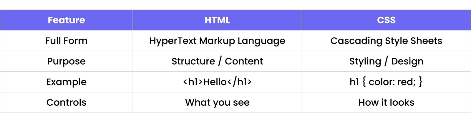
Think of HTML as the skeleton, and CSS as the clothes and style.
10. How do you apply a class to an HTML element?
1. In CSS, you define a class with a . (dot):
.myclass {
    color: purple;
    font-weight: bold;
}
2. In HTML, you use class="myclass":
<p class="myclass">Styled paragraph.</p>
You can apply the same class to multiple elements.
11. How do you apply an ID to an HTML element?
You can apply an ID to an HTML element using the id attribute. An ID must be unique on a page.
HTML
<h2 id="main-heading">Welcome</h2>
CSS
#main-heading {
    color: green;
}
In CSS, the # symbol is used to select the ID.
12. Can multiple classes be added to one element?
Yes, multiple classes can be added by separating them with spaces.
HTML
<div class="box shadow"></div>
CSS
.box {
    width: 100px;
    height: 100px;
}
.shadow {
    box-shadow: 0 10px black;
}
All the styles from both classes will apply to the element.
13. Which is stronger: ID selector or class selector?
The ID selector is stronger than the class selector.
- ID selector uses
#idname and has higher specificity.
- Class selector uses
.classname and has lower specificity.
If both are applied to the same element, the ID selector will override the class selector.
14. What is the universal selector in CSS?
The universal selector is written as *.
It selects all elements on the page and is often used to apply base styles or reset default margins and paddings.
* {
    margin: 0;
    padding: 0;
}
15. What's the difference between `*` and `body` in CSS?
* applies styles to all elements on the page.body applies styles only to the `<body>` tag.
* {
    box-sizing: border-box;
}
body {
    font-family: Arial, sans-serif;
}
The universal selector is more global, while body targets the body section only.
16. How do you change the text color of an element?
Use the color property in CSS to change text color.
p {
    color: blue;
}
This will make all paragraph text blue.
17. How do you change the font of text?
Use the font-family property to specify a font.
p {
    font-family: 'Helvetica', sans-serif;
}
You can provide multiple fonts as fallbacks.
18. How do you make text bold?
Use the font-weight property with a value of bold or a numeric value like 700.
p {
    font-weight: bold;
}
This makes the text bold.
19. How do you underline text?
Use the text-decoration property with the value underline.
p {
    text-decoration: underline;
}
20. How do you make text uppercase?
Use the text-transform property with the value uppercase.
p {
    text-transform: uppercase;
}
This converts all text inside the element to uppercase letters.
21. How do you change line spacing in CSS?
Use the line-height property to adjust the space between lines of text.
p {
    line-height: 1.6;
}
You can use a number (like 1.6) or units like px, em, or %.
22. What is the `text-align` property used for?
The text-align property is used to set the horizontal alignment of text.
Common values:
left - aligns text to the left (default)right - aligns text to the rightcenter - centers the textjustify - stretches the text to fill the container
p {
    text-align: center;
}
23. How do you center text inside a div?
Use the text-align property on the container (div) to center the text inside it.
div {
    text-align: center;
}
This will center any inline content (like text) inside the div.
24. How do you change the background color of an element?
Use the background-color property.
div {
    background-color: lightblue;
}
You can use color names, hex codes (#f0f0f0), RGB, or HSL values.
25. How do you change the text size?
Use the font-size property.
p {
    font-size: 18px;
}
You can use units like px, em, rem, or %.
26. What are `em`, `rem`, and `px` units?
px - Pixels (absolute size). A fixed unit.em - Relative to the font-size of the parent element.rem - Relative to the font-size of the root element (html tag).
p {
    font-size: 1.5em; /* 1.5 times the parent size */
}
html {
    font-size: 16px;
}
h1 {
    font-size: 2rem; /* 2 * 16px = 32px */
}
27. What is the default font-size in most browsers?
The default font size in most browsers is 16 pixels. So, 1rem or 1em usually equals 16px unless changed in the CSS.
28. How do you apply a Google Font in CSS?
- Step 1: Go to Google Fonts and select a font.
- Step 2: Copy the
<link> tag into the HTML <head>.
HTML
<link href="https://fonts.googleapis.com/css2?family=Roboto&display=swap" rel="stylesheet">
- Step 3: Use the font in your CSS:
CSS
body {
    font-family: 'Roboto', sans-serif;
}
29. How do you make italic text in CSS?
Use the font-style property with the value italic.
p {
    font-style: italic;
}
30. What is `letter-spacing`?
The letter-spacing property is used to control the space between characters in text.
p {
    letter-spacing: 2px;
}
Increasing letter-spacing can improve readability or create design effects.
Intermediate Level Questions
31. What is the CSS box model?
The CSS box model describes how every HTML element is a rectangular box made up of four parts:
- Content: The actual text or image inside the element.
- Padding: Space between the content and the border.
- Border: The line surrounding the padding (optional).
- Margin: The space outside the border, between elements.
This model helps you control the size, spacing, and layout of elements.
32. What are the 4 parts of the box model?
- Content – The actual text or image inside the element.
- Padding – Space between the content and the border.
- Border – The line surrounding the padding (optional).
- Margin – The space outside the border, between elements.
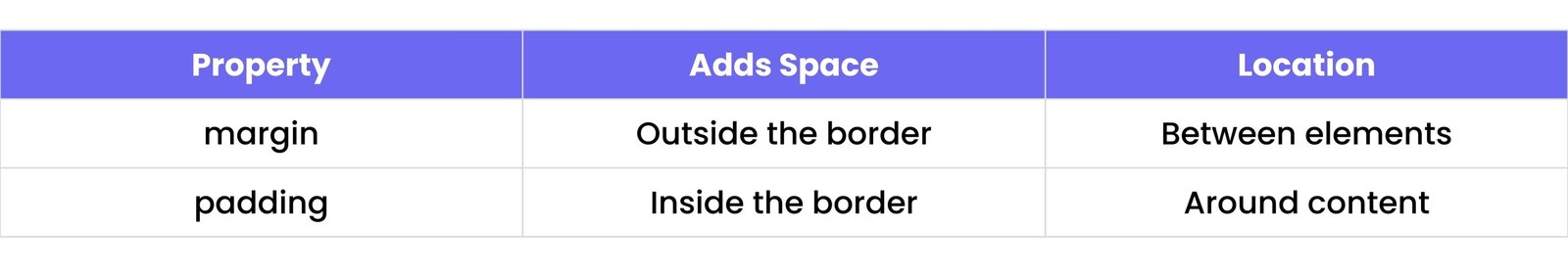
33. What does `margin` do?
margin adds space outside the element’s border. It creates distance between this element and other elements.
div {
    margin: 20px;
}
34. What does `padding` do?
padding adds space inside the element, between the content and the border.
div {
    padding: 10px;
}
35. How do you add space between elements?
Use the margin property to add space between two elements.
p {
    margin-bottom: 15px;
}
This will add space below each paragraph.
36. What is the difference between `margin` and `padding`?
37. How do you apply margin only to the top?
Use the margin-top property.
div {
    margin-top: 30px;
}
You can also use margin-right, margin-bottom, and margin-left.
38. What does `box-sizing: border-box` mean?
By default, width and height only include content.
When you set box-sizing: border-box, it includes padding and border inside the element’s width and height.
* {
    box-sizing: border-box;
}
This helps avoid layout issues where padding and borders add to the total size, making elements wider than intended.
39. How do you set the width and height of a box?
Use the width and height properties in CSS.
div {
    width: 200px;
    height: 150px;
}
You can use px, %, em, rem, or vh/vw units.
40. How do you add a border to an element?
Use the border property. You can specify width, style, and color.
div {
    border: 2px solid black;
}
You can also use:
border-radius for rounded cornersborder-top, border-right, etc., for individual sides
41. What is `border-radius` used for?
It is used to round the corners of a box (element).
div {
    border-radius: 10px;
}
You can make one corner round or all corners. Use border-radius: 50% to make a perfect circle (if width = height).
42. How do you make a circle using CSS?
To create a circle:
- Make sure the
width and height are equal.
- Set
border-radius to 50%.
div {
    width: 100px;
    height: 100px;
    background-color: red;
    border-radius: 50%;
}
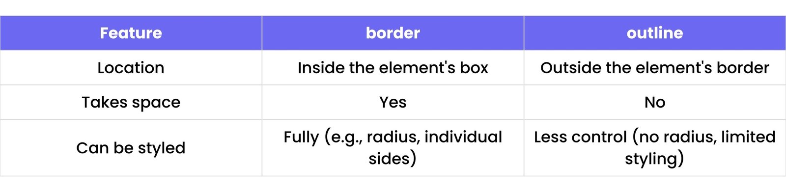
43. What is `outline` in CSS?
An outline is a line drawn outside the border of an element. It's often used to highlight or focus elements (e.g., when you click a button).
button {
    outline: 2px solid blue;
}
44. What’s the difference between `border` and `outline`?
45. How do you remove default margin/padding?
Browsers add default spacing to elements. You can remove it like this:
* {
    margin: 0;
    padding: 0;
}
This resets all elements to start clean.
46. What does `display: block` do?
display: block makes the element a block-level element.
- Takes full width by default.
- Starts on a new line.
div {
    display: block;
}
Examples: <div>, <p>, <h1> are block-level by default.
47. What does `display: inline` do?
display: inline makes the element an inline-level element.
- Takes only as much width as needed.
- Does not start on a new line.
span {
    display: inline;
}
Examples: <span>, <a>, <strong> are inline by default.
48. What is the difference between `inline` and `inline-block`?
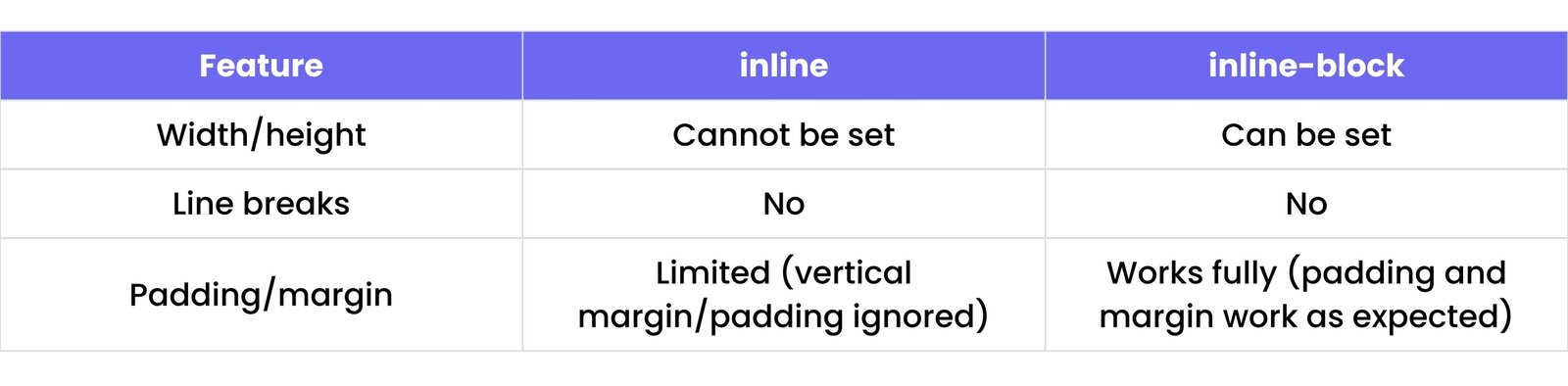
span {
    display: inline-block;
    width: 100px;
    height: 50px;
}
49. What does `display: none` do?
It hides the element completely. The element is removed from the layout and won’t take any space.
p {
    display: none;
}
50. What is `visibility: hidden`?
It hides the element, but space is still reserved for it.
p {
    visibility: hidden;
}
The element is invisible but still takes up space on the page.
51. What does `position: static` mean?
position: static is the default positioning for all elements. It means the element will flow naturally in the page layout based on its position in the HTML.
It is not affected by top, right, bottom, or left properties.
div {
    position: static;
}
52. What’s the use of `position: relative`?
position: relative positions the element relative to its normal position. You can use the top, right, bottom, and left properties to move it from where it would normally be.
div {
    position: relative;
    top: 20px;
    left: 10px;
}
The element will move 20px down and 10px right from its original position.
53. What does `position: absolute` do?
position: absolute removes the element from the normal document flow and positions it relative to the nearest positioned ancestor (an ancestor element with position: relative, absolute, or fixed).
div {
    position: absolute;
    top: 50px;
    left: 100px;
}
The element will be positioned 50px from the top and 100px from the left of its nearest positioned ancestor.
54. What does `position: fixed` do?
position: fixed removes the element from the normal flow and positions it relative to the browser window, so it stays in the same position even when scrolling.
div {
    position: fixed;
    top: 0;
    left: 0;
}
The element will be fixed at the top-left corner of the window, no matter how much you scroll.
55. How does `z-index` work?
The z-index property determines the stacking order of elements along the Z-axis (depth).
- Higher values are in front of lower values.
- It only works on elements that are positioned (
relative, absolute, fixed, sticky).
div {
    position: absolute;
    z-index: 10; /* This div will appear in front of elements with lower z-index */
}
56. What is `overflow` in CSS?
The overflow property controls what happens when content overflows an element's box.
Values:
visible: Content is not clipped and can overflow the box.hidden: Content that overflows is hidden.scroll: Content is clipped, but scrollbars will appear to allow scrolling.auto: Scrollbars appear only if content overflows.
div {
    overflow: hidden;
}
57. How do you create a scrollable container?
To create a scrollable container, set the overflow property to scroll or auto, and specify a fixed height.
div {
    height: 200px;
    overflow: scroll;
}
This creates a container with a scrollbar when content overflows.
58. What’s the default display of `div` and `span`?
- The default display of a
div is block, meaning it takes up the full width of its parent container and starts on a new line.
- The default display of a
span is inline, meaning it takes up only as much width as its content and does not start on a new line.
59. How do you center a div horizontally?
To center a div horizontally, you can set its margin to auto and define a fixed width.
div {
    width: 300px;
    margin: 0 auto;
}
This will center the div horizontally within its parent container.
60. How do you center a div vertically?
To center a div vertically, you can use flexbox or CSS grid.
Using flexbox:
.parent {
    display: flex;
    align-items: center; /* Vertically center */
    justify-content: center; /* Horizontally center */
}
Using grid:
.parent {
    display: grid;
    place-items: center; /* Centers both horizontally and vertically */
}
61. What is Flexbox in CSS?
Flexbox (Flexible Box) is a CSS layout model that allows you to design complex layouts with ease. It enables items in a container to be arranged and aligned in any direction, with flexible sizing. It's especially useful for responsive design.
62. How do you create a flex container?
To create a flex container, set the display property of the container to flex or inline-flex.
.container {
    display: flex;
}
This makes .container a flex container, and its children (flex items) will be aligned using Flexbox properties.
63. What does `justify-content` do?
justify-content controls the alignment of flex items along the main axis (usually horizontally).
Values:
flex-start: Items are aligned to the start of the container.flex-end: Items are aligned to the end of the container.center: Items are centered.space-between: Items are spaced evenly, with the first item at the start and the last item at the end.space-around: Items are spaced evenly with equal space around each item.space-evenly: Items are spaced evenly with equal space between and around each item.
.container {
    display: flex;
    justify-content: center; /* Centers items horizontally */
}
64. What does `align-items` do?
align-items aligns flex items vertically along the cross axis (usually vertically in a row layout).
Values:
flex-start: Align items to the start (top).flex-end: Align items to the end (bottom).center: Align items in the middle.stretch: Items stretch to fill the container (default).baseline: Items are aligned based on their baselines.
.container {
    display: flex;
    align-items: center; /* Centers items vertically */
}
65. How do you space items evenly?
To space items evenly in a flex container, you can use the justify-content property with the value space-between, space-around, or space-evenly.
.container {
    display: flex;
    justify-content: space-evenly;
}
66. What is `flex-direction`?
flex-direction defines the direction in which flex items are placed in the container (main axis).
Values:
row (default): Items are placed horizontally from left to right.row-reverse: Items are placed horizontally from right to left.column: Items are placed vertically from top to bottom.column-reverse: Items are placed vertically from bottom to top.
.container {
    display: flex;
    flex-direction: column;
}
67. What’s the default direction of Flexbox?
The default flex-direction is row, meaning items are laid out horizontally from left to right.
68. What is the difference between `row` and `column`?
row: Items are placed horizontally (left to right).column: Items are placed vertically (top to bottom).
69. How do you wrap flex items?
To allow flex items to wrap onto multiple lines, use the flex-wrap property.
Values:
nowrap: All items stay in a single line (default).wrap: Items will wrap to the next line if needed.wrap-reverse: Items will wrap to the next line in reverse order.
.container {
    display: flex;
    flex-wrap: wrap;
}
70. How do you make one flex item take more space?
To make one flex item take more space, use the flex-grow property. This tells the item to grow and take up available space.
.item {
    flex-grow: 2; /* This item will take twice as much space as others */
}
The default value of flex-grow is 0, meaning items don’t grow unless specified.
Advanced Level Questions
71. What is CSS Grid?
CSS Grid is a layout system that allows you to create two-dimensional layouts, both horizontally and vertically. It provides more control over complex designs, enabling items to be placed into rows and columns. It's great for creating structured, responsive layouts.
72. How do you create a grid container?
To create a grid container, set the display property to grid.
.container {
    display: grid;
}
This turns .container into a grid container, and its children will become grid items.
73. What is `grid-template-columns`?
grid-template-columns defines the number and size of columns in a grid. You can specify the width of each column using units like px, %, fr, or auto.
.container {
    display: grid;
    grid-template-columns: 200px 1fr 2fr; /* Three columns */
}
This creates a grid with three columns: 200px, one fraction (1fr), and two fractions (2fr).
74. What is `grid-template-rows`?
grid-template-rows defines the number and size of rows in a grid.
.container {
    display: grid;
    grid-template-rows: 100px 1fr 2fr; /* Three rows */
}
This creates a grid with three rows: 100px, one fraction (1fr), and two fractions (2fr).
75. What does `gap` mean in Grid?
The gap property sets the space between rows and columns in a grid layout. It is shorthand for grid-row-gap and grid-column-gap.
.container {
    display: grid;
    grid-template-columns: 1fr 1fr;
    gap: 20px;
}
This adds a 20px gap between both the rows and columns.
76. How do you place an item in a specific grid cell?
To place an item in a specific grid cell, use the grid-column and grid-row properties.
.item {
    grid-column: 2 / 4; /* Starts at column 2, spans to column 4 */
    grid-row: 1 / 3;    /* Starts at row 1, spans to row 3 */
}
This places the .item element starting at column 2 and ending at column 4, spanning from row 1 to row 3.
77. What’s the difference between Grid and Flexbox?
- Grid: A two-dimensional layout system for both rows and columns. It's perfect for complex layouts where you need to align items in both directions.
- Flexbox: A one-dimensional layout system for arranging items in either rows or columns. It's useful for simple, linear layouts.
78. What is `fr` unit in CSS Grid?
The fr (fraction) unit is used in CSS Grid to allocate a fraction of the available space in the grid container.
.container {
    display: grid;
    grid-template-columns: 1fr 2fr 3fr;
}
In this example, the total available space is divided into 6 equal parts. The first column will take 1 part, the second column 2 parts, and the third column 3 parts.
79. What is `grid-auto-flow`?
grid-auto-flow controls how grid items are placed in the grid when there is no explicit placement defined.
Values:
row: Items are placed in rows (default).column: Items are placed in columns.dense: Items fill in gaps (even if it's irregular).
.container {
    display: grid;
    grid-template-columns: 100px 100px;
    grid-auto-flow: row;
}
80. How do you make a 2-column layout with Grid?
To create a 2-column layout with Grid, use the grid-template-columns property to define two columns.
.container {
    display: grid;
    grid-template-columns: 1fr 1fr;
}
This creates a grid with two equal-width columns. You can also define specific widths (e.g., 200px 1fr for fixed and flexible columns).
81. What is a `transition` in CSS?
A transition in CSS allows you to smoothly change property values over a specific duration when an element's state changes (like when it’s hovered over). It creates a smooth effect instead of an abrupt change.
.element {
    transition: all 0.3s ease;
}
This will smoothly transition all properties in 0.3 seconds when any of the element's properties change.
82. How do you add a hover effect?
To add a hover effect, use the :hover pseudo-class to apply styles when the user hovers over an element.
button {
    background-color: blue;
    color: white;
    transition: background-color 0.3s ease, color 0.3s ease; /* Add transition for smoothness */
}
button:hover {
    background-color: darkblue;
    color: lightgray;
}
This changes the background color and text color when the button is hovered.
83. What is `transition-duration`?
transition-duration specifies how long the transition effect should take to complete.
.element {
    transition-duration: 0.5s;
}
This means the transition effect will take 0.5 seconds to complete.
84. What is `transition-delay`?
transition-delay specifies the amount of time to wait before starting the transition after the trigger event occurs.
.element {
    transition-delay: 1s;
}
This means the transition will start 1 second after the trigger event, such as hovering over the element.
85. How do you add a box shadow?
You can add a box shadow to an element using the box-shadow property.
.element {
    box-shadow: 4px 4px 10px rgba(0, 0, 0, 0.3);
}
This adds a shadow with a 4px horizontal and vertical offset, 10px blur, and a semi-transparent black color.
86. How do you animate an element with `@keyframes`?
You can animate an element using @keyframes to define the animation's steps.
@keyframes slide {
    0% {
        transform: translateX(0);
    }
    100% {
        transform: translateX(100px);
    }
}

.element {
    animation: slide 2s infinite; /* Animation name, duration, and repeat */
}
This animates the element to move horizontally from 0 to 100px over 2 seconds and repeats indefinitely.
87. What does `transform: scale()` do?
transform: scale() is used to resize an element horizontally or vertically (or both).
.element {
    transform: scale(1.5);
}
This will make the element 1.5 times its original size.
88. How do you rotate an element?
To rotate an element, use the transform: rotate() property.
.element {
    transform: rotate(45deg);
}
This rotates the element 45 degrees clockwise.
89. What is `opacity` in CSS?
opacity defines the transparency level of an element. The value ranges from 0 (fully transparent) to 1 (fully opaque).
.element {
    opacity: 0.5; /* 50% transparent */
}
This makes the element 50% transparent.
90. How do you add a gradient background?
To add a gradient background, use the background property with linear-gradient or radial-gradient.
Example (linear gradient):
.element {
    background: linear-gradient(to right, red, yellow);
}
This creates a linear gradient that transitions from red to yellow horizontally.
91. What are media queries?
Media queries are used in CSS to apply styles based on the device’s characteristics, such as screen size, resolution, and orientation. They allow you to create responsive designs that adapt to different devices.
@media screen and (max-width: 600px) {
    .element {
        font-size: 14px;
    }
}
This applies the style only when the screen width is 600px or less.
92. How do you make a layout mobile-friendly?
To make a layout mobile-friendly, use responsive techniques like:
- Using relative units (
%, em, rem, vw, vh) instead of fixed units (px).
- Implementing media queries to adjust styles for smaller screen sizes.
- Using flexible layouts like Flexbox and CSS Grid.
- Ensuring images and media are responsive (
max-width: 100%; height: auto;).
93. What does `max-width: 100%` do?
max-width: 100% ensures that an element never exceeds the width of its parent. It allows the element to shrink when the screen is smaller, making it responsive.
img {
    max-width: 100%; /* Ensures the image doesn't overflow its container */
    height: auto;    /* Maintains the aspect ratio */
}
This ensures the image will scale down to fit its parent container while maintaining its aspect ratio.
94. What’s the difference between `px`, `em`, and `%`?
px (pixels): A fixed unit, not relative to other elements. It’s useful for precise control over sizes.em: Relative to the font size of the parent element. 1em = parent font size.%: A percentage relative to the parent element’s size (width, height, font size, etc.).
div {
    width: 50%; /* 50% of parent's width */
}
95. What does `viewport` mean in CSS?
The viewport is the visible area of the browser window. In CSS, you can use the vw and vh units to define sizes relative to the viewport's width and height.
96. What is `vw` and `vh` unit?
vw (viewport width): 1vw equals 1% of the viewport’s width.vh (viewport height): 1vh equals 1% of the viewport’s height.
.element {
    width: 50vw;   /* 50% of the viewport width */
    height: 100vh; /* 100% of the viewport height */
}
97. What is `min-width` in media queries?
min-width is used in media queries to apply styles when the viewport width is greater than or equal to the specified value.
@media screen and (min-width: 768px) {
    .element {
        background-color: blue;
    }
}
This applies the styles when the viewport width is 768px or more.
98. How do you hide an element on mobile screens?
To hide an element on mobile screens, use media queries with display: none based on the screen size.
@media screen and (max-width: 600px) {
    .element {
        display: none;
    }
}
This hides the .element when the screen width is 600px or less.
99. What’s the difference between desktop-first and mobile-first design?
- Desktop-first design: Styles are initially written for desktop devices, and then media queries are used to adjust the layout for smaller devices.
- Mobile-first design: Styles are initially written for mobile devices, and then media queries are used to scale up the layout for larger screens.
Mobile-first is a more popular approach as it focuses on optimizing for the smallest screens first, ensuring a better mobile experience.
100. What is `@import` in CSS?
The @import rule is used to import one CSS file into another CSS file.
/* style.css */
@import url("another-style.css");

body {
    font-family: Arial, sans-serif;
}
While it works, linking multiple CSS files directly in HTML using <link> tags is generally preferred for performance reasons, as @import can sometimes delay page rendering.